Recreational participation in New Zealand
The diagram below was published to show the percentage of men and women participating in various recreational activities in 1996,

This diagram can be criticised in several ways (e.g. the 'women' stand a little above the axis and it appears that no women do running or jogging whereas this category is just not in the 'top ten activities for women so it has been omitted). However the main problem is illustrated by a comparison of Gardening and Swimming. The proportion of women doing Gardening is less than twice the proportion doing Swimming, but the difference seems much greater since the area of the Gardening woman is about 4 times greater and her volume is about 8 times greater.
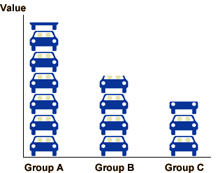
Using pictures of objects instead of bars in a barchart is misleading and must be avoided.
Merit raises
The next example is not one from official statistics but is particularly misleading. As part of a study of how merit pay policies are tied to employee performance, data were collected about the merit raises (measured as a percentage of salary) for 3,990 employees in a large company. The diagram below was published to summarise the data.
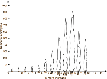
Again, the visual impression is misleading because the widths of the carrots also change. In particular, the employees getting under 5% merit increase seem visually unimportant, but they comprise nearly 10% of the total employees.