Small data sets
If a simple table has only a few distinct categories, the information in it
can be very simply expressed. If there are only two categories, the information
can often be expressed in text as efficiently as in a bar graph.
Previous custodial sentences for sentenced prisoners
The bar chart below describes the numbers of New Zealand sentenced prisoners
in 2003 who had a previous custodial sentence.
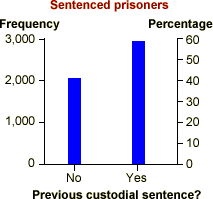
This bar chart is only based on two numbers — 2,108 prisoners had no previous
sentence and 2,987 had a previous sentence. The information can be expressed equally
clearly in the boxed text below:
41.4% of the 5,095
sentenced prisoners had no previous custodial sentence.
Chartjunk
Since the information contained in a bar chart is often simple (only 2 values
above), it is tempting to embellish bar charts 'artistically' to make them more
visually appealing. These additions are collectively called chartjunk.
Many spreadsheets, such as Microsoft Excel, make it easy to add chartjunk to bar
charts.
In general, chartjunk should be avoided — it is usually easier to read information
from a standard bar chart. Rather than adding chartjunk, draw the bar chart small
or to replace it with a frequency table.
Three-dimensional chartjunk
A common form of chartjunk is obtained by changing each bar into a 3-dimensional
object. When the resulting 3-dimensional picture is rotated, it often becomes
harder to compare the heights of bars and to read off values from the axes. In
particular, perspective views should be avoided.
Origin of tourists arriving in Hawaii
The bar chart below describes the placed of origin of all tourists arriving
in Hawaii in 2001.
This bar chart can be rotated. Hold the mouse button down in the centre of
the diagram and drag to rotate. (Alternatively, the buttons on the right can be
used to rotate the diagram.
Although this diagram looks more 'artistic' than a simple bar chart, it is
harder to read off the numbers of arrivals from each region, especially for more
'extreme' rotations. Click Show 2D to see a simple bar chart
that displays the information more effectively.
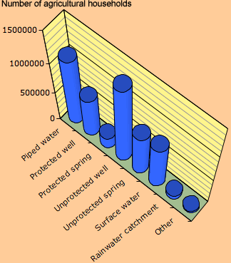
Tanzania drinking water
The diagram below was produced by Microsoft Excel to show the distribution
of the sources of household drinking water in the dry season of the 2002/3
agricultural year.
The rotation and perspective viewpoint of the diagram make it an extremely
poor representation of the data. For example, can you estimate the number
of households using protected wells?
Avoid drawing bar charts in 3-dimensions.