Click the button below to print this chapter in the usual way.
The best print results are obtained if the text is reduced in size and printed on sheets of paper that are smaller than A4. This can be done using your browser's Page Setup command to scale by 71% and then printing on A5 paper.
If you don't want to print now,
Chapter 7 Maps
7.1 Colouring regions
Information about countries and regions
Official Statistics publications often contain comparisons of the characteristics
of different countries or regions within a single country. Such comparisons can
be made with tables and bar charts, as described in earlier sections of this chapter.
However it is often clearer to present the information in a map. The various areas
on the map can be coloured or shaded according to the values of interest.
African information
The diagram below shows some data about African countries.
European
European power in control of the country in 1945
Calories
Calories per capita per day in 1998
Life expectancy
Male life expectancy in 2003
AIDS/HIV
Percentage of adults (15-49) with AIDS/HIV in 2003
The first of these measurements is categorical (since it collects the countries
into one of five groups). The other measurements are continuous numerical ones.
The African map has been coloured to represent the values of the variables.
Use the pop-up menu to select the measurement to display on the map and investigate
its distribution through Africa.
Click on a row of the data table or a country on the map to highlight it in
both parts of the diagram.
Note that the accuracy of these data are questionable. For
example, the AIDS rates are likely to be under-reported in some countries
and some values are unknown (shaded in grey on the map).
Population density
The information that is displayed on a map is usually only available within
fairly large regions (e.g. countries), but occasionally information is available
on a much smaller scale. The map below describes population density in Asia and
is based on a very fine grid of areas -- population density is known or has been
estimated within very small areas.
7.2 Choice of colours
Continuous scale or groups?
When a continuous numerical quantity is displayed on a map, a choice must be
made about how to use colour to represent it.
Continuous colour
The quantity can be represented with a continuum of shades between two colours
(e.g. red and blue). However it is often difficult to assess where any particular
shade lies in this continuum. Adding a third contrasting colour to the continuum
helps.
Grouped colour
Alternatively, the values can be grouped into discrete classes with distinct
colours for each. If there are more than two or three classes (and colours), care
should be taken with their choice. If the colours do not change in a predictable
way, there is a danger that the map will appear to be a random mosaic of colours.
Choose the colours for a map carefully.
In black-and-white publications, it is usually best to use group the values
and use a small number of grey shades.
African life expectancy in 2005
The map below shows life expectancy varied in Africa in 2005.
Use the pop-up menu to investigate the use of different colours. Observe that:
With Continuous red -> blue, it is difficult to compare
the life expectancies of countries in the range 55-65.
With Five groups, mixed, you need to check the key carefully
to see which countries have lowest and highest life expectancy.
The two choices Continuous yellow -> red -> blue and
Five groups, smooth are probably the best colour representation.
7.3 Adding information with circles
Display of a measurement and 'size'
Direct shading of regions on a map can only display the values of one measurement.
It is possible to display the value of this measurement and also a different 'size'
measurement for the region if they are represented by coloured circles
on the map. The circle's colour again represents the main measurement and its
area is proportional to the 'size' of the region.
Circle area should be proportional to size, not
circle diameter.
The 'size' measurement that is represented by circle area is often population,
but it can be more closely associated with the main measurement. An example is
shown below.
AIDS/HIV in Africa
The circles on the map below describe the incidence of AIDS/HIV in African
countries in 2005. The area of each circle represents the total number
of cases in that country. The colour describes the percentage
of the population with the disease.
Click on any country to see its AIDS/HIV incidence numerically.
Increasing the size of the circles a little (using the slider) makes the information
stand out better.
7.4 Maps with pie and bar charts
Adding other information to maps
Coloured circles of varying diameter can effectively describe the geographic
distribution of some measurements. Other simple displays such as pie or bar charts
can also be superimposed on the regions of a map, but they must be simple to be
effective.
If the information about each region is complex, ordinary tables and
graphs may convey it better than a map.
Urban and rural population in Africa
Pie charts have been added to the map of Africa below. The area of each circle
represents the total population in 2006 and the pie slices show the proportions
who are classified as urban and rural.
An alternative display would have been solid circles whose colour represented
the proportion of urban dwellers, but the pie charts let you estimate more accurately
the proportion in any country.
People with AIDS/HIV in Africa
The next map shows the number of people with AIDS/HIV in each country in 2005
(circle area) and also the proportions of these who are children, adult women
and adult men. (A question mark represents unavailable information.)
This map conveys the information well, but a similar diagram would become much
harder to understand if there were more than three categories.
Other examples
The following three maps were published in the Contemporary Atlas of New
Zealand. In each case, bar charts or stacked bar charts are superimposed
on different regions.
The above diagram describes submissions about management of forests in the
West Coast of New Zealand. The bar charts successfully convey the information
that a larger proportion were in favour of sustainable logging in the West Coast
than elsewhere in New Zealand. (The West Coast had high unemployment and logging
provided jobs.)
The bar charts here again show clearly that a larger proportion of companies
in New Zealand were foreign-owned in Auckland and Wellington than those in the
rest of the country. It also shows the increase in companies based in Auckland
rather than Wellington and the increasing proportion of foreign-owned companies
in Auckland in 1997. However the rotation of the map and the 3-dimensional bars
do not make it clearer.
The final map tries to display too much information in its stacked bar charts.
Their areas reflects the land areas planted in vegetables (a size measurement)
and the slices represent the proportions of land devoted to different vegetables.
If bar or pie charts are added to a map, they should be simple.
7.5 Distorted population maps
Map projections
There are many different ways of drawing maps that represent the world's countries
on paper. Since the countries are actually arranged on a sphere, any arrangement
on flat paper involves some distortion of the areas and/or the relative locations
of the countries.
Area proportional to population
The map areas of countries on some projections are very different from their
land areas. This is particular evident in the Mercator projection where the size
of countries in the far north and south are considerably exaggerated.
A different kind of distortion of areas results from intentionally altering
the areas of countries to be proportional to their populations. There are many
different ways to do this, while keeping roughly to the relative locations of
countries and retaining their borders with other countries.
African populations
The map below shows all countries in Africa.
Click the checkbox Show circles to draw a circle centred on
each country with area proportional to the land area of the country. Each circle
contains virtually the same ink as was used on the original map.
Now select Area = Population from the pop-up menu at the bottom.
The circles are now drawn with area proportional to the population in the countries.
Imagine these circles being moved and reshaped so that the circles
for adjacent countries touch, but retain the same areas.
This distorted map would increase the map areas of countries with high population
densities compared to the others.
Examples of world population maps
There is no unique way to distort the areas of the countries -- there are several
goals in such a map:
Map areas must be proportional to population.
Countries should retain the same borders with other countries.
The overall shape of countries and regions should be recognisable.
The map below places greatest emphasis on keeping recognisable shapes for the
individual countries but their relative positions are distorted so much that some
regions are almost unrecognisable (e.g. Africa and the Middle East).
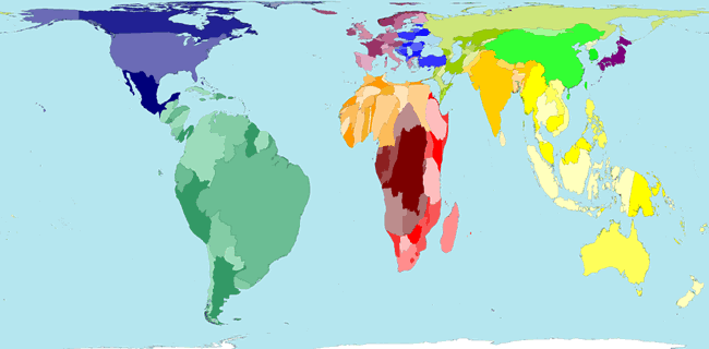
The next map, produced by ODT Maps (http://ODTMaps.com) is much better, though
the shapes of some countries (especially Russia) are quite distorted and the UK
appears to be further north than Canada.
The map below is much simpler with each country represented by a rectangle,
but it is still fairly effective for displaying the world's population.
7.6 Other distorted maps
Distorting maps to display other information
Maps can be similarly distorted to make the areas of countries (or regions)
proportional to many other measurements.
Map areas must represent a quantity that is 'part of a whole'. If two areas
are combined, the value for the combined area should be the sum of their values.
For example, area should not be proportional to infant mortality rate in the
countries -- this would give unreasonable emphasis to very small countries. A
better measurement to use for the map areas of countries would be the total number
of infants dying.
WorldMapper
It is far from simple to construct such distorted maps, but software has been
written to automatically produce them. The following maps were all drawn by WorldMapper.
Although the resulting maps occasionally produce spidery distortions, the result
is often excellent.
Rainfall volume
The map below shows where the world's rainfall occurs. Observe in particular
the high rainfall in Brazil and Indonesia.
Electricity generation
The next map shows where the world's electricity is generated. The distortion
of the shapes of countries in Africa is particularly severe.