Click the button below to print this chapter in the usual way.
The best print results are obtained if the text is reduced in size and printed on sheets of paper that are smaller than A4. This can be done using your browser's Page Setup command to scale by 71% and then printing on A5 paper.
If you don't want to print now,
Other displays for partitions of a total
Two variations of the standard bar chart are often encountered. A stacked bar chart is simply a bar chart in which the bars are stacked on top of each other. It is particularly useful when comparing several sets of values since the stacked bar charts can be drawn side by side.
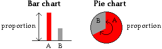
In a pie chart, a circle is split into segments according to the proportion of data values in each category. The angle for each category is given by the proportion.
Although pie charts seem visually different from the two types of bar chart, they are closely related.
| In bar charts, stacked bar charts and pie charts, the area of ink for any category equals the proportion of the total in that category |
|---|
World cereal production in 2006
The table below shows the total production of cereals (millions of tonnes) in the six continents of the world in 2006.
| Region | Cereal production |
|---|---|
| Asia Europe Northern America Central & S America Africa Oceania |
1102.3 403.6 397.5 192.7 145.9 17.2 |
The diagram below shows a bar chart of these data.
Drag the slider to the right to stack the bars of the bar chart.
In the diagram below, drag the slider to change the stacked bar chart into a pie chart.
Warning
Stacked bar charts and pie charts should only be used to display values that are partitions of a total. The sum of two values and the total of all values must be meaningful quantities since the graphs imply that the different segments represent proportions of some total.
Infant deaths from abuse
| The following example shows data that should not be displayed in a pie chart. |
The pie chart below was published in a New Zealand newspaper as part of an article on child abuse.
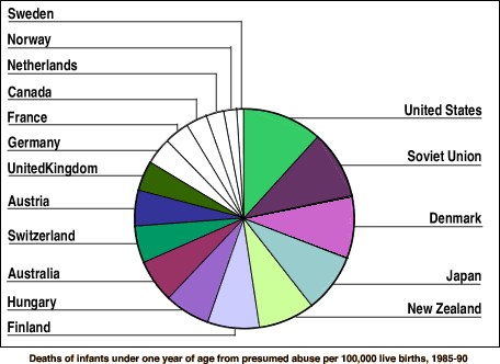
Since the value from each country is a rate of deaths per 100,000 live births, it is meaningless to add these for different countries -- the total cannot be interpreted. A pie chart should therefore not be used.
A bar chart would be a better display of these data. (It would also allow more accurate comparisons between the rates in different countries -- it is fairly difficult to compare the areas of different slices above.)
Bar charts and pie charts highlight different aspects of the data
For quantities that are not partitions of some total (e.g. life expectancies or death rates in several countries), only bar charts should be used.
For data that do form a partition of a total (e.g. a frequency table), both a bar chart and a pie chart are valid representations of the data. However, although both are visual representations of the same values, they highlight different features of the data.
Pie charts are particularly useful if the categories are ordered in some meaningful way.
World rice production
The table below shows world rice production (in thousand tonnes) in 1996. The seven major rice-producing countries are separately shown.
| Country | Rice production (million tonnes) |
Percentage | |||
|---|---|---|---|---|---|
|
|
|
|||
| Total | 566.9 |
100.0 |
A pie chart and a bar chart are shown below.
Rice production was similar in Bangladesh, Vietnam and Thailand and they are very hard to distinguish in the pie chart. (Click on segments to read off the exact proportions of world production.) In the bar chart, it is clearer that production in Thailand is lower than in Bangladesh and Vietnam. The difference between China and India is even clearer in the bar chart.
On the other hand, the pie chart shows that just over half of the world's rice was produced in China and India since these categories span about half of the circle. A further quarter was produced in the next four countries (Indonesia, Bangladesh, Vietnam and Thailand) since their combined 'slice' is a further quarter of the circle. This information is not immediately apparent in the bar chart. Drag over adjacent categories with the mouse to read off the proportions in these groups. (Push the mouse button down over one segment and move the mouse with the button kept down over other segments.)
Chartjunk
As with bar charts, pie charts are often graphical representations of a small number of values. For example, a pie chart of the gender of students in a class is only based on a single value, the proportion of males. As a result, there is a temptation to 'enhance' pie charts as 3-dimensional objects -- chartjunk.
Resist the temptation -- it does not make the data any easier to understand and may indeed be misleading since 3-dimensional pie charts can over-emphasise the categories closest to the viewer.
Tourist expenditure in Hawaii
The pie chart below describes the money that tourists spent in Hawaii in 2006. (The total tourist expenditure was $12,380,900,000 in that year.)
This diagram is 3-dimensional. Press the mouse in the centre of the pie chart and drag (with the mouse held down) towards the top left to rotate the diagram. The slider can be used to alter the thickness of the pie.
The simple pie chart is equally effective for displaying the data. If the rotation is extreme or the pie is thick, the rotated pie chart can exaggerate the importance of the front categories.
Variations
The following diagrams show other 3-dimensional variations of the basic pie chart. In both cases, the extra dimension is chartjunk -- neither improves on a basic 2-dimensional pie chart.
Local authority income
The doughnut chart below describes the sources of income of New Zealand local authorities in 1996.
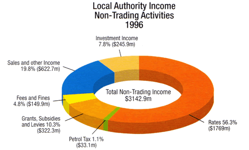
The annotations provide an alternative to a table and key accompanying the diagram, but the 3rd dimension is not helpful.
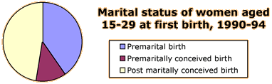
Marital status on first birth
In the following pie chart, all slices have been 'exploded'.
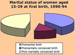
Although it is occasionally helpful to explode one group of categories in a single slice to highlight their combined contribution to the total, the information in the pie chart is blurred if this is done to all categories. And, of course, the 3rd dimension does not help at all.
Small is beautiful
In general, it is better to draw a standard pie chart smaller rather than embellishing it with chartjunk.
Marital status on first birth?
The simpler small pie chart below shows the data more clearly than the exploded 3-dimensional pie chart that was published.
Pictographs
We mentioned earlier that the use of 2- and 3-dimensional pictures to replace the bars on a bar chart can be misleading since the visual impact of any bar depends on its area or volume, not its height. A similar problem arises when a picture is split into segments to form a kind of stacked bar chart. Again the visual impact of different slices is often different from their contribution to the total of the values.
| Avoid slicing a picture to form a stacked bar chart. |
|---|
Tourist accommodation
The diagram below was published to describe where tourists in New Zealand stayed during their trips.
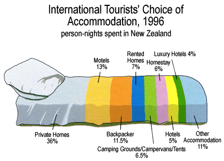
This is similar to a stacked bar chart, but the pillow on the bed gives undue visual impact to the first category.
Petrol
The two diagrams below were published in a major New Zealand newspaper in 1997 and are much more misleading.
 |
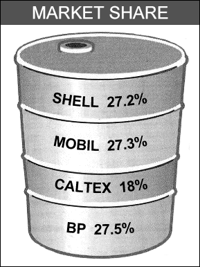 |
The diagram on the left gives greater visual impact to the central categories, both of which are types of government taxation. It should come as no surprise that the diagram was provided to the newspaper by one of the petrol companies!
The diagram on the right is not so bad, but it has been inaccurately drawn and the perspective display makes the petrol companies at the top of the diagram seem too large. (The diameter of the barrel is greater at the top.)
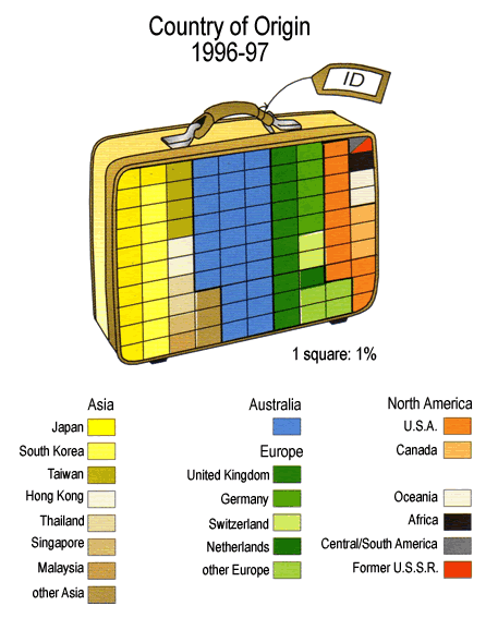
Origin of tourists to New Zealand in 1996-97
In next diagram also uses splits a picture into segments, but at least some attempt has been made to keep the visual impact of each category proportional to its value.
Colour and shades of grey
Simple bar charts (of the type shown in this section) display their information as effectively in black and white as in colour.
In pie charts however, the slices corresponding to the categories touch each other, so it is more important that they can be easily distinguished. If there are more than 3 or 4 different categories, colour is best to distinguish them. There is no overhead to use colour in web-based publications, but it is more expensive to print colour on paper so different shades of grey are often used in printed pie charts.
Shades of grey are difficult to distinguish if there are many of them, so the category names are often printed adjacent to the pie chart slices instead of in a separate key.
| In publications that do not use colour, extra care must be taken to clearly identify the segments of pie charts. |
Next billion population
The world population is projected to increase by just over 1 billion between 2000 and 2015. The pie chart below describes the regions of the world from which these extra people will come.
It is fairly easy to match the slices of the pie chart to countries when they are drawn in colour. Use the pop-up menu to draw the pie chart with different shades of grey. The regions are now harder to identify.
Types of student in tertiary education
The pie charts below were published to describe the students in three types of tertiary education college in New Zealand in 2002. Note how the segments of the pie chart are labelled.
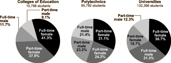
Although the individual pie charts are clear, there is a major problem with the way that they are shaded. There is no consistency in the ordering or shading of categories in the different pie charts. For example, 'full-time female' is represented by black in two of the pie charts but grey in the third. If the same ordering and shading had been used in all pie charts, it would have been much easier to understand the differences between the three types of college.
| If several groups are being compared, it is essential that the same colours and ordering are used for the display of each. |
Comparison of different groups will be discussed more fully in a later section.