
If you don't want to print now,
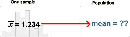
Census: measurements from complete population
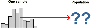
We often want to find information about a particular group of individuals (people, fields, trees, bottles of beer or some other collection of items). This target group is called the population.
When measurements are made from every item in the target population, the collected data are called a census.
Sampling from the population
A census is often not feasible:
Fortunately, we can often obtain sufficiently accurate information by only measuring a selection of units from the population.
Data from a subset of the population is called a sample.
Simple random sample
The simplest way to select a representative sample from a population is called a simple random sample. In this, each unit has the same chance of being selected and some random mechanism (e.g. tossing a coin, rolling a die or a computer-based method) is used to determine whether any particular unit is included in the sample.
Although there is some inaccuracy when a sample is used instead of the whole population, the savings in cost and time often outweigh this.
Sampling from a population of values
When only a single measurement is made from each individual, it is convenient to define the population and sample to be sets of values (rather than people or other items). This abstraction — a population of values and a corresponding sample of values — can be applied to a wide range of applications.
In the remainder of this chapter, we examine the consequences of sampling from populations of numerical and categorical values.
Sampling people
The diagram below illustrates the sampling process with a population of 56 people.
Click the button Take sample to randomly select 15 of these people. Repeat a few times to observe the variability in the units sampled.
Although there are many differences between the individuals, we are often only interested in one. Click the checkbox Only show Gender to concentrate on this aspect of the individuals; the population is a set of categorical values (Male or Female) and the sample is similarly categorical.
Similar categorical populations and samples would arise if we were interested in whether the people were married, intended to vote for a particular candidate or were unemployed.
Sampling boxes
The diagram below shows 120 boxes that were manufactured in a production run. The boxes have a variety of shapes and colours and some (marked with a cross) are found to be defective.
Click the button Take sample to randomly select 17 boxes.
Click Only show Box state to concentrate on whether the boxes are defective. As with the previous example, this reduces the problem to random sampling from a population of categorical values (Defective or OK).
Variability
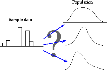
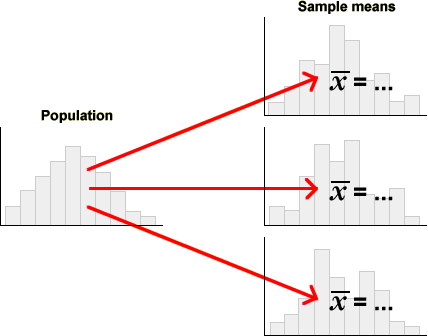
The mechanism of sampling from a population results in sample-to-sample variability in the information that we obtain from the samples.
Sample information about the population
However in practice, we only have a single sample that has been collected to provide information about the population. Sampling results in incomplete information about the population since we do not have information about some of the population members.
What information does a sample provide about the underlying population?
Effect of sample size
In later chapters, we will describe in much more detail how to use sample information to make inference about an underlying population. At this point, we simply note that we must take account of sample-to-sample variability when interpreting sample data and that the larger the sample size, the more information we have about the population.
Bigger samples mean more stable and reliable information about the underlying population.
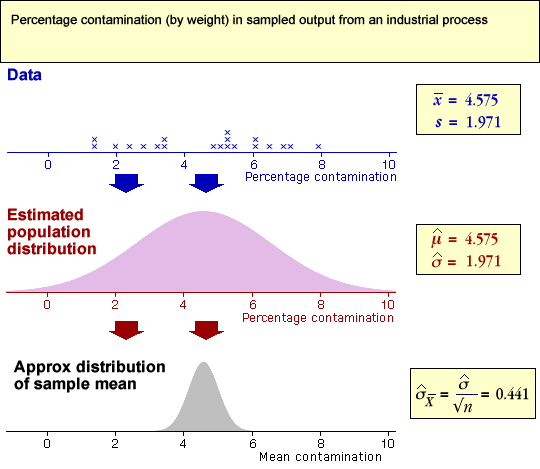
Calorie intake in UN countries
It is important to assess trends in nutrition around the world, but researchers often need to wait over a year until data about nutritional intake in any year is made publicly available. A United Nations researcher decides to request nutritional information from a random sample from all countries in 2006 before the data have been published.
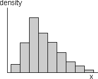
Although we cannot demonstrate what would happen at the start of a future year, we can use the known information from 2003-5 to demonstrate the kind of variability that is likely to be observed. The diagram below shows food intake in calories per capita per day.
The diagram above shows a stacked dot plot, histogram and box plot for the calorie intakes of a random sample of 10 countries from this 'population'. Click on any cross on the dot plot to display the name of the country and its exact calories.
Click Take sample a few times to observe the sample-to-sample variability in the three displays. With a sample size as low as 10, the sample distributions vary considerably. In some samples, there even appear to be outliers or clusters.
From a single small sample, there is a lot of uncertainty about the population distribution.
Use the pop-up menu to change the sample size to 40, then take a few more samples. Observe that the graphical displays now become less variable. Repeat with a sample size of 100 and observe that the overall features of the sample distribution change even less from sample to sample.
The bigger the sample size, the more consistently the sample distribution reflects the distribution in the underlying population.
Finally, use the pop-up menu to display the nutritional intakes of all 176 countries — the population distribution about which we are really interested.
Any of the samples of 100 countries give a close approximation to the population distribution of calorie intakes.
Even the samples of 40 countries mostly give a reasonable impression of the shape of the population distribution.
Estimating means and proportions
A random sample is often selected from a population in order to estimate some particular numerical summary of it. The population characteristic of interest might be...
Although we do not know the value of the population mean or proportion, the corresponding value from a sample can be used to estimate it. Estimation will be considered in greater depth in the next chapter, but we note here that the sample mean or proportion is usually different from the target population mean or proportion.
The difference between an estimate and the value being estimated is called its sampling error.
When a population characteristic is estimated from a sample, there
is usually a sampling error.
Estimating the proportion of males
The diagram below again illustrates the sampling of 15 people from a group of 56.
Click Take sample a few times and observe that the sample proportion of males varies from sample to sample. The difference between the estimate and the population proportion of males is the sampling error.
Estimating the proportion of defective boxes
The diagram below shows 120 boxes, some of which are defective.
Click Take sample a few times to select samples of 15 boxes. Observe resulting sampling errors.
Estimating a mean age
The diagram below shows the ages of 49 students attending a night-school class about local history.
Click Take sample a few times to select 10 of these students at random. Observe the variability in the sample mean age and its difference from the true mean age in the class (the sampling error).
Effect of sample size on sampling error
The larger the sample size, the smaller the sampling error. However when the population is large, sampling a small proportion of the population may still give accurate estimates.
Sampling error depends much more strongly on the sample size than on the proportion of the population that is sampled.
For example, a sample of 10 from a population of 10,000 people will estimate the proportion of males almost as accurately as a sample of size 10 from a population of 100.
The cost savings from using a sample instead of a full census can be huge.
Shelving for large library books
The manager of a library intends to purchase new shelving for its collection and wonders what proportion of its books will fit on shelves with 'standard' spacing. Since there are over one million books in the library, it is infeasible to classify all books as normal or outsize, so the decision on shelving must be made from a sample of books.
To investigate how many books must be sampled, we will sample from a population of 1,000,000 books in which 20% are outsize.
Initially we will take random samples of 1,000 books. Click Take sample a few times. The difference between the sample proportion of outsize books and the population proportion (0.200) is the sampling error.
Use the pop-up menu to investigate how the sample size affects the accuracy of the estimate. You should observe that the sampling error is usually smaller when the sample size is large.
In practice, a sample size of 1000 books would give the library a sufficiently accurate estimate of the proportion of outsize books. It is certainly hard to imagine a situation where more than 1% of this population would need to be sampled!
Different sampling schemes
In a random sample of size n from a finite population of N values, each population value has the same chance of being in the sample. Two different types of random sample are common in practice.
Both sampling methods can be performed by sequentially selecting values until the required sample size is reached. They differ in how the second and subsequent values are selected.
A sample with replacement can contain the same population value more than once.
Since no value can appear more than once in the sample, SWOR covers more of the population and gives more accurate estimates than SWR.
However occasionally the sampled individuals cannot be removed from the population and SWR is necessary. An example would be a biologist who records characteristics of animals that are sighted within a region; there may be no way to tell whether a bird has already been spotted. (The statistical theory for analysing SWR is also easier than for SWOR, though this should not affect the sampling scheme that you use!)
Practical differences
If the sample size, n, is much smaller than the population size, N, there is little practical difference between SWR and SWOR — there would be little chance of the same individual being picked twice in SWR.
When the population is large (and considerably larger than the sample size), SWR and SWOR are almost identical.
In particular, if the population size is infinite, SWR and SWOR are identical.
Illustration
The distinction between sampling with and without replacement is shown in the diagram below. The values in the diagram are ages of 49 students attending a night-school class about local history.
Click the button Take sample to randomly select 5 of the 49 students with replacement. Take a few more samples and observe that it is possible to select the same student twice or more.
Use the pop-up menu to increase the sample size and select a few more random samples. The bigger the sample size, the greater the chance of selecting the same individual two or more times when sampling with replacement.
Select the option Without replacement, then take a few more samples. Since we can no longer select any individual more than once, the samples cover more of the population.
Selecting a sample manually (raffle tickets)
When choosing a random sample, each population member must have the same chance of being included in the sample. How can we select a random sample in practice? One method of selecting a random sample of size n is...
This method is often used for raffles, but thorough mixing is difficult for large populations and it is rarely used in research applications.
Random digits
An alternative method of selecting a random sample involves generating random digits (0, 1, ..., 9). There are several ways to generate random digits such that each has the same chance of appearing.
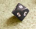 Roll a 10-sided
die several times. (6-sided dice are more common, but 10-sided dice are also used
in various games — especially fantasy games.)
Roll a 10-sided
die several times. (6-sided dice are more common, but 10-sided dice are also used
in various games — especially fantasy games.)Concatenating 2 or more of these random digits gives a larger random number.
Click the button Generate digit to generate a random digit.
Concatenating three such random digits gives a random number between 0 and 999. Click Generate value to find a random number in this range.
Random number between 0 and k
A random number that is equally likely to be any number between 0 and 357 can be found by repeatedly generating 3-digit numbers (between 0 and 999) until a value between 0 and 357 is obtained.
It is easier however to use a spreadsheet such as Excel — it has a function designed for this purpose, "=RANDBEWEEN(0, 357)".
Selecting a random sample
To select a random sample without replacement using random numbers,
The diagram below illustrates sampling without replacement from a population of 56 individuals. They have been numbered from 0 to 55.
Click Random index. If the resulting two digits are between 0 and 55, the corresponding individual is added to the sample. Otherwise, an error message appears and a new random value must be generated.
Repeat several times to add more individuals to the sample. Note that:
Generalising from data
Most data sets do not arise from randomly sampling individuals from a finite population. However we are still rarely interested in the specific individuals from whom data were collected.
The recorded data are often 'representative' of something more general.
The main aim is to generalise from the data.
Examples
The following data sets were collected to provide information about something more general than the specific 'individuals' from whom the values were collected.

We can (and should!) use exploratory graphical and numerical summaries to help understand the distribution of values in data sets such as these. However the data give incomplete information about the underlying process — with more data, we would be able to do better.
We need to explain more precisely what is meant by 'generalising from the data'.
Randomness of data
Not only do we usually have little interest in the specific individuals from whom data were collected, but we must also acknowledge that our data would have been different if, by chance, we had selected different individuals or even made our measurements at a different time.
We must acknowledge this sample-to-sample variability when interpreting the data. The data are random.
All graphical and numerical summaries would be different if we repeated data collection.
This randomness in the data must be taken into account when we interpret graphical and numerical summaries. Our conclusions should not be dependent on features that are specific to our particular data but would (probably) be different if the data were collected again.
Hardness of brick pavers
In an experiment to assess the durability of one type of brick pavers, a sharpened drill impacted the surface of 10 pavers for a period of 1 minute. The volume of material eroded (mL) was recorded.
If the experiment was repeated with a different sample of brick pavers of the same type, different values would be obtained. Click Repeat experiment with 10 different pavers to see how the recorded data might change.
The dot plot, mean and standard deviation all vary considerably.
The results from a single experiment clearly tell us something about the hardness of this type of paver, but how do we take into consideration the randomness?
Use the pop-up menu to increase the sample size and repeat.
With a bigger data set, the dot plot, mean and standard deviation vary less between the different data sets.
Data that are not sampled from a finite population
Sometimes data are actually sampled from a real finite population. For example, a public opinion poll may select individuals from the population of all residents in a city. The previous section showed that:
Random sampling of values from a finite population can explain the sample-to-sample variability of some data.
However there is no real finite population underlying most data sets from which the values can be treated as being sampled. The randomness in such data must be explained in a different way.
Estimating the speed of light
A scientist, Simon Newcomb, made a series of measurements of the speed of light between July and September 1882. He measured the time in nanoseconds (1/1,000,000,000 seconds) that a light signal took to pass from his laboratory on the Potomac River to a mirror at the base of the Washington Monument and back, a total distance of 7442 metres. Since all his measurements (24828, 24826, ...) were close to 24800, they have been coded in the table below as (24828-24800 = 28, 24826-24800 = 26, ...)
| 28 26 33 24 34 -44 27 16 40 -2 29 |
22 24 21 25 30 23 29 31 19 24 20 |
36 32 36 28 25 21 28 29 37 25 28 |
26 30 32 36 26 30 22 36 23 27 27 |
28 27 31 27 26 33 26 32 32 24 39 |
28 24 25 32 25 29 27 28 29 16 23 |
Newcomb's measurements cannot be considered to be sampled from any real finite population. However there is variability within this data set that reflects inaccuracies in his experimental procedure. Repeating his experiment would have resulted in a different set of measurements.
Sampling from an abstract population
Random sampling from a population is such an intuitive way to explain sample-to-sample variability, we also use it to explain variability even when there is no real population from which the data were sampled.
We replace the real population that usually underlies survey data with an abstract population of all values that might have been obtained if the data collection had been repeated. We can then treat the observed data as a random sample from this abstract population.
The variation in the underlying abstract population gives us information about the variation in similar data in general.
Defining such an underlying population therefore not only explains sample-to-sample variability but also gives us a focus for generalising from our specific data.
Estimating the speed of light
Newcomb's data can be treated as a sample from the population of all possible measurements that could have been made by repeating the experiment an infinite number of times.
The variability in this abstract population reflects the variability in Newcomb's experimental technique. The desire to generalise from Newcomb's specific 66 measurements can therefore be translated into estimation of characteristics of the underlying population (and hence the true speed of light).
Newcomb's data can be treated as a random sample from this population and they provide information about the distribution of values in it.
Distributions
When an abstract population is imagined to underly a data set, it often contains an infinite number of values. For example, consider the lifetimes of a sample of light bulbs. The population of possible failure times contains all values greater than zero, and this includes an infinite number of values. Moreover, some of these possible values will be more likely than others.
This kind of underlying population is called a distribution.
The notion of sampling from an infinite population is difficult, so we will now illustrate it in a different context as an extension of sampling from a finite population.
Location of cows in a field
Consider a cow that can freely move within a field. We observe its location in the field at six times so our data are six 'locations' for the cow.
Initially consider the field being split into a 5x5 grid giving a population of 25 possible locations for the cow. The six positions at which the cow was observed are a random sample of 6 from this population. Click Take sample a few times to see possible locations using this model.
Use the pop-up menu to change the grid to a 10x10 grid and then a 30x30 grid to allow a finer specification of the cow locations. In both cases, we are still selecting samples (with replacement) from a finite population.
Finally select Infinite from the pop-up menu to continue this refinement of the grid to its extreme, allowing the cow locations to be anywhere within the field — an infinite population. Clicking Select sample selects a random sample of locations from this infinite population.
In the illustration above, we assumed that all possible locations in the field were equally likely. The idea of a distribution also allows for some possible values to be more likely than others. For example, the cow may be more likely to be in some parts of the field above than others.
Sampling from a population
Sampling from an underlying population (whether finite or infinite) gives us a mechanism to explain the randomness of data. The underlying population also gives us a focus for generalising from our sample data — the distribution of values in the population is fixed and does not depend on the specific sample data.
Unknown population
The practical problem is that the population underlying most data sets is unknown. Indeed, if we fully knew the characteristics of the population, there would have been little point in collecting the sample data!
Even though our model implies that we could take many different samples from the population,
In practice we only have a single sample.
However this single sample does throw light on the population distribution. In later chapters, we will go into much more detail about how to estimate population characteristics from a sample.
Effectiveness of insecticide
Users of an insecticide are interested in what proportion of the target insects are likely to die at any dose. This proportion will be unknown, but it is possible to collect data that throws light on its value.
The symbol π denotes the population proportion of beetles that would die at a particular weak concentration of the insecticide. In an experiment, fifty beetles were sprayed with this concentration and the diagram below shows the resulting data.
The survival of the fifty beetles can be treated as a sample from an abstract infinite population in which a proportion π would die, but π is an unknown value. It is of more interest than the proportion in our specific sample.
The sample proportion dying, p = 0.72, however throws some light on the likely value of π.
Sampling one value from a finite population
Random sampling from populations is described using probability. If one value is sampled from a finite population of N distinct values, we say that
The definition can be extended to populations where some values occur more than once. In particular, when one value is randomly selected from a categorical population, the probability of obtaining a particular value is the proportion of population values equal to it.
The probability that a single sampled value is x is the proportion of times this value occurs in the population.
Categorical example
In the population of 44 categorical values below, there are 27 'success' and 17 'failure' values. The probability that a single value sampled from this population is a success is therefore 27/44.

Household size in Mauritius
The bar chart below shows the sizes of all households in Mauritius in its 2000 census. Dual axes are shown to display both the number of households and proportion of each size.
If a single household is randomly selected in Mauritius, the probability that it will be of any particular size equals the population proportion of households of that size in the census.
Click on the bars to read off the probabilities.
Probability of getting one of several values
When one value is sampled from a population, the probability of getting a particular value, x, is the proportion of population values that equal x. A similar definition is used for the probability that the sampled value is either x, y, ...
The probability that a single sampled value is either x, y, ... is the proportion of population values that are either x, y, ... .
If the values are numerical, this definition gives the probability of getting a value within some range. For example, if 12 values in a population of 100 values are under 3.5, we say that the probability that a single sampled value will be under 3.5 is 12/100 = 0.12. To express this in an equation, we use the symbol X for the value that is sampled and write
Prob( X < 3.5 ) = 0.12
More generally,
Prob( a < X < b ) = propn of values between a and b.
Tyre tread of taxis
The diagram below shows a jittered dot plot of the tyre treads depths from a fleet of 60 taxis.
The taxis with tread depth between 3.5 and 4.0 are highlighted. The probability that a single taxi selected at random from the fleet will have a tyre depth between 3.5 and 4.0 is the proportion of highlighted values.
Drag the left and right edges of the highlighted area to display the probabilities of getting a value in other ranges.
Probability and population proportion
When sampling from a finite population, the probability of any 'event' is the proportion of population values for which that 'event' happens. For example, the probability that a randomly selected household from a town contains more than two adults equals the proportion of households of that size in the town.
The same definition can be used for infinite populations (distributions). When selecting one value from the population,
The probability of any value or range of values equals the proportion of these values in the population.
Probability and long-term proportion
There is an alternative but equivalent way to think about probability when it is possible to imagine repeatedly selecting more and more values from the population (e.g. repeating an experiment again and again).
The probability of any value or range of values is the limiting proportion of these values as the sample size increases.
The fact that the sample proportion always stabilises at the probability (i.e. the population proportion) is called the law of large numbers.
Sex of babies
The sex of a newborn baby at a maternity unit is a categorical value (male or female). The randomness of the baby's sex can be modelled as being a value that is randomly sampled from an abstract infinite population in which a proportion of values are male and the rest are female.
The probability that one baby will be male is the proportion of male values in this underlying population.
Alternatively, we can imagine a sequence of more and more babies being born. The probability of one baby being male is also the limiting proportion of males in this (imaginary) sequence of births.
These are two different ways to think about the probability, but the value is the same.
Law of large numbers
The diagram below illustrates the fact that a sample proportion tends to a limit as the sample size increases. (The limit is the probability.) Imagine recording the sex of a sequence of babies born at the maternity unit.
Click Find new value a few times to observe the sex of a sequence of babies. When only one baby has been observed, the proportion of females must be either 0 or 1, but after 20 babies have been observed, the proportion should be somewhere near 1/2.
Continue observing additional babies until about 1000 have been recorded. By this time, the proportion of females will have stabilised.
(Hold down the button Find 10 values to speed up the simulation.)
If we carried on infinitely long, the proportion would stabilise at a value that we call the probability of a baby being female.
Describing categorical and discrete populations
Since we have defined the probability of any value to be its proportion in the population from which we are sampling, graphical displays of these population proportions also describe the probabilites.
Bar charts were used earlier to describe the distribution of values in finite data sets, but a bar chart whose vertical axis is labeled with proportions (not counts) can be used in the same way to describe an infinite population.

Bar charts and the law of large numbers
An alternative interpretation of these bar charts comes from the law of large numbers. If we imagine repeating the data collection to increase the sample size indefinitely, the law of large numbers states that the sample proportions in the different categories will eventually stabilise at the underlying population proportions (probabilities). The sample bar chart will therefore stabilise at the above bar chart of the probabilities.
The diagram below shows the bar chart of a random sample of 20 values from a discrete infinite population.
Take a few samples to observe the variability in the shape of the bar chart.
Now increase the sample size to 200 and take a few more samples. The shape of the bar chart becomes more stable. As the sample size is increased further, the bar chart becomes less variable and our description of the infinite population is the limiting bar chart (describing an infinite sample from the population).
The 'infinite-sample' barchart gives probabilities that describe the population distribution.
Histograms and probability density functions
The distribution of values in a infinite categorical or discrete population can be displayed in the same way as a sample or finite population — with a bar chart. Finite samples of continuous numerical values are often displayed using histograms and these can also be used as graphical displays of infinite populations.
However we noted before that the exact shape of a sample histogram depends on the choice of classes that were used to draw it. Class width is usually reduced as much as possible to retain a fairly smooth histogram shape. For an infinite population, this reduction in class width can be taken to its extreme, resulting in a smooth histogram called a probability density function. This is often abbreviated to a pdf.

Probability density functions are still essentially histograms and share all properties of histograms.
The law of large numbers and histograms
Take a few samples to observe the variability in the shape of the histogram of samples of size 50.
Increase the sample size to 500, then 5000, and take more samples. As expected from the law of large numbers, the proportion in each class becomes less variable.
With the larger sample size, the classes can be made narrower without giving the histogram a jagged appearance. Make the classes Narrower until the histograms start to appear jagged.
Increase the sample size to 50,000 and note that the class width can be made still narrower.
With large samples, the shape of the histogram is approaching a smooth curve.
Finally change the sample size to Infinite and note that the histogram can now be made arbitrarily narrow, resulting in a smooth curve.
The limiting 'infinite sample' smooth histogram is the probability density function of the population.
Shape of a probability density function
A probability density function (i.e. population histogram) can have any shape, though it is usually a fairly smooth curve. Indeed, we often have only rough information about its likely shape from a single sample histogram.
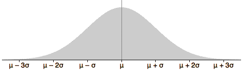
Normal distributions
One family of symmetric continuous probability density functions called normal distributions is particularly useful. Although normal distributions are only appropriate as population models for a small number of data sets, they are extremely important in statistics — their importance will be explained later in this chapter.
At this stage, we will use normal distributions to give a concrete example of a probability density function.
The shape of the normal distribution depends on two numerical values, called parameters, that can be adjusted to give a range of symmetric distributional shapes. The two normal parameters are called µ and σ and are the distribution's mean and standard deviation.
Shape of the normal family of distributions
Use the two sliders to adjust the normal parameters. Observe that the location and spread of the distribution are changed, but other aspects of its shape remain the same for all values of the parameters.
Note also that the total area under the probability density function remains the same (exactly 1.0) for all values of the parameters. This holds for all probability density functions.
For some data sets, a normal distribution provides a reasonable model. The two parameters can be chosen to make the distribution's shape match that of a histogram of the data as closely as possible.
Reaction to stimulus
The diagram below shows a histogram of reaction times of 40 subjects to a visual stimulus (in hundredths of a second), with a superimposed normal probability density function.
Use the sliders to adjust the normal parameters to obtain as close as possible a match to the histogram. This normal distribution can be used as an approximate model for how the data might have arisen.
We have used a subjective procedure of matching the shapes of the histogram and probability density 'by eye'. A more objective way to 'estimate' the normal parameters will be presented in the next chapter. Click the button Best fit to apply this objective method.
We will revisit normal distributions later in this chapter.
Probabilities from a histogram
In histograms, the area above any class equals the proportion of values in the class.
The diagram below shows the histogram of a population of 50 values.
Drag with the mouse over some of the histogram classes to highlight them. The proportion of values in the selected classes equals the area above these classes. This is also the probability that a single sampled value is within these classes.
Probabilities from a probability density function
Since the probability density function (pdf) describing an infinite numerical population is a type of histogram, it satisfies the same property.
The probability that a sampled value is within two values, P(a < X < b), equals the area under the pdf.
In the diagram below, again drag with the mouse over the diagram to highlight an interval of values. The probability of getting a value from the interval is equal to the area above that interval.
Informal introduction to some properties of probability
Whether probability is defined through sampling from a finite population, or sampling from a hypothetical infinite population, it obeys the same rules.
We only informally introduce some of the ideas here. It is easiest to understand them in the context of sampling a single value from a finite population.
Probabilities are always between 0 and 1
For any event, A,
0 ≤ P(A) ≤ 1
This follows from the fact that probabilities are really proportions.
Meaning of probabilities 0 and 1
For any event, A,
If the event A cannot happen then P(A) = 0
If the event A is certain to happen then P(A) = 1
Pregnancy of rats that are caught by traps in a wood
Consider the event that a trapped rat is 'both male and pregnant'. The probability of this event is 0 since it is impossible.
The probability that a trapped rat is 'either male or female' is 1 since it is certain that it will be one or other gender.
Probability that an event does not happen
For any event, A,
P(A does not happen) = 1 - P(A)
Marital status
If a proportion 0.6 of male adults are married, then a proportion (1 - 0.6) = 0.4 are not married. Since probabilities are really proportions, the same result holds for them.
Addition law
When two events cannot happen together, they are said to be mutually exclusive. For any two mutually exclusive events, A and B,
P(A or B) = P(A) + P(B)
If the events A and B are not mutually exclusive,
P(A or B) < P(A) + P(B)
Number of children
Let X denote the number of children that a woman will have. The possible values for X are 0, 1, 2, ..., and these values are mutually exclusive.
If P(X = 0) = 0.1, P(X = 1) = 0.3, P(X = 2) = 0.3, P(X > 3) = 0.3, then the probability that she will have fewer than 2 children is P(X = 0) + P(X = 1) = 0.1 + 0.3 = 0.4.
Independence
When sampling two or more values at random with replacement from a population, the choice of each value does not depend on the values previously selected. The successive values are then called independent.
In random sampling with replacement, or random sampling from an infinite population, successive values are independent.
On the other hand, if sampling without replacement from a finite population, successive sample values are not independent. The second value selected cannot be the same as the first value, so knowing the first value affects the probabilities when the second value is selected.
In random sampling without replacement from a finite population, successive values are not independent.
Independence can be given a more precise definition, but this informal definition is enough for our purposes here.
Rolling dice
When two or more dice are rolled, this is usually done such that the second die has probability 1/6 for each value, irrespective of the value that appeared on the first die. The values that appear in the first and second dice are therefore independent.
More about probability
In a later chapter, we will extend some of these ideas about probability.
Modelling other situations with probability
We often model a data set as a random sample from some population and probability was introduced as a way of describing the randomness of such data. Probability is also used to model a variety of other situations involving randomness.
The randomness of games of chance involving cards, dice or roulette wheels can often be expressed simply in probability terms. Sporting competitions can also often be modelled using fairly simple probability models. Such models usually simplify reality, but they may capture the essentials of behaviour.
Women's tennis match
A simple model for a tennis match between two players, A and B, will now be described. In this model, we will assume that:
Probability of A winning her serve = π1
Probability of B winning her serve = π2
We will also assume that the results of successive points are independent — winning one point does not make A more likely to win the next point too — and the standard rules of tennis are also part of the model. This is a simplification of a real tennis match but it could still be useful to determine how the probability of winning a whole match depends on π1 and π2.
Simulation
How can a probability model be used to find information about such a system? One way is to use the probabilities to generate an instance of the system. If the model was to specify that something happens with a probability of 0.5, then we could toss a coin to generate an instance (with say head meaning that the event happens). Events with other probabilities can be generated in a similar way on a computer.
Generating all 'events' in the model from the probabilities in this way is called a simulation of the model. (The mechanism will be clarified in the example below.)
Women's tennis match
The diagram below shows how randomly generated points can simulate a complete women's tennis match with 3 sets. Initially, both players are equally matched and have probability 0.75 of winning their serves.
Click Simulate Next Point to play a single point of the match — the computer randomly generates a result, based on the probability of the server winning the point. Click this button repeatedly to generate points until the match is completed. (Or hold it down to speed up the simulation.)
Click Start New Match to perform another simulation. Note that the precise sequence of points is unlikely to be repeated exactly in different simulations, even when the probabilities are the same in successive matches. (Before performing further simulations, you may use the sliders to adjust the probabilities winning individual points for the two competitors.)
In practice, we would rarely be interested in displaying as much detail in a simulation (except perhaps when checking that we have programmed the rules of the match properly!). We are usually interested in only one or two outcomes (such as the identity of the winner or the total number of sets played in the match) and only these summaries need be displayed from each run of the simulation.
Repetitions of a simulation
Repeating a simulation and observing the variability in the results can give insight into the randomness of the system's behaviour.
Sport leagues
In many sports, teams are grouped into leagues, with each team playing every other team one or more times throughout during the year. Teams gain points for wins and draws and their total points are usually tabulated each week in newspapers. We will use a simulation to investigate how much the points in a league table reflect the randomness of individual matches and how much they depend on the abilities of the different teams.
In this page, we will consider a league with 10 teams in which each team plays each other twice and:
| Points from a match = | 3 if team wins 1 if team draws 0 if team loses |
Model
The first stage in any simulation is to produce a model for the process. In the league table example, such a model defines the probabilities of winning, drawing and losing for each match during the season. A good model would express these probabilities in terms of different abilities for the various teams (perhaps based on their results from the previous year), a home-team advantage and changes during the season. However a much simpler model can still provide useful insight.
We initially assume that the two teams in each match are equally likely to win. More precisely, in any match between teams i and j, we assume that

Click Run League to perform a simulation in which each pair of teams plays two matches (one at each team's home ground).
Is the best team likely to be top of the league?
We will now concentrate on a single team, Team A, and examine how its skill level affects its league placing at the end of the season. This is shown by its rank at the end of the season on the dot plot at the right of the above diagram. (A rank of 1 means that the team was top or top equal in the league.)
With team A still equally likely to win and lose each match, click Accumulate and run the simulation several more times. Observe that Team A has (almost) the same chance of being in any position in the league at the end of the season.
The slider under the diagram allows us to adjust the probability of Team A winning its matches. (The other teams remain evenly matched.) Give Team A a probability of 0.55 of winning its matches — more than double its probability of losing — then repeat the simulation 100 times.
Observe that Team A often wins the league, but not always.
Even with over double the the chance of winning than losing each match, Team A only ends the season on top of the league in about half of the simulations.
Indeed, you will probably have observed that Team A's final placing was in the bottom half of the league in several simulated seasons!
A simple probability model can often give valuable and perhaps surprising insight into a system through a simulation.
Evidence of skill?
The simulation on the previous page showed that there is considerable variability in the league table at the end of a season even if all teams are equally matched — the top team often has considerably more points than the bottom team even when we have given all teams equal ability in our simulation.
This variability in the league tables leads us to question whether an actual league table might be explained simply by natural variability of teams with equal ability. A simulation can throw light on whether all teams might have equal abilities.
English Premier Soccer League in 2008/9
The table below shows the points gained by all teams in the English Premier Soccer League at the end of the 2008/9 season. Each team played all other teams twice (once at home and once away) — a total of 38 games — earning 1 point for each draw and 3 points for each win. The Premier League Cup is won by the team with the greatest number of points at the end of the season (Manchester United in the 2008/9 season).
| Team | Pts | |
| 1 | Manchester United | 90 |
| 2 | Liverpool | 86 |
| 3 | Chelsea | 83 |
| 4 | Arsenal | 72 |
| 5 | Everton | 63 |
| 6 | Aston Villa | 62 |
| 7 | Fulham | 53 |
| 8 | Tottenham Hotspur | 51 |
| 9 | West Ham United | 51 |
| 10 | Manchester City | 50 |
| 11 | Wigan Athletic | 45 |
| 12 | Stoke City | 45 |
| 13 | Bolton Wanderers | 41 |
| 14 | Portsmouth | 41 |
| 15 | Blackburn Rovers | 41 |
| 16 | Sunderland | 36 |
| 17 | Hull City | 35 |
| 18 | Newcastle United | 34 |
| 19 | Middlesburgh | 32 |
| 20 | West Bromwich Albion | 32 |
Simulation
If teams have different skill levels, and therefore different probabilities of winning, then there will be more variability in the final points in the table than if all teams are evenly matched. (The difference between the points won by the best and worst teams will be greater.)
The simulation below assumes equally matched teams with P(draw) = 0.25, the proportion of draws in the actual league that year. We will use it to investigate measures of spread in the simulated league tables.
Click Accumulate then click Run League several times to simulate a few seasons. The diagram shows a dot plot of the range of points in the league table (maximum minus minimum). This jittered dot plot shows how large the range is likely to be if all teams are equally matched.
In the actual 2008/9 season, the top team got 90 point and the bottom team got 32 points, a range of 58 points, and the standard deviation of the points was 18.2. From the simulation with equally matched teams, such high spread of results seems extremely likely — so we can conclude that some teams really are better than others.
| Range | Standard devn | |
|---|---|---|
| Actual 2008/9 soccer league | 58 | 18.2 |
| From simulation | between 15 and 45 | between 5 and 12 |
Interpreting a graphical summary of a sample
There is sample-to-sample variability in summary displays of samples from a population. However in any practical situation we only have a single data set (sample), so how can we use this knowledge of sample-to-sample variability?
We can assess features such as outliers, clusters or skewness in a data set by examining how often they appear in random samples from a population without such features. In particular, we can examine variability in samples from a normal distribution that closely matches the shape of the data set.
Strength measurements
The diagram below describes measurements of the maximum voluntary isometric strength (MVIS) of 41 male students at the University of Hong Kong.
The top half of the diagram shows a box plot and jittered dot plot of the MVIS data. There is an indication of skewness (a long tail to the distribution on the right). Does this indicate that MVIS has a skew distribution or could it be simply a result of sampling from a symmetric population?
We examine the variability of similar displays from a symmetric normal distribution with similar centre and spread to the data. (The distribution's mean (23.78) and standard deviation (10.530) equal those of the data.) The bottom half of the display shows one such random sample from this normal population. Click Take sample a few times to observe the sample-to-sample variability of the sample displays.
Observe that there is rarely as much of an impression of skewness as that shown by the box plot of the actual data. Since this degree of skewness is unlikely if the population is a symmetric normal one, we can conclude that there is strong evidence that MVIS has a skew distribution.
Random values
Performing a simulation of a probability model is based on generation of random values from the probability distributions in the model.
A computer program should normally be used to generate random values. The program Excel contains functions that can be used.
In the rest of this section, we investigate how to generate categorical and numerical values from arbitrary distributions without relying on computer software.
The basis of random number generation is a random value between 0 and 1 for which each possible value is equally likely. Such a value is said to come from a rectangular (or uniform) distribution between 0 and 1 and has the probability density function shown below.
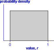
A value can be generated from a rectangular distribution by successively generating random digits (e.g. by rolling a 10-sided die).
The diagram below illustrates generation of a rectangularly distributed value.
Generating a categorical value
Generation of a random value from a categorical distribution can be based on a rectangularly distributed random value, r . If the categorical distribution has two possible values, success and failure, and the probability of success is denoted by the symbol π, then a success will be generated if r is less than π.
If there are more than two possible categories in the distribution, the method can be easily extended. Each possible value corresponds to a range of values of r whose width equals the required probability. (Note that all probabilities for a categorical distribution must sum to 1.0.)
The diagram below illustrates generation of a random result from a tennis match in which player Blue has probability 0.6 of beating player White.
Click Generate value to find a rectangularly distributed value. If this value is less than 0.6, a categorical value Blue wins is generated; otherwise White wins is generated.
Repeat several times and observe that approximately 60% of the values generated are Blue wins.
The next diagram shows how a random value can be generated from a categorical distribution with more than two possible categories.
Click Next Value to generate a random eye colour. Select Hair colour from the pop-up menu to generate random hair colours.
Generating a continuous numerical value
We have already shown how to generate a random rectangularly distributed value, but how can a numerical value be generated from another continuous distribution? There are several algorithms to generate random values from continuous numerical distributions and many are more efficient than the one that we describe below. However the following method is relatively easy to describe and understand.
Consider the diagram below which encloses the distribution's probability density function with a rectangle.
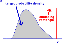
A random value from the distribution can be generated by repeatedly generating a random point within the rectangle, until the point lies within the shaded area of probability density function. The x-coordinate of this point will be a random value from the required distribution.
The diagram below illustrates for a distribution of values between 0 and 1 (actually a normal distribution) to avoid the complication of scaling the x-values.
Click Generate value to generate a random horizontal and vertical position within the bounding rectangle (0 to 1 horizontally and vertically).
If this point lies under the probability density function, the horizontal position is accepted as a value from the distribution. Otherwise, the value is rejected and another random point must be generated.
Click Generate value several times until 30 or more values have been generated. The distribution of the generated values (the horizontal positions of the crosses under the probability density function) should conform reasonably with the target distribution!
Sampling mechanism
The mechanism of sampling from a population explains randomness in data.
However, in practice, there is only a single sample and we must use it to give information about the population. The population is the focus of our attention — we are rarely interested in the specific individuals in our sample and the underlying population is a generalisation of this type of 'individual'.
Parameters and statistics
Instead of trying to fully estimate the population distribution, we usually focus attention on a small number of numerical characteristics — often only one. Such population characteristics are called parameters. The corresponding values from a sample are called sample statistics and provide estimates of the unknown parameters.
The population mean is often of particular interest and the sample mean provides an estimate of it.
Variability of sample statistics
The variability in random samples also implies sample-to-sample variability in sample statistics.
In order to assess how well a sample statistic estimates an unknown population parameter, it is important to understand its sample-to-sample variability.
The remainder of this section investigates the variability in sample means.
Tread depth of taxi tyres
A taxi company is interested in the tyre tread depth (mm) in the 60 taxis that it owns. These 60 values are the population of interest and their mean and standard deviation are population parameters. The top half of the diagram below shows this population.
To save the cost of measuring the tread depths of all 60 cars, the company decides to randomly select 12 of them (without replacement). Click the button Take sample to select a random sample. The sample mean could provide an estimate of the mean tread depth in the whole fleet of taxis (if the population was unknown as it would be in practice).
Observe that the sample mean and standard deviation are similar to those of the population but they are not identical. Select a few more samples and note the variability in the sample statistics.
Any single sample mean provides a reasonable estimate of the population mean but the sample-to-sample variability affects its accuracy.
Distribution of the sample mean
All summaries of sample data, graphical and numerical, vary from sample to sample. The most widely used summary statistic is a sample's mean, so this section describes the variability of sample means.
A single value that is sampled from a population has a distribution that is described by the population distribution. When a random sample of n values is sampled, the sample mean is also random, but has a distribution that is less variable than the population distribution. (Sample means 'average out' the extremes in a sample, so sample means tend to be closer to the centre of the population distribution.)
Simulation
The following diagram selects random samples of values from a normal population with mean 12 and standard deviation 4. This population distribution would be an appropriate model for various types of data:
The normal population is shown at the top with a random sample of 16 values underneath.
Click Take sample a few times to display different random samples and their means. Observe that the sample means vary from sample to sample — they have a distribution.
Now click the checkbox Accumulate and take 20 or 30 further samples. The bottom display shows the means from all samples in a stacked dot plot.
The second of these points is particularly important.
You may click on the crosses representing the means in the lower jittered dot plot; the sample that generated that mean is displayed above. Look at the samples that gave rise to the highest and lowest means.
Centre and spread of the sample mean's distribution
The sample mean has a distribution with the following properties.
It is possible to quantify these bullet-points more precisely. The distribution
of a sample mean, ![]() ,
is centred on the population mean — its mean is µ.
,
is centred on the population mean — its mean is µ.
![]()
The standard deviation of the distribution of the sample mean is
![]()
where the sample size is n.
Simulation
The following diagram is similar to that on the previous page. Random samples are again taken from a normal population with mean 12 and standard deviation 2.
Set the checkbox Accumulate then click Take sample a few times to see the variability of the means of samples of size 16.
Use the pop-up menu to change the sample size, then repeat the sampling to investigate the effect of sample size on the distribution of the sample mean. Verify that:
Shape of the mean's distribution
Whatever the population distribution, the sample mean has a distribution whose mean and standard deviation are closely related to those of the population.
![]()
![]()
Although we can easily find the centre and spread of the sample mean's distribution using these formulae, the exact shape of its distribution depends on the shape of the population distribution. For example, skewness in the population distribution leads to some skewness in the distribution of the mean.
Samples from normal populations
This simplifies greatly if the samples come from a normal population.
When the population distribution is normal, the sample mean also has a normal distribution.
This can be expressed as:
![]()
Distribution of sample mean from normal population
The diagram below illustrates the theory. The top half of the diagram shows a normal population with mean 12 and standard deviation 2, and the bottom half shows the distribution of a sample mean.
Use the slider to display the distribution of the sample mean for different sample sizes. Observe that:
Means from non-normal populations
When the population is not a normal distribution, the sample mean does not have a normal distribution (though the earlier equations above still provide its mean and standard deviation).
![]()
![]()
However an important theorem in statistics called the Central Limit Theorem states that...
For most non-normal population distributions, the distribution of the sample mean becomes close to normal when the sample size increases.
Simulation
The diagram below shows a population distribution with mean 4.0 and standard deviation 4.0 but is highly skew. A distribution of this form is sometimes appropriate for lifetimes of objects such as electric toasters or car windscreens. (It is less appropriate for lifetimes of biological organisms.)
A random sample of n = 2 values from the distribution is also shown.
Click Accumulate and take 50 or more samples. Observe that the sample means also have a skew distribution and that it is centred on the population mean, 4.0.
Use the pop-up menu to increase the sample size to 8 and take a further 50 samples. Observe that:
Theory
Advanced statistical theory can find the distribution of sample means for this type of distribution. The underlying theory is unimportant, but we use it in the diagram below to show the distributions of the sample means.
Use the slider to see how increasing sample size affects the distribution of the mean:
Even with a sample size of 20, the shape of the distribution is very close to normal.
Need for multiple values to assess variability
In most situations, we need to make two or more measurements of a variable to get any information about its variability. For example, a sample of size two or more is needed to calculate the sample standard deviation, s.
A single value contains no information about the quantity's variability.
Achieving the impossible?
It would appear necessary to record several sample means (from different random samples) before we could obtain an estimate of the standard deviation of the sample mean.
In practice, we rarely have the luxury of repeated samples, so how can we assess the variability of a sample mean on the basis of a single sample?
Fortunately, we do not need multiple samples to do this. We can estimate the distribution of the sample mean from a single sample, based on the equations
![]()
![]()
We use the sample mean and standard deviation, ![]() and s
in these equations as estimates of µ
and σ.
and s
in these equations as estimates of µ
and σ.
Examples
In the examples below, the data are used to find an estimate of the underlying population distribution — our best guess is a distribution with the same mean and standard deviation as the data.
(We have drawn this estimated population distribution as a normal distribution, but it could have a different shape (e.g. skew) with the same mean and standard deviation.)
The sample mean will be approximately normal and its standard deviation can be found from the estimated population standard deviation.
Note that the last two data sets are probably not from normal populations — they seem a bit skew. However the sample means will still be approximately normal.
Standard deviation of a sample mean
Earlier in this section, we presented a formula for the standard deviation of a sample mean,
![]()
This formula, with σ replaced by s, can estimate the standard deviation of the mean from a single random sample.
Independent random samples
This formula is only accurate if the sample is collected in such a way that each successive value is unaffected by other values that have already been collected. For example, if values are sampled at random with replacement from a population, any population value has the same chance of being selected whatever values were previously selected. This is called an independent random sample.
When statisticians use the term random sample, independence is implied unless dependence is otherwise mentioned.
Dependent random samples
When the sample values depend on each other, they are said to be dependent.
The worst type of dependency arises through bad sample design. For convenience or to save money, values are often sampled from 'adjacent' individuals. Since these values tend to be similar, there is less variability in the sample than in the underlying population — the sample standard deviation, s, underestimates σ.
To make matters worse, the mean of such a dependent sample is more variable than the mean of an independent sample of the same size. For both reasons,
The formula
![]()
can badly underestimate the variability (and hence accuracy) of the sample mean of dependent random samples.
Always check that a random sample is independently selected from the whole population before using the formula for the standard deviation of the sample mean.
Independent random sample of incomes
In the following diagram, ten male householders are sampled from a town in order to estimate the town's average income.
Click Take sample once to see the incomes from an independent random sample of ten males from the town. The cross on the right shows the sample mean income. A normal distribution is also shown whose standard deviation was obtained from the formula above .
Click Take sample about 20 more times and observe that the sample means have a distribution whose spread conforms (roughly) to the standard deviations that are obtained from the individual samples.
Sampling from one street in the town
Now click Reset, drag the slider to give a correlation of 0.9, and take a single sample. This shows what might be obtained if a single street was selected from the town and the ten sampled males were all from this street. (Data collection would be cheaper.) Note that the sampled incomes are similar since the individuals come from the same area of the town. The formula therefore predicts a lower standard deviation for the sample mean than before.
Take about 20 more samples and observe that the sample means are actually more variable than for an independent random sample. For both reasons, the standard deviation from the formula badly overestimates the accuracy of a sample mean.
With all 20 samples visible, drag the slider to observe both effects better.
The more dependent the sample, ...
Sampling with replacement from finite populations
When selecting a random sample with replacement from a finite population, each successive value does not depend on earlier values, so the sample is an independent random sample. The formula that we gave earlier for the standard deviation of sample means is therefore still appropriate
![]() where
where ![]()
Note that the formula for the population standard deviation, σ, uses divisor N, the number of values in the population, rather than (N - 1). The distinction between these two divisors was mentioned when the standard deviation was initially defined.
Sampling without replacement from finite populations
The above formula does not hold when the sample values are dependent on each other in any way. We saw that when the sample values are positively correlated (i.e. they tend to be similar), the formula overstates the accuracy of the sample mean.
The opposite happens when a random sample is selected without replacement from a finite population. The successive values are again dependent — after a large value is selected, it cannot be selected again, so the next value will tend to be lower. The sample values are therefore negatively correlated.
Provided only a small fraction of the population is sampled (say under 5%), the dependence is slight and can usually be ignored. However if the sampling fraction is higher, the earlier formula should be corrected since it understates the accuracy of the sample mean. The correct formula is
![]()
The quantity (N - n) / (N - 1) is called the finite population correction factor.
The diagram below shows a population of 16 values.
Click Take sample to select a random sample of 2 of these values (without replacement). The sample mean is shown in the lower half of the diagram with a normal distribution whose standard deviation is calculated without the finite population correction factor.
Click Finite population correction to show the effect of the correction factor. Since only a small fraction of the population is sampled, there is little difference.
Turn off the correction factor, increase the sample size to 14, then take several samples. The jittered dot plot of the sample means shows a distribution with much lower spread than the normal distribution. After turning on the correction factor, the normal distribution matches the actual spread of the distribution of sample means.
Increase the population size to 48 and again observe that the correction factor has little effect when a small fraction of the population is sampled, but is important when the sampling fraction is high.
Normal distribution parameters
The family of normal distributions consists of symmetric bell-shaped distributions that are defined by two parameters, µ and σ. The mean and standard deviation of a normal distribution are equal to µ and σ, respectively.
Normal distributions as models for data
A normal distribution is sometimes used as a population to model the variability in a data set. (The data are assumed to be a random sample from this population.) On the basis of a single set of data, there is rarely enough information about the shape of the underlying distribution to be sure that a normal distribution is the 'correct' population, but it is often a close enough approximation.
Grass intake by cows
In an experiment that investigated the grazing behaviour of dairy cows, four cows were studied while they grazed on 48 different plots of grass. The grass intake was estimated in each plot by sampling before and after the experiment, and the number of bites made by each cow was recorded. The diagram below shows the grass intake per bite in each of the plots.
There are only 48 observations, so it is impossible to be sure of the shape of the underlying population distribution. However the histogram does seem reasonably symmetrical, so a normal distribution is a reasonable model.
Adjust the normal parameters with the sliders to match the shapes of the histogram and normal curve as closely as possible.
Many data sets cannot be modelled by a normal distribution. A normal distribution would not be an appropriate model for ...
Data with skew distributions can often be transformed into a fairly symmetrical form. A normal distribution may be a reasonable model for the transformed data.
Do not assume that all data sets that you meet can be modelled adequately by normal distributions.
Normal distributions describe many summary statistics
A more important reason for the importance of the normal distribution in statistics is that...
Many summary statistics have normal distributions (at least approximately).
We demonstrated earlier that the mean of a random sample has a distribution that is close to normal when the sample size is moderate or large, irrespective of the shape of the distribution of the individual values.
In a similar way, the distributions of the following summary statistics are approximately normal when sample size is moderate or large...
Since most statistical methods require an understanding of the variability of such summary statistics, it is important that you become familiar with the properties of normal distributions.
Effect of normal parameters on distribution
Distributions from the normal family have different locations and spreads, but other aspects of their shape are the same. Indeed, if the scales on the horizontal and vertical axes are suitably chosen,...
All normal distributions have the same shape
The diagram below repeats an earlier diagram which showed the range of possible shapes for normal distributions.
The next diagram is similar, but the axes are rescaled when the parameters are adjusted.
Note that the basic 'shape' of the curve is the same for all parameter values.
A common diagram for all normal distributions
The two normal parameters, µ and σ, describe the normal distribution's centre (mean) and spread (standard deviation). As shown on the previous page, all normal distributions have the same shape, other than their centre and spread.
The diagram below describes all normal distributions.
Observe how the tails of the distribution fade away.
Examples
In the following examples, the values of the parameters µ and σ are used to add a numerical scale to the diagram.
Some probabilities for normal distributions
We now give a few probabilities that hold for all normal distributions.
A more precise version of the second probability is
You often meet the value "1.96" in statistics!
Use the pop-up menu to display the probabilities of values (highlighted areas) within 1, 2 and 3σ of µ
70-95-100 rule of thumb and the normal distribution
These probabilities conform closely to the 70-95-100 rule that we presented as a rule-of-thumb for numerical data sets with reasonably symmetric 'bell-shaped' distributions.
Indeed, the normal probabilities are the basis of the earlier rule-of-thumb!
Standard deviations from the mean
All normal distributions have the same shape on a scale of 'standard deviations from the mean'.
Expressing an x-value in terms of standard deviations from the mean gives a z-score for the value. The z-score describes where the value lies in the above diagram.
![]()
This equation can also be written in the form
![]()
Probabilities and z-scores
The properties of normal distributions on the previous page give the probabilites that a z-score will be within ±1, ±2 and ±3:
Any other probability (area) relating to a normally distributed random variable, X, can be found in terms of z-scores:
(We will explain how to accurately obtain probabilities from z-scores in the following page.)
Weights of apples
A factory packing apples has observed that Fuji apples from its supplying farms have approximately a normal distribution with mean of 180 grams and standard deviation 10 grams.
The diagram above translates the chosen apple weight, x, into a z-score that describes how many standard deviations (in units of 10g) it is above the mean (180g).
The z-score defines the position of the apple weight on the lower of the two axes. The highlighted area is the probability of a lower value.
Distribution of z-scores
The process of subtracting the mean from a value, x, then dividing by its standard deviation is a common one in statistics and is called standardising x.
![]()
If X has a normal distribution, then Z has a standard normal distribution with mean µ = 0 and standard deviation σ = 1.
Probabilities for the standard normal distribution
Although there is no explicit formula that you can use to find probabilities (areas) for the standard normal distribution, Excel and most statistical programs can find such probabilities for you. Statistical tables can also be used to look them up (as will be explained later).
Weights of apples
The diagram below shows the distribution of weights of Fuji apples arriving at a packhouse. The distribution is normal (µ = 180g, σ = 10g).
Use the slider to translate apple weights, x, into z-scores.
The probability of a lower apple weight is translated into a probability about the z-score. The probability (area) is highlighted on the standard normal distribution of the z-score at the bottom of the diagram.
(We rely on the computer to evaluate the area under the standard normal distribution accurately!)
Examples
The diagrams below are templates that further illustrate the process of finding normal probabilities through z-scores.
Probability of lower value
The diagram translates the x-value into a z-value. The area to the left of this z-value on the standard normal probability density is the required probability.
Different values can be typed into the three text-edit boxes, so the template will find probabilities for other normal distributions.
Confirm that ...
Other normal probabilities
In the previous page, we showed how z-scores could be used to find the probability of getting a value less than x in a normal distribution. Other probabilities can be similarly translated into ones involving z-scores.
Probability of higher value
The following diagram is similar to that on the previous page, but finds the probability of getting a value above the x-value rather than below it.
Confirm that ...
Probability of being between two values
The final diagram asks for the probability of getting a value between two x-values. This is the area under the standard normal probability density between the two corresponding z-scores.
Confirm that ...
Evaluating other probabilities
Statistical software and tables can easily evaluate the probability of getting a z-score less than any specified value. It takes a little more thought and work to find other probabilities.
Translating probabilities into ones about the probability of lower z-scores is relatively easy if you keep in mind the following two facts.
Probability of higher value
The probability of getting a value greater than x can be evaluated as one minus the probability of a value less than x.
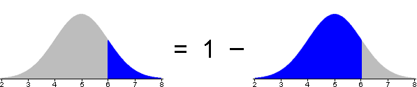
This conversion can be done either before or after translating the required probability from x-values to z-scores.
Probability of value between two others
The probability of getting a value between x1 and x2 can be evaluated as the difference between the probabilities of values less than x1 and x2.
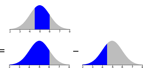
Again, the conversion can be done either before or after translating the required probability from x-values to z-scores.
Standard normal probabilities without a computer
Questions about normal distributions can be answered in terms of areas under a standard normal probability density. These areas might be obtained very roughly by eye from a graph, but a computer should be used to evaluate the area more accurately. For example, most spreadsheets contain functions to evaluate standard normal probabilities.
Similar calculations can be done without a computer. Most introductory statistics textbooks contain printed tables with left-tail probabilities for the standard normal distribution.
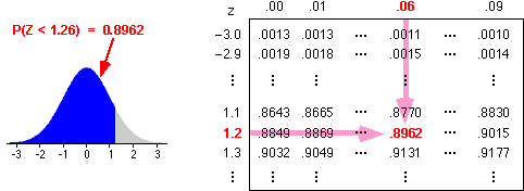
These tables can be used after the required probability has been translated into a problem relating to the standard normal distribution.
Note that...
Finding an x-value from a probability
The previous pages explained how to find the probability that a value from a normal distribution will be less than some value, x.
In some circumstances, we must solve the inverse problem — we are given a probability and must find the value x such that there is this probability of being less.
Terminology
Weights of apples
The diagram below shows the distribution of weights of Fuji apples arriving at a packhouse. The distribution is normal (µ = 180g, σ = 10g).
The slider translates apple weights, x, into z-scores and uses the z-scores to find the probability of getting an apple with weight less than x.
This question wants the weight, x, such that
P ( Apple weight < x ) = 0.9
Adjust the slider to make the probability 0.9.
Finding quantiles
The above 'trial-and-error' method of finding a quantile involves trying different x-values until the target probability is attained.
x ![]() z-score
z-score ![]() probability
probability
A better method performs the inverse operations directly,
probability ![]() z-score
z-score ![]() x
x
The first step of this process involves finding the z-score for which there is the required probability of being less. Statistical software or Excel can evaluate this z-value, or statistical tables can be used. For example, the diagram below shows how to find the z-score such that there is probability 0.9 of being less.

Translating from a z-score to the corresponding x-value is done with the formula,
![]()
(Remember that the z-score tells you how many standard deviations you are from the mean.)
Weights of apples
The diagram below shows the distribution of weights of Fuji apples arriving at a packhouse. The distribution is normal (µ = 180g, σ = 10g).
Use the slider to find the z-score corresponding to any probability. (The computer does the calculation, but normal tables could alternatively be used as described above.)
The z-score is then translated into an apple weight.
Do the data come from a normal distribution?
A histogram of the data can be examined and may indicate that there is skewness or that the distribution separates into clusters. However if the data set is large, a normal probability plot can indicate more subtle departures from a normal distribution.
Normal probability plot
A normal probability plot is produced in the following way:
If the data set is from a normal distribution, the data should be spaced out in a similar way to the normal quantiles, so the crosses in the normal probability plot should lie close to a straight line.
Examples
Interpreting the shape of a normal probability plot is most easily explained with some examples.
The values on the horizontal axis are q1 < q2 < ... < qn which are spaced out as you would expect from a normal distribution. Those on the vertical axis are the actual data values. Data sets with different features can be chosen from the pop-up menu.
Observe how the distribution of the data set affects the shape of the probability plot.
How much curvature is needed to suggest non-normality?
In the examples above, linearity or nonlinearity in the probability plot was clear. In practice however, the randomness of real data means that the probability plot will not be exactly straight even when the data are sampled from a normal population.
How much curvature is needed to conclude that the underlying distribution is not normal?
This is a difficult question to answer and we will not address it here.
A sample proportion has a distribution
If a categorical data set is modelled as a random sample from a categorical population, the sample proportions in the various categories must be treated as random quantities — they vary from sample to sample.
The population proportion in any category of a categorical population is called the category's probability, and the Greek letter π is often used to denote the probability of a particular category of interest. The corresponding sample proportion is usually denoted by p.
| Sample Statistic | Population Parameter | |
|---|---|---|
| Mean | µ | |
| Standard deviation | s | σ |
| Proportion/probability | p | π |
Note carefully that...
| In statistics, the symbol π is used to represent a probability that may take any value between 0 and 1, depending on context. Do not confuse it with the mathematical constant π. |
It is important that you understand the distinction between a sample proportion and the underlying population probability.
Sex of babies
Consider the sex of a newborn baby at a maternity unit. We can model the baby's sex as a categorical value (male or female) from a hypothetical infinite population of 51.2% male and 48.8% female values. (These population proportions are obtained from historical records of births.)
The sexes of 10 babies born in one day at the maternity unit would be modelled as a random sample of n = 10 values from this population.
Click Take sample a few times to observe the variability in samples from this model. In particular, observe that the sample proportion of male babies varies from sample to sample.
Unknown probabilities
In some applications, we know the population probabilities for the categories of interest, but usually these values are unknown. (In practice, population parameters are usually unknown constants.) The corresponding sample proportions are approximations to these probabilities, but it is important to recognise that the underlying probabilities are unknown.
Effect of insecticide on beetles
Fifty beetles were sprayed with a weak concentration of insecticide. The symbol π denotes the probability of a beetle dying. The diagram below shows the result of the experiment.
The unknown parameter π is of greatest interest, but we only know the sample proportion dying, p = 0.72, which throws some light on the likely value of π.
Understanding the sample-to-sample variability of a proportion allow us to assess the proportion that is observed in a single observed data set.
Properties of a sample proportion
Sample proportions vary from sample to sample. Our model (of sampling from an underlying population) therefore means that they have probability distributions.
The sample proportion in a particular category from a random sample of size n has a distribution that ...
Count and proportion of successes
Although the sample proportion in a category, p , is a good summary statistic, the raw count of sample values in the category, x = np, contains equivalent information and is often easier to use.
p and x = np have distributions with the same shape (other than the scaling constant n).
Telepathy experiment
Consider an experiment which investigates whether one subject can telepathically pass shape information to another subject. A deck of cards containing equal numbers of cards with circles, squares and crosses is shuffled. One subject selects cards at random and attempts to 'send' the shape on the card to the other subject who is seated behind a screen; this second subject writes the shape imagined for the card.
If the second subject is just guessing, then the probability of giving a correct answer for each card is a third. The diagram below simulates such an experiment where the second subject guesses each card. Values are therefore sampled from an infinite categorical population of one third 'correct' and two thirds 'wrong' values.
Click the checkbox Accumulate then take a few samples to build up the distribution of the proportion of 'correct' guesses in samples of size n = 20. The distribution is discrete since only a few distinct values are possible. The distribution of the sample proportion should be centred on π = 0.333.
Use the pop-up menu to change the sample size and repeat sampling to verify that the sample proportion has lower spread when the sample size is higher.
Finally, use the pop-up menu to change the scale on the sampling distribution of the proportions to show the the distribution of the sample number of correct guesses. Observe that the shape of the distribution is unchanged.
Notation
We now generalise the telepathy example on the previous page. Consider an infinite categorical population that contains a proportion π of some category that we will call 'success'. We call the other values in the population 'failures'.
In the telepathy example, a correct guess might be called a 'success' and a wrong guess would be a 'failure'. The probability of success is π = 0.333.
The labels 'success' and 'failure' provide terminology that can describe a wide range of data sets. For example,
| Data set | 'Success' | 'Failure' |
|---|---|---|
| Sex of a sample of fish | female | male |
| Quality of items from production line | acceptable | defective |
| Bank balances | in credit | overdrawn |
When a random sample of n values is selected from such a population, we denote the number of successes by x and the proportion of successes by p = x/n.
Distribution of a proportion from a simple random sample
The number of successes, x , has a 'standard' discrete distribution called a binomial distribution which has two parameters, n and π. In practical applications, n is a known constant, but π may be unknown. The sample proportion, p , has a distribution with the same shape, but is scaled by n .
With appropriate choice of the parameters n and π, the binomial distribution can describe the distribution of any proportion from a random sample.
Shape of the binomial distribution
The diagram below shows some possible shapes of the binomial distribution. The barchart has dual axes and therefore shows the distributions of both x and p.
Drag the sliders to adjust the two parameters of the binomial distribution. Observe that
The diagram can be used to obtain binomial probabilities by setting π and n to the appropriate values, then clicking on one of the bars in the barchart.
Telepathy experiment
For example, to find the probability of a subject guessing correctly 4 out of 5 cards in the telepathy example, set π = 0.33 and n = 5, then click on the bar for x = 4. The probability is shown under the barchart.
The diagram below demonstrates that a binomial distribution does indeed describe sample-to-sample variability. The pink barchart at the bottom of the diagram shows the binomial distribution with parameters n = 20 and π = 0.333 that describes the distribution of the sample proportion of correct guesses from n = 20 guesses.
Click Accumulate and take several samples. Observe that the distribution of x matches the theoretical binomial distribution. Repeat the exercise with different sample sizes.
Assumptions underlying the binomial distribution
The binomial distribution is applicable to a wide range of applications where a random sample of categorical measurements is obtained. The number of successes has a binomial distribution provided...
Evaluating binomial probabilities
If we are satisfied that a binomial distribution is appropriate, it can be used to obtain the probability of any number of successes. Binomial probabilities may be obtained using ...
A range of counts
To find the probability that the number of successes is within any interval, the probabilities of each of the integer counts within the interval are added.
When doing this, care must be taken with the wording of the question — think carefully about whether the 'extreme' value that is mentioned in the wording of the interval should be included.
| In words... | In terms of X | Using 1/2 |
|---|---|---|
| More than 5 | X > 5 | X > 5.5 |
| Greater than or equal to 5 | X ≥ 5 | X > 4.5 |
| No more than 5 | X ≤ 5 | X < 5.5 |
| At least 5 | X ≥ 5 | X > 4.5 |
| Fewer than 5 | X < 5 | X < 4.5 |
| 5 or fewer | X ≤ 5 | X < 5.5 |
The above table translates a few possible wordings for an interval into a range of counts. The final column provides an interpretation of each interval that most clearly expresses which counts are included.
We recommend translating any interval into its form using 1/2 before finding its probability.
(This translation of intervals is particularly useful when using the normal approximations that are described in the following pages.)
Examples
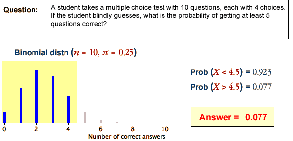
Each question involves a binomial distribution whose bar chart is displayed on the left and the integer counts specified in the question are shown in a different colour. The sum of these probabilities (bar heights) is evaluated by the computer and displayed on the right to give the answer.
Problems with using a binomial distribution when n is large
Although the number of 'successes' in a random sample always has a binomial distribution, it is computationally difficult to obtain probabilities from a binomial distribution when n is large. In a large random sample of say n = 10,000 categorical values, probabilities of interest usually involve summing the probabilites for a large number of individual values for the number of successes.
P(X < 5,600) = P(X = 0) + P(X = 1) + ... + P(X = 5,599)
We next describe a way to approximate such probabilities without summing so many values.
Proportions and means
If we assign a code of '1' to the successes and '0' to the failures in the random sample, then the resulting values are called an indicator variable.
| Individual | Categorical variable | Indicator variable |
|---|---|---|
| 1 2 3 4 5 6 7 ... |
success success failure success failure failure success ... |
1 1 0 1 0 0 1 ... |
The mean of the indicator variable is identical to the proportion of successes.
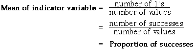
| A sample proportion is really a kind of mean. |
Therefore the results that we met earlier about the distribution of sample means can also be applied to sample proportions. In particular, when the sample size is large, the distribution of a sample proportion becomes close to a normal distribution.
In the diagram below, use the sliders to observe that for any fixed π, the shape of the binomial distribution becomes closer to normal as n increases.
Formulae for the binomial mean and standard deviation
Not only does the proportion of successes, p , have a distribution that is close to normal when n increases, but it is also possible to obtain formulae for the mean and standard deviation for this approximating distribution. Since the number of successes, x = np, is a constant times p , there are similar formulae for the mean and standard deviation of x .
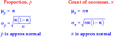
The diagram below shows a binomial distribution and its normal approximation.
Use the sliders to verify that the binomial distribution has a very similar shape to its normal approximation when n is large.
With n fairly large and π moderate, drag over the bars of the binomial barchart. The binomial probability of getting a count less than x is shown beneath the barchart. The corresponding probability from the normal approximation is shown on the right.
Observe that probabilities obtained from the normal approximation are close to the true binomial probabilities when n is fairly large.
Finally, note how we use values of x that end in '.5' for the normal approximation. This is sometimes called a continuity correction.
Use of the normal approximation to the binomial distribution
When the sample size, n , is large, the probability of the number of successes, X, being within an interval may involve addition of many individual small binomial probabilities.
![]()
This sum can be difficult to evaluate by hand and rounding errors can lead to inaccuracies. Even on a computer, such summations are unnecessarily difficult.
An alternative is to use a normal approximation. Its accuracy depends on the value of n being large enough. A common rule-of-thumb for using a normal approximation is when
nπ > 5 and n(1-π) > 5
The examples below use a normal approximation to evaluate binomial probabilities.
Examples
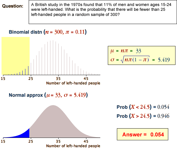
The binomial distribution underlying each question is approximated by a normal distribution with the same mean and standard deviation. The probability in the question is evaluated from the area under the normal distribution (using the methods described earlier for the normal distribution).
Note the translation of the range of values into one involving 1/2. It is called a continuity correction in this context.
Grouping of individuals
A simple random sample of individuals from some population is conceptually the easiest sampling scheme. However more accurate estimates of population characteristics can often be obtained with different sampling schemes.
If the individuals in the population can be split into different groups (called strata in sampling terminology), it is often better to take a simple random sample within each separate group than to sample randomly from the whole population. This is called a stratified random sample.
For example, a simple random sample of 40 students from a class of 200 males and 200 females might (by chance) include 25 males and 15 females. A stratified random sample would randomly select 20 males and 20 females, ensuring that the sex-ratio in the sample matched that in the population.
The benefits from stratified random sampling are greatest if the measurement being sampled is different in the different strata. For example, we might want to estimate the mean summer income of the students. If male students tend to have higher incomes than female students, a stratified random sample based on gender will be more accurate than a simple random sample.
Weekly turnover by grocery stores
The diagram below shows the weekly turnover of 100 grocery stores in a city. Of these stores, 50 belong to large grocery chains and the other 50 are smaller independent stores. The 50 stores belonging to chains tend to have higher turnovers. (This is not real data — the difference between the two types of store is more extreme than would usually be observed, but does illustrate the potential gains from stratified sampling.)
The left half of the diagram illustrates simple random sampling of 10 from the 100 stores, whereas stratified random sampling of 5 store from each group is illustrated on the right.
Click Take sample a few times to observe the variability of the mean turnover for the two sampling schemes. (A jittered dot plot of the means is shown to the right of each samples. A normal curve shows the distribution of the sample means.)
Observe that stratified random sampling gives sample means with less variability. The mean from a stratified random sample is therefore a more accurate estimate of the population mean.
In practice, the aim is more likely to be estimation of the total grocery turnover in the city, but this is simply 100 times the mean turnover, so stratified sampling gives the same improvement over a simple random sample.
Groups with different variability (advanced)
In stratified random samples, random samples are usually taken from the different strata in proportion to the number of population values in the strata. For example, if a population of 1,000 values is split into three strata of N1 = 500, N2 = 300 and N3 = 200 values and a sample of n = 50 is to be taken, then samples of n1 = 25, n2 = 15 and n3 = 10 would be taken from the three strata — i.e. 1/20 of the population within each stratum.
This proportionality is not however essential, and greater accuracy can be obtained by selecting larger samples from strata with greater variability. However if sample size is not proportional to stratum size, the overall sample mean is no longer appropriate for estimating the overall population mean.
If there are k strata of size N1, N2, ..., Nk,
and samples of size n1, n2, ..., nk
are taken from the strata, giving means ![]() , then the population mean should be estimated by
, then the population mean should be estimated by
Weekly turnover by grocery stores
The following diagram is similar to the one above, but in this example, there are 80 small stores (with relatively low turnover) and 20 chain stores with higher turnover and also a higher spread in their distribution.
The left half of the diagram does stratified random sampling with sample sizes proportional to the stratum sizes (8 local stores and 2 chain stores). On the right, a disproportionately large sample is taken from the chain stores because of their higher variability — 3 local stores and 7 chain stores.
Click Take sample a few times to verify that the estimated mean weekly turnover is more accurate when a larger sample is taken from the chain stores — the variability in the estimate is lower.
An extreme example of disproportionate sample sizes occurs when using sampling to estimate the mean profits of companies. If a list of 'large' companies is available, it is often best to record information from all of the large companies but only sample a small fraction of the smaller companies.
Sampling frame
Both simple random samples and stratified random samples require a complete list of all individuals in the target population. This list might be obtained from an electoral roll or some other publicly available list and is called a sampling frame.
In other situations, a complete list is unavailable, so a different sampling scheme is necessary. For example, a town council might be interested in collecting information from households with teenage children. Without a complete list of such children, how might you sample them?
Cluster sampling
One solution to this problem is to group the target individuals into reasonably small groups, called clusters, for which a complete list is available. Clusters are similar to the strata that are used for stratified sampling, but are usually much smaller. For example, to sample teenage children in a town, the clusters might be defined by the different streets. (Long streets might be split into shorter sections.) It is not necessary to know beforehand how many children live in each street.
For cluster sampling, a simple random sample of clusters is selected, with all individuals in these clusters selected. For example, in any selected street, an interviewer might approach each household in order to identify the households with teenage children and obtain information from them.
The mean of any variable that is calculated from the individuals in a cluster sample can be used to estimate the corresponding characteristic of the underlying population.
Cost advantages
Even when a complete sampling frame is available, cluster sampling might be used to reduce the cost of sampling (or to increase the sample size for the same cost) since it is often cheaper to record information from individuals in the same cluster than from different parts of the sampling frame.
For example, it is cheaper to interview people in every house in several streets than to interview the same number of individuals who are scattered randomly over the town.
The diagram below illustrates cluster sampling. The population of 324 individuals has been split into 36 clusters, each of which contains 9 individuals. (In many practical situations, the cluster sizes would be different.)
Click Take sample to take a cluster sample of 27 individuals — i.e. to take a simple random sample of 3 clusters.
Accuracy of cluster sampling
When individuals in the same cluster tend to be more similar than individuals in different clusters, the estimates that are obtained from cluster sampling are more variable (and hence less accurate) than the corresponding estimates from a simple random sample of the same size.
The ordinary formula for the standard deviation of a sample mean will overestimate its accuracy if the mean is obtained by cluster sampling.
The diagram below illustrates sampling from a population of 25 clusters, each of which contains 4 individuals. (The different vertical bands represent the different clusters in the population.)
Click Take sample several times to build up the distribution of the mean using cluster sampling of 5 clusters. Choose Simple random sample from the pop-up menu then take several more samples. Since all clusters have similar spreads of values, simple random sampling and cluster sampling result in sample means with similar distributions (i.e. similar accuracy).
Move the slider to about half-way to accentuate the differences between the clusters (the four values in each cluster become more similar) and observe that this has little effect on the accuracy of the sample mean when simple random sampling is used. However the sample mean becomes much more variable with cluster sampling.
Cluster sampling is as good as simple random sampling if the clusters are similar to each other, but is worse if the clusters are different.
Sampling from large populations
Two-stage sampling is a sampling scheme that is related to cluster sampling, but is of most use for large populations when the individuals are very widely separated in some sense. For example, many polls are conducted to obtain national information about voting intentions or consumer purchases, and there is a high cost associated with travelling between different regions.
In two-stage sampling, the population is separated into groups of adjacent individuals called primary sampling units. These primary sampling units are typically large — for example a country might be split into 20 or more regions. A small number of these are selected according to some sampling scheme, then individuals are sub-sampled within each selected primary unit.
Costs are reduced by limiting sampling to a small number of primary units. For example, if individuals are only sampled from within say 5 regions, travelling and accommodation costs will be considerably reduced.
The diagram below is a small-scale illustration of two-stage sampling of 16 values from a population of 128 individuals.
Click Take sample to select all 16 primary sampling units and a sample of size 1 from each. This is identical to a stratified random sample.
Change the control Primary units sampled to 2 primary units. Click Take sample to randomly select two of the primary units, with all individuals in each unit being sampled. Since complete primary units are sampled, this extreme is identical to cluster sampling.
Finally, change the control to select either 4 or 8 primary units. Taking a sample now involves a random selection of primary units, followed by a random selection of individuals within each. Typically there are large numbers of individuals and primary units so random sampling is needed for both primary units and individuals within them.
Cost and accuracy (advanced)
In the example above, there was a considerable cost involved with travel between the primary units, so the total cost is reduced when fewer primary units are sampled. Unfortunately, the accuracy of the resulting estimate is usually lower in this situation.
The number of primary units to sample is therefore a trade-off between accuracy and cost. The details are beyond the scope of CAST.
In the diagram below, the vertical bands separate 16 primary units, each of which contains 8 individuals whose values are shown in a jittered dot plot.
Initially, all primary units are similar — their means are nearly the same. Click Take sample several times to observe the sampling distribution of the mean (in the pink band to the right of the population dot plots). When the number of primary units sampled is changed, the distribution of the mean remains the same. The most cost-effective sampling scheme is therefore to sample the smallest number of primary units possible.
Change the slider at the bottom to half-way between Similar and Different. Now some primary units are fairly consistently higher than others. Observe that reducing the number of primary units sampled now has a much greater effect on the standard deviation (and hence accuracy) of the mean.
As with cluster and stratified sampling, formulae for the standard deviation of the resulting estimates are beyond the scope of an introductory course.
Estimation
The aim of sampling is usually to estimate one or more population values (parameters) from a sample. A following chapter deals in depth with this issue of estimation, but we mention here that estimates such as sample means or proportions are random quantities. If we were to repeat the sampling process, the estimate would vary and this sample-to-sample variability can be described by a distribution (e.g. the distribution of the sample mean or sample proportion).
The estimate is not guaranteed to be the same as the value that we are estimating, so we call the difference the error in the estimate. There are different kinds of error.
Sampling error
We have presented four different ways to sample from a population
Each of these involves randomness in the sample-selection process, so the estimated mean or proportion is unlikely to be exactly the same as the underlying population parameter that is being estimated. This kind of error is called sampling error.
When sampling books from a library or sacks of rice from the output of a factory, sampling error is the main or only type of error.
Non-sampling error
When sampling from some types of population — especially human populations — problems often arise when conducting one of the above sampling schemes. For example, some sampled people are likely to refuse to participate in your study.
Such difficulties also result in errors and these are called non-sampling errors. Non-sampling errors can be much higher than sampling errors and are much more serious.
It is therefore important to design a survey to minimise the risk of non-sampling errors. The following pages discuss various types of non-sampling error.
'Missing' responses
The first two types of non-sampling error are caused by failure to obtain information from some members of the target population.
Coverage error
Coverage error occurs when the sample is not selected from the target population, but from only part of the target population. As a result, the estimates that are obtained do not describe the whole target population — only a subgroup of it.
A researcher is interested in irrigation practice amoung wheat growers in a region. There is no database containing names and addresses of all farmers growing wheat, so questionnaires are sent to members of a local wheat-growers association. Depending on the number and characteristics of farmers who grow wheat but are not members of the association, there is potential for considerable coverage error.
A magazine aimed at teenagers conducts a poll by asking readers to mail back a questionnaire in its January issue. The results are published as providing teenage attitudes to certain issues.
This survey only covers teenagers who read the magazine, not all teenagers. There is potential for considerable coverage error if the magazine-readers are not 'typical' of all teenagers.
Non-response error
In many surveys, some selected individuals do not respond. This may be caused by ...
If non-response is related to the questions being asked, estimates from the survey are likely to be biased.
A survey is conducted to assess the number and types of books that are read in a city. Phone numbers are randomly selected from a telephone directory and these numbers are phoned in weekday evenings.
People who are not at home (and therefore do not respond) are likely to read less than those who do respond, so the sample responding will tend to overestimate book readership. Estimates of book readership would therefore be biased.
There are several other flaws in this survey that introduce further non-sampling errors. In particular, there is also coverage error since residents whose numbers are not listed in the telephone directory cannot be sampled.
Real example
In the 1936 American presidential election, there were two candidates, Roosevelt and Landon. The Literary Digest conducted a poll, aiming to predict the result of the election; its procedure was to mail questionnaires to 10 million Americans (using names from telephone books and club membership). From the 2.4 million replies, it made the following prediction:
| Landon | Roosevelt | |
|---|---|---|
| Literary Digest's prediction | 57 | 43 |
| Actual result | 38 | 62 |
Despite the large sample size (and resulting small sampling error), the non-sampling errors were extremely large in the poll.
The group who responded would have different characteristics from the whole population, hence the large difference between the Literary Digest prediction and the actual election result.
Incidentally, another pollster, George Gallup, also conducted a survey before this election. Although he only sampled 50,000 people, he put more effort into making his sample representative. His poll predicted that Roosevelt would win the election with 56 percent of the vote, much closer to the actual result.
'Inaccurate' responses
The next two types of non-sampling error are caused by inaccurate information being obtained from the sampled individuals.
Instrument error
Instrument error usually results from poorly designed questions. Different wording of questions can lead to different answers being given by a respondent. The wording of the question may be such as to elicit some particular response (a leading question) or it may simply be carelessly worded so that it is misinterpreted by some respondents.
| I am interviewing for the Smiths Confectionary Company. Do you prefer Smiths or Jones chocolate? |
| The government intends to improve profitability of manufacturers by removing interest rate controls. Do you agree? |
| How many workers do you employ in your farm? |
The first two questions are leading questions — it is clear which answer the interviewer is hoping for, and we are tempted to oblige! The third question will be clear to many respondents, but others employ seasonal or part-time workers and may answer this question in different ways.
Interviewer error
Interviewer error occurs when some characteristic of the interviewer, such as age or sex, affects the way in which respondents answer questions. For example, questions about racial discrimination might be differently answered depending on the racial group of the interviewer.
The diagram below is a small-scale illustration of a leading question. An interviewer asks 14 women...
I am interviewing for the Smiths Confectionary Company. Do you prefer Smiths or Jones chocolate?
Use the button Take sample a few times. Some respondents who really prefer Jones chocolate have stated that they prefer Smiths. As a result, the sample proportion preferring Smiths chocolate is higher than the proportion in the target population.
Methods of obtaining sample information
Whatever sampling scheme is used, information must be obtained from each individual selected in the sample. When sampling items produced by a factory or trees in a forest, the process of obtaining measurements from each item is usually fairly straightforward.
However there are various options for collecting information from human populations. Each method has its advantages and disadvantages.
Telephone
Telephone surveys are relatively cheap to conduct and, therefore, sample sizes can be greater.
Telephone numbers may be selected at random from a telephone book but this misses unlisted numbers, so random dialing is often used.
Mailed questionnaire
In a postal survey, individuals would be randomly selected from electoral rolls or other population lists. Alternatively, questionnaires might be delivered by hand to the mailboxes of a sample of houses.
Interviewer
Interviewers who approach respondents at home are most likely to get responses for long questionnaires.
Houses are rarely selected at random. Often streets are randomly selected and every 5th or 10th house in the street is approached. This is called a systematic sample.
Street corner
Some surveys are conducted by approaching people in busy shopping centres or similar public places.
To reduce coverage errors, a quota sample is often used. Each interviewer is told to interview fixed numbers of old, young, male, female, etc. respondents. The proportion with each characteristic is chosen to reflect the corresponding proportion in the target population. It is much harder to assess the accuracy of quota samples than the sampling schemes that were described at the start of this section.
Self-selected
Phone-in or mail-in surveys are often conducted by radio stations and magazines. The respondents are usually so unrepresentative that the results are meaningless. These types of survey should be avoided.
Statistics and simple questions
Students are usually taught statistics in the context of well-defined questions. For example,
Students are usually presented with relevant data and asked to draw a conclusion. Although it is important to master the statistical techniques to extract information from pre-collected data,
the use of statistics in the real world is rarely so simple.
Statistics for complex problems
In practice, problems are rarely so well-defined and there may be various different ways to collect data to throw light on them.
Collection and analysis of data to help attack the problem usually suggest further questions for which further data are required. Several cycles of data collection and analysis are usually needed, with considerable input from an expert in the problem area between each cycle of the process.
Continuous quality improvement
One important example of this type of continuing process arises in business and industrial contexts where statistics is an important part of the long-term monitoring of performance. The process may simply monitor existing systems to ensure that they continue to perform at their current levels, or the aim may be to improve aspects of the system. The latter is often called continuous quality improvement or total quality management.
Detecting problems
Problems in a process are usually detected by collecting and analysing data about the performance of the system. Various different types of data can be collected to throw light on the performance of a system. In this section, we describe one particularly useful way to monitor processes.
Control charts are an important tool for detection of problems in a process.
Inherent variability
When a production process is monitored, there is usually variability in the output. A certain level of variability is unavoidable, at least without substantial changes to the process. In the terminology of quality control, we say that this 'acceptable' level of variability is a result of common causes (or random causes). If this is the only source of variability, the process is said to be in control.
Systematic changes
Our aim is to detect changes to the output that are not the result of common causes. Such systematic changes are said to be the result of special causes (or assignable causes) and could result in...
Systematic changes usually indicate problems with the quality of the output.
Run chart
Successive measurements are recorded at regular intervals as part of the process monitoring. These values are used to detect special causes so that the process can be quickly adjusted to maintain quality.
The aim is to detect problems as soon as possible.
In a control chart, values are plotted in time order, giving a type of time-series plot. As each value is plotted, it is compared to earlier points and, depending on the value, it may be taken as a warning that the process is out of control.
The simplest kind of control chart occurs when an individual measurement is made from the process at regular intervals. The plot of these measurements against time is called a run chart. The challenge is to detect systematic changes in the run chart (due to special causes) over the background level of variability (due to common causes).
Milk carton filling
A milk bottling factory fills plastic cartons with a nominal 2 litres of milk. Randomness in the filling process means that the actual volume varies from carton to carton. The manager has determined that it is possible to achieve a mean volume of 2040 ml with almost all cartons holding between 2000 and 2080 ml; variability within this range is considered to be due to common causes.
The diagram above shows the successive milk volumes in cartons that were sampled from the process output during one shift. Drag the slider to display the values in the order that they were recorded. Click on individual crosses to see the milk volume (g) in the individual sampled cartons.
Lines have been drawn on the plot at 2000 and 2080 ml. Values outside these limits are displayed in red — they might be taken to indicate special causes.
The process starts 'in control' with variation that seems to conform to common causes. However between observations 30 and 70 there seems to be an increasing trend in the process. At observation 70, the operators checked the filling machine and found a loose valve which was tightened. The final observations again seem to conform to common causes with the possible exception of observation 76 which was unusually low though no special cause could be found for this outlier.
Use the scroll bar to again look at the observations in the order they arise. How soon would you detect the increasing trend?
Control limits
The simplest rule suggesting a special cause is any value that is outside two control limits. The values 2000 ml and 2080 ml on the run chart in the previous page might be used as control limits. More extreme values in the process suggest that it is out of control — they trigger an examination of the process for a special cause.
Since control limits on a run chart are used to trigger an examination of the production process — possibly a costly exercise — we must set them wide enough that they are rarely exceeded when the process is stable.
Control limits from the 70-95-100 rule
We usually base the control limits on the mean and standard deviation of the process when it is in control. The 70-95-100 rule of thumb states that in many distributions,
The rule is illustrated in the diagram below.
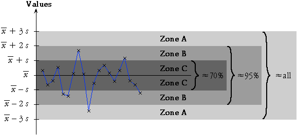
By setting the upper and lower control limits to be 3 standard deviations on either side of the process mean, we avoid many 'false alarms' when the process is in control.
The normal distribution below shows the variability of a process with mean 52 and standard deviation 0.5.
Click anywhere on the distribution to display the proportion of values within this distance of the process mean.
Click the checkbox Show Mean and St Devn to replace the horizontal axis with a scale showing distances from the mean as multiples of the standard deviation. Verify the 70-95-100 rule for this distribution.
The 70-95-100 rule is a less reliable guideline for non-normal distributions. Select the option Skew distribution from the pop-up menu beneath the diagram and repeat the exercise.
Although the actual proportion of values outside the mean ± 3 st devn control limits depends on the shape of the distribution, it is a rare occurrence for all distributions when the process is under control. However:
Control limits at ± 3 standard deviations from the process mean should be avoided for very skew distributions.
If the measurements are very skew, consider transforming the data before producing a run chart.
Additional triggers for an out-of-control process
The most commonly used indication of a process being out-of-control is a value outside the upper and lower control limits (more than three standard deviations away from the centre line). This is sensitive to changes to the process mean or increases in the process variability.
However additional triggers have been proposed that are also sensitive to systematic changes in a process. These are all based on successive values within 1 standard deviation (Zone C), 2 standard deviations (Zone B) or 3 standard deviations (Zone A) from the specified centre.
The five most commonly used indications that a process is out of control are described in the diagram below.
Use the pop-up menu below for a description and example of the five triggers.
The different triggers are illustrated again in the following artificial control chart. The red dots are values that trigger one of the indications that have been described. Try to determine which of the indications have been triggered before clicking on the dot for verification.
Finally choose the option In control data from the pop-up menu to see an example of a typical set of values from a process that is performing according to specifications.
False alarms
Although the individual patterns that we use as triggers occur rarely in a process that is in control, they do occur occasionally. Indeed, the proportion of values from a stable process that triggers each of the criteria is typically about 1 in 200, so if all five criteria are used, a reasonable number of false alarms will occur.
Process in control
The following diagram shows a series of measurements from a stable process (a normal distribution with mean 14.5 and standard deviation 1.0).
As before, red dots will denote values that are exceptional. Clicking on a red dot will show which of the criteria has been triggered. Click the button 1 extra several times to record other values from the process. To speed up the sampling, use the other buttons to generate more values at a time.
Clearly a single exceptional value is not conclusive proof that the process is out of control. However it is appropriate to examine carefully the operation of the process to look for an assignable cause for this value (and adjust the process if such a cause is discovered). And a series of such values does indicate that the process is out of control.
Obtaining control limits
It is important to evaluate control limits from the mean and standard deviation of values from the process when it is in control. The process should be monitored carefully (to avoid special causes) for this training period.
Charge weight of insecticide dispensers
Consider an industrial process manufacturing insecticide dispensers. Among other measurements relating to the quality of the dispensers, it is important to keep the charge weight of the dispensers within fairly tight limits.
Drag the slider to the right to show the successive charge weights of dispensers that were sampled from the process output over a period of two days. We will treat these data as a training set and use the mean (463.66) and standard deviation (16.94) from these initial observations to obtain control limits for further data.
Drag the slider to observe the charge weights of the next 99 dispensers that were recorded in the following two days.
What are your conclusions about the process?
Is the process conforming to the distribution that was observed earlier? In what way has it changed?
Samples instead of individual values
Although control charts for individual values are sometimes used, it is more common to examine samples from a process at regular intervals rather than individual values. There are a few reasons:
Control chart for means
We first consider detection of whether the mean output level of a process is changing, based on a run chart of the means of successive samples. Sample means of n values vary less from sample to sample than individual values, and have standard deviation
![]()
The control limits for a control chart of sample means are therefore...
![]()
where ![]() and s
are estimates of the mean and standard deviation of individual values when the
process is in control. These control limits should be distinguished carefully
from the corresponding control limits for individual values,
and s
are estimates of the mean and standard deviation of individual values when the
process is in control. These control limits should be distinguished carefully
from the corresponding control limits for individual values,
![]()
Since the control limits used in a control chart for means are closer to ![]() than those in a control chart for individual values, the chart is more sensitive
to changes in the process mean over time.
than those in a control chart for individual values, the chart is more sensitive
to changes in the process mean over time.
Training data
In order to obtain control limits, we must know the mean and standard deviation of the measurements when the process is 'in control'. These are usually estimated from a set of 'training samples' in which great care is taken to avoid special causes.
The process mean, ![]() is estimated by the mean value from the training samples. We will initially
use the standard deviation of the training sample as our estimate, s,
but will describe a better estimate at the end of this page.
is estimated by the mean value from the training samples. We will initially
use the standard deviation of the training sample as our estimate, s,
but will describe a better estimate at the end of this page.
Paint primer thickness
The diagram below shows thickness of paint primer in mils (an imperial measurement equal to one thousandth of an inch), measured from a sample of 10 items each morning and afternoon for 5 successive mornings and afternoons. We will regard these data as a training set from which we obtain control limits for later samples of primer thickness.
(In practice, there are usually more training samples, but we use a small real data set for illustration.)
The control limits that are initially shown are those for a run chart of individual values — mean ± 3 standard deviations for the 50 values in the training data.
Use the scroll bar to display the samples that were measured over the next 15 half-days. No values are outside the 3-standard deviations limits, so we would conclude that the process is in control.
Now click the checkbox Show Means. The raw values in the samples are dimmed and the sample means are displayed, joined by blue lines. The sample means are considerably less variable than the raw values, so the control limits are redrawn closer to the centre line.
Based on the means, we again conclude that there is no evidence of a shift in the process mean.
As in control charts for individual values, additional triggers can be used that depend on several successive means. These are defined in the same way as those in control charts for individual values. For example, six successive sample means either increasing or decreasing suggest that there might be a special cause.
Better estimate of s from training samples (advanced)
A different estimate of the process standard deviation, s, is usually preferred to the overall standard deviation of the values in the training samples.
Instead, s is usually estimated from the standard deviations within each of the training samples. We denote the standard deviations of the k training samples, each of size n, by s1, s2, ..., sk. The most commonly used estimate of s is...

where the value c4(n) is a constant that depends on the sample size in each of the k samples, n. Its value may be obtained from tables or using the formulae
The second part of this formula allows the value of c4 for sample size n to be obtained from its value for sample size n - 1, as illustrated below.
(An alternative estimate of s that is occasionally used is
Although this estimate is better when the data have a reasonably symmetric distribution, the earlier estimate is more 'robust' to problems in the training data.)
Detecting changes to process variability
A control chart of sample means is used to detect shifts in the 'centre' of a process. In a similar way, a control chart to assess whether the process variability has changed can be based on the spread of successive samples.
A control chart for changes in process variability can be based on the sample standard deviations of successive samples, but it is more common in practice to use a control chart based on the sample ranges.
Paint primer thickness
The diagram below shows the ranges of successive paint primer samples, along with control limits that were obtained from the initial five training samples. The details of the calculations for the control limits are complex but unimportant..
The actual data values have also been drawn on the chart in grey to help you see the connection between the sample ranges and the raw data. They are not usually included in range charts.
Use the slider to display the ranges of the samples from the following 15 half-days. The ranges are all within the control limits, so there is no indication of a change in the process variability.
By separately targetting the process centre and variability with a control chart for means and a control chart for ranges, we can get better indications of any changes in the performance of the process, and we can therefore intervene more promptly to correct potential drops in quality.
Finding the cause of problems
Control charts (and other collected data) may indicate problems with a system. For example,
However, after detection of a problem, its cause must be identified in order to rectify it. This is usually a non-trivial exercise and the following tools often help.
Brainstorming
Continuous quality improvement is usually performed by a team, and a good way to get ideas is with a brainstorming session. In this, all team members contribute short phrases that are written on either a large sheet of paper or individual scraps of paper (post-it notes are good). The points should be written down without discussion or editing, and all team members should be encouraged to contribute.
Once these ideas have been written down, they must be structured or grouped in some way.
Cause-and-effect diagrams
After possible causes for a problem have been contributed in a brainstorming session, they can be structured in a cause-and-effect diagram. In this,
Because of the shape of this diagram, it is often called a fishbone diagram.
This structuring of possible causes helps to focus attention on the most likely causes and on ones that may be altered in the 'Do' step in the Plan-Do-Check-Act cycle.
Failure rates in a university
University management has observed that failure rates in first-year papers have increased in the past ten years and want to understand the problem before adopting any new policies that may improve student performance.
The cause-and-effect diagram below shows potential causes for the problem that were suggested in a brainstorming session.
Drag the slider to see how the cause-and-effect diagram was constructed.