If you don't want to print now,
Bivariate data: population or sample?
Some bivariate data sets are complete populations — there is no larger underlying population of which the data are representative. The 'individuals' in such data sets commonly have names or other labels that are an inherent part of the data.
More often, we have no interest in the specific individuals from which the data are collected. The individuals are 'representative' of a larger population or process, and our main interest is in this underlying population.
Salaries of human resources managers
The scatterplot below shows the average salaries of human resources managers in each of the mainland states of the USA (except Washington DC) and their population densities.
There is a tendency for states with high population densities to have relatively high salaries. However our main interest is in the names of the states with high or low values. Click on the crosses to identify the states.
Bank branches and minorities
In order to investigate whether banks serve all communities equally, a New Jersey newspaper compiled data from each of New Jersey's 21 counties. The scatterplot below shows the number of people per bank branch in each county and the percentage of minority groups in the county.
Local residents might be interested in the specific counties, but most outsiders would want to generalise from the data to describe the relationship in a way that might describe other similar areas in the Eastern USA. How strong is the evidence that banks tend to have fewer branches in areas with large minority groups?
Response distribution at each X
In experiments, the values of the explanatory variable, X, are controlled by the experimenter. Several response measurements are often made at each distinct value of X. Experimental data are rare in business, but similar data arise when X is discrete — there are several response values corresponding to each distinct x-value.
At any single value of X, the repeated response measurements can be considered as a univariate data set and can be modelled as a random sample from some distribution — commonly a normal distribution. The characteristics of the distribution will often depend on the value of X.
The collection of distributions of Y at different values of X comprise a model for the complete bivariate data set called a regression model.
House prices and bathrooms
The sale prices of all houses sold in an area were collected. How does the sale price relate to the number of bathrooms in the houses?
The diagram below shows the resulting data. The crosses have been jittered a little (randomly moved) to separate them in the scatterplot.
This diagram is 3-dimensional. Position the mouse in the middle of the diagram and drag towards the top left of the screen to rotate the plot (or click the 3D rotation button). The histogram at each x-value describes the distribution of house prices with that number of bathrooms.
Possible model for house prices
The next diagram shows a possible model for the data above— a normal distribution for each number of bathrooms (X).
You may use the mouse (or the buttons at the top right) to rotate the 3-dimensional diagram. Click Take sample to show a random sample of values from each of these normal distributions. Our model claims that the observed data are a data set of this form.
Normal linear model for the response
A regression model for the response in a bivariate data set describes how the response distribution depends on X. The most commonly used regression model is a normal linear model. This model involves:
The last two properties of the normal linear model can be expressed as
![]()
![]()
Note: only the response is modelled
A normal linear model does not try to explain the distribution of x-values.
Example of a normal linear model
A typical normal linear model is shown below.
Drag the slider to see how the distribution of Y depends on the value of X. Observe that...
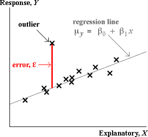
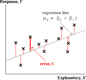
The centre of the response's distribution is the green line on the diagram, called the regression line. In this example, it is described by the equation
![]()
The spread of the response distribution is the same for all X,
![]()
Click Take sample a few times to observe typical data from this model when 5 response measurements are made at each of X = 1, 2, 3 and 4.
The model can also be used in situations where the values of X are not repeated. Select the option Regular X then take a few more samples to see typical data if the values of X are chosen to be 0.6, 0.8, 1.0, ..., 4.4.
Select the option Random X and take a few more samples to see typical data if the values of X are irregularly spaced.
Description of the model in terms of a response distribution
The normal linear model describes the distribution of Y for any value of X. It can be expressed in the form...
![]()
where
![]()
![]()
Description of the model in terms of 'errors'
An equivalent way to write the same model is...
![]()
where ![]() is called the model error and has a distribution
is called the model error and has a distribution
![]()
It is helpful to observe that the error, ε , for a data point is
![]()
which is the vertical distance between the cross on a scatterplot and the regression line.
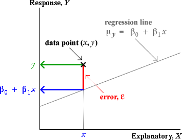
It is worth stressing here that in practical situations,
The slope and intercept of the regression line, β0 and β1, are unknown parameters. The errors, ε, therefore cannot be determined exactly.
In the next section, we will see how these quantities can be estimated.
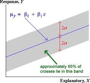
Band containing about 95% of values
The 70-95-100 rule states that approximately 95% of values in any sample are within 2 standard deviations of the mean. In the context of a normal linear model, approximately 95% of the errors will therefore be within 2 standard deviations of zero — i.e. between ±2σ.
Since the errors are the vertical distances of points from the regression line, this means that...
Approximately 95% of the crosses will be within ±2σ of the regression line (vertically).
There is therefore a band 2σ on each side of the regression line that contains approximately 95% of the crosses on a scatterplot of the data.
Example
The diagram below shows a normal linear model with parameters
![]()
![]()
The blue regions in the tails of the normal probability density function are more than 2σ (i.e. 1.6 for this model) on each side of µy. They are approximately 5% of the normal distribution's area, so about 95% of y-values sampled from this distribution will be within the bounds. This is true for each X — drag the slider to verify — so approximately 95% of sampled values will lie in the gray band on the x-y plane.
Click Take sample a few times to verify that approximately 95% of values are within the grey band.
Finally, click the button at the top right of the diagram to look down on the x-y plane. In later pages, we will represent a normal linear model with a 2-dimensional diagram of this form.
Three parameters of the normal linear model
A normal linear model,
![]()
![]()
involves 3 parameters, β0, β1 and σ. These parameters provide considerable flexibility to the model.
Drag the three red arrows to adjust the parameters of the normal linear model.
Click Take sample a few times to verify that approximately 95% of values are within the grey band.
(Note that the values of X are not fixed in this example — they vary from sample to sample. The normal linear model does not attempt to describe variability in X, though a standard univariate distribution such as a normal distribution might fit the distribution of X in this example.)
Interpreting the model's slope and intercept
The most important parameters of a linear model are its slope, β1, and intercept, β0. These can be interpreted in a similar way to the slope and intercept of the least squares lines that were fitted to data in an earlier chapter.
| Context | Interpretation of β1 | Interpretation of β0 |
|---|---|---|
| Y = Sales of music CD ($) X = Money spent on advertising ($) |
Increase in mean sales for each extra dollar spent on advertising | Mean sales if there was no advertising |
| Y = Exam mark X = Hours of study by student before exam |
Increase in expected mark for each additional hour of study | Expected mark if there is no study |
| Y = Hospital stay (days) X = Age of patient |
Average extra days in hospital per extra year of age | Average days in hospital at age 0. Not particularly meaningful here. |
Esimating the parameters by eye
The regression line (i.e. the straight line showing how the mean depends on x) and the band that is 2σ above and below it are a good way to understand the normal linear model. Indeed they can be used as an informal way to estimate the parameters of the model 'by eye'. (We will give better methods in the next section.)
Artificial data
A normal linear model might be used to describe how the response depends on the explanatory variable.
In the next section, we will explain how to objectively estimate the parameters to match a data set. Click Best values to see these 'best' parameter values.
If there are fewer values or if the relationship is weaker, it is harder to position the band by eye.
Auction price for grandfather clocks
The data set below shows the auction prices of 32 grandfather clocks and their ages (years). The data might be used to predict the sale price of another clock from its age.
A normal linear model might be used to describe how auction price depends on age.
In the next section, we will explain how to objectively estimate the parameters to match a data set.
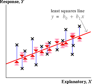
Least squares
In practical situations, the three parameters of the normal linear model, β0, β1 and σ, are unknown values — all that we have available is a single data set that we believe comes from a model of this form. Although we cannot hope to determine the values of these unknown parameters exactly, we can obtain estimates of them from the data.
We previously examined bivariate data of this form and fitted a line by least squares. The slope and intercept of the least squares line are estimates of the slope and intercept of the regression line.
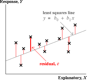
The best estimates of β0 and β1 are the slope and intercept of the least squares line, b0 and b1
Since b0 and b1 are functions of a data set that we assume to be a random sample from the normal linear model, b0 and b1 are themselves random quantities — they would be different if a different data set was collected.
Auction price for grandfather clocks
In practice, only a single data set is available. The scatterplot below shows the auction prices for a sample of grandfather clocks and their ages.
Our 'best guesses' for β0 and β1 are the least squares estimates shown in the blue equation.
Variability of the least squares slope and intercept
The diagram below represents a normal linear model. (The band is 2σy above and below the regression line that shows how µy depends on X.)
Click Take sample a few times to generate different data from the model. Observe the variability of the least squares lines fitted to these data sets.
The two parameter estimates (the values in the blue equation) are usually close to the model values (in the top equation), but they vary from sample to sample.
The sample-to-sample variability of the least squares estimates means that the least squares slope and intercept in the grandfather clock data are unlikely to be exactly equal to the underlying β0 and β1.
Errors and residuals
We observed earlier that the error, ε, for any data point is its vertical distance from the regression line.
In practice, the slope and intercept of the regression line are unknown, so the errors are also unknown values. However just as the least squares line gives estimates of β0 and β1, the least squares residuals provide estimates of the unknown errors.

The residuals are therefore estimates of the unknown errors.
Estimating the error standard deviation
The third unknown parameter of the normal linear model, σ, is the standard deviation of the errors,
![]()
A sensible estimate of σ is therefore the sample standard deviation of the residuals,
![]()
It can be proved mathematically that the least squares residuals always have mean zero, so this formula is equivalent to
![]()
Unfortunately, this estimate tends to be a little too low, and a better estimate is
![]()
Volume of wood from trees
The value of a hardwood tree depends on the volume of timber that can be harvested from it. However the volume of timber cannot be measured easily before a tree is cut down, so forestry managers must estimate it from other measurements that are easier to make. A common measurement is the diameter of the tree at breast height, 4.5 feet above ground level. Data were obtained from 31 black cherry trees that were harvested in the Allegheny National Forest in Pennsylvania. The volume of timber (cubic feet) is plotted against the area at breast height (square inches, determined from the diameter).
The residuals from the grey line on the scatterplot are shown in a jittered dot plot on the right. Drag the line (by moving the red arrows) to make the residuals small.
Click Least squares to show the least squares line (and hence the best estimates of β0 and β1). The best estimate of σ is found from the least squares residuals and is shown on the bottom right.
Distribution of the least squares slope and intercept
The least squares estimates b0 and b1 of the two linear model parameters β0 and β1 vary from sample to sample. Each has a distribution that can be described by a probability density function.
The least squares estimates, b0 and b1, have normal distributions that are centered on β0 and β1 respectively.
Sampling variability of the least squares line
The diagram below shows a normal linear model and a data set that is sampled from this model. The least squares line is shown in blue.
Click Take sample a few times to observe the variability in the least squares lines.
Click the checkbox Accumulate then click Take sample about 10 times. The variability of the least squares lines is shown on the right. (Click on any line to show the sample to which it belongs.)
Sampling distributions of b0 and b1
We have not yet seen ways to describe the variability of complex summaries such as least squares lines. It is much easier to describe the separate distributions of b0 and b1.
Click the checkbox Accumulate then click Take sample several times. The variability in each parameter estimate is shown in a stacked dot plot. (Click on any cross on the right to show the sample to which it belongs.)
Each parameter estimate has a univariate distribution. Click the checkbox above to superimpose its theoretical normal distribution on each stacked dot plot.
How accurate is the least squares estimate of the slope?
In the previous page, we explained that the least squares slope has a normal distribution with mean
![]()
When b1 is used as an estimate of β1, there is therefore an error that has a normal distribution centred on zero,
![]()
The standard deviation of this distribution describes the likely size of the estimation error.
It can be shown mathematically that...
![]()
where sx is the standard deviation of the explanatory variable, X.
This formula is not important enough to warrant remembering, but we will use it later to explain some properties of the estimate.
Since σ is unknown, the above formulae for the standard deviation of b1 cannot be evaluated. However we can approximate it by replacing σ with an estimate from the data,
![]()
Examples
For each data set below, the least squares estimate of the slope is shown. The distribution of the error in this estimate, (b1 - β1) is evaluated on the right.

The normal distribution in the bottom right describes how far the least squares estimate is likely to be from β1.
Confidence interval for the slope
The slope of the least squares line, b1, is a good estimate of the normal linear model's slope, β1, and the error in this estimate has a normal distribution,
![]()
The estimate b1 has probability 0.95 of being within 1.96 standard deviations of β1, suggesting a 95% confidence interval of the form
![]()
Unfortunately the standard error depends on σ and therefore cannot be determined exactly. However we can obtain an approximation

If this approximation is used, the constant 1.96 must be replaced by a larger value, tn-2, which is obtained by looking up t-tables with (n - 2) degrees of freedom.
A 95% confidence interval for the slope is
![]()
Most statistical software will evaluate b1 and its standard error for you when you fit a normal linear model, so it is fairly easy to evaluate the confidence interval in practice — you will not need to use any of the formulae above!
Tourist arrivals in Hawaii
Consider again the tourist arrival data for Hawaii between 1990 and 2002.

Since there are n = 13 data points, we look up t tables with 11 degrees of freedom to get the value 2.201. A 95% confidence interval for the slope is therefore
![]()
In words, we are 95% confident that tourism is increasing at a rate of between 232,000 and 704,000 per year.
Warning: It would be dangerous to extrapolate this trend many years into the future — a linear trend may not continue.
Properties of 95% confidence interval
Confidence intervals for a linear model's slope have the same properties as the confidence intervals that we examined earlier for population means and proportions.
Since the interval is evaluated from random sample data, it will vary from sample to sample. In 95% of such samples, the 95% confidence interval will include the true population slope, but in 5% of samples it will not.
We cannot tell whether or not our single data set is one of the 'lucky' ones.
Simulation
The diagram below shows a sample from a normal linear model in which the true value of β1 is 0.75. (In real data sets, β1 is an unknown value but, by simulating data from a situation where it is known, we can examine the accuracy of our estimates.)
On the right, the 95% confidence interval for β1 based on this data set is displayed. Click Take sample a few times to observe the variability in the confidence intervals.
Click Accumulate then take about 100 samples. You should observe that approximately 95% of the resulting confidence intervals include the true value of β1, 0.75.
The confidence intervals that do not include β1 are drawn in red. You may click on any interval to display the data set that produced it.
What affects the accuracy of the least squares slope?
We gave a formula for the standard deviation of b1 earlier in this section. It can be rewritten as
![]()
where
It is interesting to observe how these three quantities influence the accuracy of the least squares slope as an estimate of β1.
The standard error of the least squares slope, b1, is lowest when:
The first two influences on accuracy are not surprising but the third needs a little more thought.
Demonstration
The diagram below shows the distribution of the least squares slope for samples from a normal linear model.
Use the pull-down menu to alter the sample size. Observe that the spread of the distribution of b1 is lowest when the sample size is large.
Change the sample size back to 20, then adjust the response standard deviation. Observe that the spread of the distribution of b1 is lowest when the response standard deviation is small.
Change the response standard deviation back to a medium value, then adjust the spread of X. Observe that the spread of the distribution of b1 is lowest when the spread of X is high.
(Click Accumulate then take a few samples at any combination of the three characteristics to verify that the blue normal distributions are indeed correct!)
Implications for experimental design
There are important consequences when designing experiments that will generate regression data. In order to increase the accuracy of the estimate of the least squares slope,
There is however a major problem when the spread of
x-values is increased too much.
Beware nonlinearity
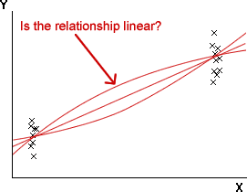
Although many relationships are acceptably linear over a limited range of x-values, at extreme x-values the relationship often becomes nonlinear. Although a good spread of x-values is desirable, the normal linear model is not appropriate if there is curvature. A compromise is needed.
Even when you have decided on a range of x-values that will be used in the experiment, it is important to avoid using only values at the two ends of this range, even though this maximises sx. Without intermediate values, it is impossible to assess whether the data are linear or not.
Does the response depend on X?
In a normal linear model, the response has a distribution whose mean, µy, depends linearly on the explanatory variable,
![]()
If the slope parameter, β1, is zero, then the response has a normal distribution that does not depend on X.
![]()
If the slope is zero, there is no association between Y and X.
In experimental data where lurking variables have been avoided, we can further say that X does not affect Y.
Hypothesis test
This can be tested formally with a hypothesis test for whether β1 is zero. The methodology is similar to that for tests about a population mean or proportion and will be described in the rest of this section.
It is important to remember that a single data set can provide evidence about whether β1 = 0, but it usually does not allow a definite conclusion to be reached.
Model for the effect of price on sales of a New Zealand wine
We consider linear models for how the price of a popular New Zealand cabernet sauvignon red wine affect its sales in a supermarket chain, measured as a proportion of total red wine sales in a week. The relationship between price and sales will be nonlinear at high prices, but is expected to be reasonably linear within a price range of $12 to $20 per bottle.
Testing whether β1 is zero therefore tests whether price has any effect on sales.
The diagram below shows the same range of models, but allows us to see typical data from the models. These are data that might be observed if each of the 4 prices were tried in the supermarket chain for 4 separate weeks, randomised over a 16-week period.
The slider again allows the model's slope to be altered. Change the slope to zero (so that price has no effect on sales).
Click Take sample a few times to see typical experimental data from the model.
The least squares line usually has non-zero slope, so a single data set cannot immediately tell you whether β1 is zero.
Testing for zero slope
To assess whether the explanatory variable affects the response, we test the hypotheses
![]()
The least squares slope from a sample, b1, is the obvious statistic to throw light on the value of β1, but b1 varies from sample to sample. We must therefore take account of its standard deviation to assess its distance from zero.
If we knew the error standard deviation (we don't!)
If we knew the value of σ, we could evaluate the standard deviation of b1
![]()
This could be used to standardise b1
standardised value, ![]()
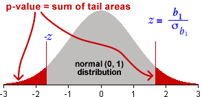
and z would have a standard normal distribution (mean 0 and sd 1) if β1 is really zero (H0). The p-value for the test would therefore be the probability of getting a value from the standard normal distribution that is as far from zero as the z-value that you evaluated from your data.
Test statistic in practice
Unfortunately σ is usually unknown and the standard deviation of b1 must be estimated from the sample data. We therefore use a test statistic of the form
t ratio, ![]()
The p-value
The only change to the method when using the test statistic t rather than z is that a t distribution with n - 2 degrees of freedom must be used to obtain the p-value instead of the standard normal distribution.

The p-value is interpreted in the same way as for other hypothesis tests.
Interpretation of p-value
Consider a data set with least squares slope b1 and corresponding p-value, 0.0023. The p-value tells us that the probability of getting a least squares slope as far from zero as b1 would be only 0.0023 if H0 was true (i.e. if Y and X were not related). Since this is very unlikely, the data give strong evidence that the linear model slope is not zero and therefore that the response is related to the explanatory variable.
Similarly, if we calculate that the p-value for b1 is 0.4, this tells us that a least squares slope as far from zero as b1 would occur with probability 0.4, even if Y and X were not related. Since this is fairly high, our conclusion should be that there is no reason to doubt the null hypothesis — there is no evidence of a relationship between the response and explanatory variables.
Examples
The following data sets show hypothesis tests for a few data sets and the conclusions that are reached.

Strength of a relationship
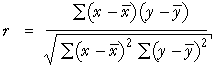
The strength of the relationship between two variables, X and Y, is usually summarised by their correlation coefficient, r.
When the data are sampled from some population, there is a corresponding underlying population correlation coefficient, ρ, that r approximates. (ρ is the Greek letter r, pronounced 'rho'.) The sample correlation coefficient r is an estimate of the unknown population parameter, ρ.
As the sample size increases, r becomes a more accurate estimate of ρ, but its distribution is always centred near ρ.
The size of the correlation coefficient is therefore not dependent on the sample size.
Strength of evidence for a relationship
It is important to distinguish between the correlation coefficient, r, and the p-value for testing whether there is a relationship between X and Y.
It is important not to confuse these two values when interpreting the p-value for a test.
The interpretation of the p-value is helped by giving an alternative formula for the test statistic,
![]()
This can be rewritten in terms of the correlation coefficient, r, and the sample size as...
![]()
Since the p-value describes how far t is from zero,
The p-value depends on both r and the sample size, n.
If r stays the same, the test statistic becomes further from zero (and the p-value for the test therefore becomes smaller) as the sample size increases.
The following examples illustrate how both the sample size and the correlation coefficient affect the p-value.
In the data set at the top left, there is no evidence of a relationship between the variables — a correlation coefficient of 0.24 could easily have arisen by chance even if the variables were not related at all.
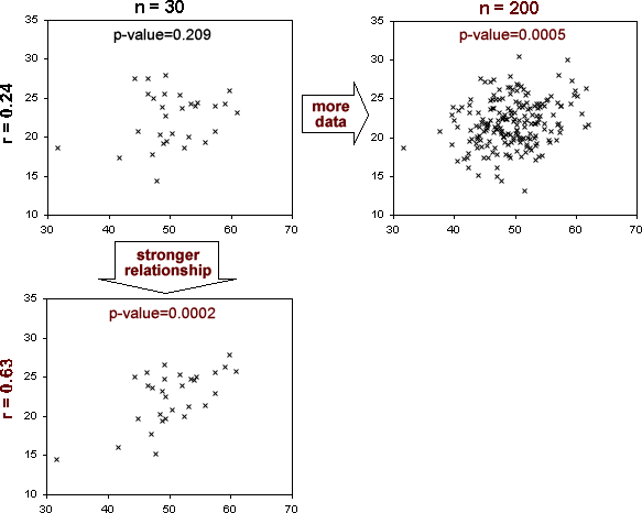
The data set on the top right has the same correlation coefficient, 0.24. However its sample size is much higher and a correlation coefficient this far from zero is now very unlikely, so the p-value is small. There is almost certainly a relationship between X and Y, even though the relationship is weak.
With a sample size of 30, the relationship would need to be stronger for us to detect it. The data set on the bottom left shows that r = 0.63 gives strong evidence of a relationship with a data set of this size.
Properties of p-value
P-values for testing whether a linear model's slope is zero have the same properties as p-values for other hypothesis tests. In particular,
Simulation of distribution of p-values
The diagram below builds up the distribution of p-values for testing whether the slope is zero.
With β1 = 0, click Take sample several times and verify that the p-values are rectangularly distributed between 0 and 1.
(Click on any p-value to see the data set that gave rise to it.)
Change the linear model slope to β1 = 0.5, then take several more samples. The p-values tend to be closer to zero.
Repeat with β1 = 1.0.
As shown by the above simulation, when Y and X are not related (β1 = 0), it is still possible to get small p-values, suggesting that β1 is not zero. However there is only probability 0.01 of getting a p-value as low as 0.01 — it is unlikely but possible. Such a p-value is more likely if the variables are related so we interpret it as giving strong evidence of a relationship.
Model allows us to estimate response distribution at any X
Bivariate data sets contain response measurements corresponding to a few specific values of X, whereas a normal linear model provides a response distribution for all X. By fitting a normal linear model to the data, it is therefore possible to estimate the response distribution at x-values for which we do not have data.
Tree diameter and timber volume
The value of hardwood trees depends on the volume of timber that can be obtained when the trees are harvested. However the volume of timber cannot be easily measured when the tree is standing, so volume is usually estimated from measurements that are easier to make, such as the tree diameter 4.5 feet above ground level. The diagram below plots the cross-sectional area at this height against the volume of timber for 31 black cherry trees that were harvested in the Allegheny National Forest in Pennsylvania.
The relationship seems reasonably linear, so we will try to fit a normal linear model to the data. The least squares line is shown in the diagram below with the grey band representing ± twice the estimate of σ.
Drag the slider to display the estimated normal distribution of the volume of timber obtained from a tree of any cross-sectional area.
The mean of this estimated distribution (i.e. the least squares line) provides a prediction of the volume of timber for a different black cherry tree of any cross-sectional area.
What affects the accuracy of a prediction?
Since the predicted response at X,
![]()
depends on the least squares estimates, b0 and b1, it also varies from sample to sample. The prediction has a normal distribution whose mean is
![]()
The standard deviation of the prediction describes its likely distance from this underlying population value. It depends on:
Predictions are least variable (most accurate) when predicting at an x-value near the mean of the 'training' data.
The diagram below shows a sample from a normal linear model and the least squares line that is fitted to these data.
Click Accumulate, then take approximately 20 further samples. The variability of the least squares lines is shown on the right.
Now drag the slider on the right to expand the scales in the diagrams. Observe that the least squares lines (and hence the predictions that are made from them) are least variable near the centre of the data, but become increasingly variable as you extrapolate from the data.
The next diagram concentrates on the errors that result from using the estimate
![]()
of the true mean response,
![]()
Click Accumulate, then take about 50 further samples. The jittered dot plot on the right shows the distribution of the errors that are obtained when using a least squares line to estimate the mean response at X.
(Click on any cross in this plot to see the data set that gave rise to it.)
Drag the slider to observe the distribution of the errors at other x-values. Observe that the errors are least variable when predicting near x = 2.5.
Finally, click the checkbox below to display the theoretical distribution of the errors and again drag the slider to adjust the value of X.
Estimating mean volume of timber
In the timber volume example, the timber volume obtained from harvested trees was related to the cross-sectional area at chest height. The manager of a forest would be interested in estimating the mean timber volume that could be obtained from trees with different cross-sectional areas,
![]()
using the least squares estimate,
![]()
Since both b0 and b1 become less variable (and hence more accurate estimates of β0 and β1) as the sample size increases,
The estimate of the mean timber volume also becomes increasingly accurate as the sample size increases.
Predicting timber volume from a single tree
In contrast, the manager might want to predict the timber volume that could be obtained from a single tree that has cross-sectional area X ft2. The same prediction would be used as above,
![]()
However, no matter how accurately we estimate the mean volume from trees with this cross-sectional area, the single tree will also have a distribution with standard deviation σ around this mean. As a result, the errors in predicting the volume from a single tree will be greater.
The distribution of the prediction error cannot have a standard deviation that is less than σ.
Difference between estimating a mean and predicting a new value
We will perform a simulation from a normal linear model with β0 = 3.3 and β1 = 0.75. Data from the model will be used to estimate the mean response when X = 5.5 and also to estimate a new individual's response value at this x-value. The same value is used both for estimation and prediction,
![]()
but the error is different in the two situations.
The true mean response is 7.43. (We can evaluate this since we know the values of β0 and β1 in the simulation — in practice we would not be able to determine the mean response.) The top half of the diagram shows the error in estimating this from the least squares line.
The bottom half of the diagram shows the error from predicting a new response value at X = 5.5.
Click Accumulate then take several samples from this linear model. Observe that the prediction error has greater spread than the estimation error at the top.
Use the pop-up menu to increase the sample size to 210. Observe that the error in estimating the mean becomes very small, but the prediction error is still quite large. Although we can estimate the mean response accurately, we have no information about how far the new value will be from this.
(In practice, it would be unwise to estimate or predict at X = 5.5 since the highest x-values in the data are about 4 — we are not sure that the relationship will remain linear at high X. However it makes the diagram above clearer.)
Interval estimates
In the previous page, we showed that the same value,
![]()
is used both to estimate the mean response at x and to predict a new individual's response at x. However the errors are different in the two situations — the errors tend to be larger for predicting a new value.
In both situations, it is more informative to give an interval of 'likely' values rather than a single value.
Estimating mean response
A 95% confidence interval for the mean response takes the form
![]()
We do not provide a formula for the standard error on the right of this formula — the details are not important and statistical software will tell you the value.
Predicting a new individual's response
For prediction, a similar interval can be found
![]()
where the value k is greater than the corresponding standard error for the confidence interval. (Again we do not provide a full formula. Statistical computer software will perform the calculations for you.)
A 95% prediction interval is wider than a 95% confidence interval for the distribution's mean.
Extrapolation
These 95% confidence intervals and 95% prediction intervals are valid within the range of x-values about which we have collected data, but they should not be relied on for extrapolation. Both intervals assume that the normal linear model describes the process, but we have no information about linearity beyond the x-values that have been collected.
From a scatterplot, we can check that there is approximate linearity within the observed range of x-values but there is no way to check linearity beyond the observed data.
Inertia welding experiment.
Manufacturers use inertia welding to join different metals that cannot easily be joined by other means (e.g. aluminium to steel). One part of a workpiece is attached to a flywheel that is rotated at speed and forced into contact with another piece that is restrained from rotating. The heat generated by friction at the interface produces a hot-pressure weld.
The diagram below shows data from an inertia welding experiment. The two variables in the experiment were the velocity (ft per minute) of the rotating workpiece and the breaking strength of the weld.
Drag the slider to display...
Because of uncertainty about linearity of the relationship, the confidence intervals and prediction intervals are unreliable if X is greater than 3.0 or less than 2.0.
Do the normal linear model assumptions hold?
Although a normal linear model is often used to describe how an explanatory variable, X, affects the distribution of a response, Y, it is not a suitable model for all bivariate data.
![]()
![]()
In particular, the following four requirements are implicit in the model but may be violated.
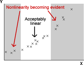
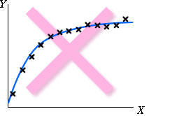
Linearity In some data sets, the response mean does not change linearly with X. The relationship is then called nonlinear. In the diagram on the right, the response levels off as X increases, so a normal linear model is not appropriate. |
 |
Constant standard deviation Sometimes the response standard deviation is different for different values of X. In the diagram on the right, the variability of the response is higher at large values of X. |
 |
Normal distribution for errors Sometimes distribution of the response (at any value of X) is skew or differs in shape from a normal distribution in other ways. In the diagram on the right, the response has a skew distribution with occasional very large values. |
 |
Independent errors All observations (and hence all errors) are assumed to be independently obtained. When the observations are ordered in time, successive errors may be correlated, with big values tending to be followed by others big values, etc. This is most commonly seen when the explanatory variable is time — i.e. when using a linear model to fit the trend in a time series. In the diagram on the right, crosses on one side of the least sqrs line are often followed by other crosses on the same side. |
 |
Residual plots
The above problems may be evident in a scatterplot of the raw data, but a residual plot often highlights any problems.
Examples
The first example below shows a data set that satisfies the assumptions for a normal linear model.
Observe that the plot of residuals against X is a horizontal band of constant width. (Click on any point to see how the residual relates to the plot of the raw data on the left.)
Select other data sets from the pop-up menu at the top. These are data sets for which different linear model assumptions are violated. Observe how the problems are reflected in the residual plots.
In the remainder of this section, we will look in more detail at the four assumptions underlying the normal linear model.
Linearising the relationship between Y and X
Even though two variables, X and Y, are nonlinearly related, applying a nonlinear transformation to one or other of the variables can linearise the relationship. In other words, some transformation of X may be linearly related to some transformation of Y.
For example, it may happen that the Y2 is linearly related to log(X), satisfying the following model.
![]()
![]()
The parameters of this model could again be estimated by least squares, based on the transformed values of the two variables, and confidence intervals and hypothesis tests would be valid.
Transformation of X
In the following example, only transformations of the explanatory variable, X, will be considered.
Vitamin B and weight gain of rats
The following data set was obtained from an experiment in which 18 rats were given diets containing different quantities of riboflavin (vitamin B2). The doses used in the experiment were 2.5, 5, 10 and 20 mug per day and the weight gains of the rats (grams) were recorded over a period of 4 weeks. The relationship between weight gain and dose is nonlinear — weight gains seem to be less affected by increasing the dose once it is over 10 mug per day.
Drag the red line on the horizontal axis towards the right to apply a power transformation to the dose. Observe that a log transformation (between a power of 0.01 and -0.01) linearises the relationship reasonably well. (Use the arrow keys on the keyboard to make fine adjustments to the power.)
A normal linear model explaining weight gain in terms of log(dose) is therefore reasonable. Note that a linear model between weight gain and log(dose) implies a nonlinear model between weight gain and dose.
Again drag the red line to apply a log transformation to the dose of vitamin B2. The least squares line is drawn on the diagram on the left and its equation is shown below. The diagram on the right shows this equation on a the original untransformed axes; observe that it is curved.
In the next page, we will examine how transformations of the response, Y, may also be used when there is curvature.
Transformations and the error standard deviation
In a scatterplot of Y against X, transforming X moves the crosses horizontally, but does not affect the spread of response values at each value of X.
If the error standard deviation is the same for each x in a plot of Y against X, it will also be constant in a plot of Y against any transformation of X.
Transformation of X therefore does not affect whether or not the linear model's assumption of constant error standard deviation holds.
However,
Transformation of the response, Y, not only affects linearity of the relationship, but also affects whether or not the error standard deviation is constant.
This is more easily explained in an example than with words.
Prices of second-hand Mazda cars
The scatterplot below shows the retail prices of 124 Mazda cars, obtained from the newspaper The Melbourne Age on 8 February 1992. The grey line is the least squares line fitted to the data.
The residual plot on the right highlights two problems. Firstly there is clearly nonlinearity — the prices level off at high ages. Also, the standard deviation of the price is much lower for cars over 10 years old — there is non-constant error standard deviation.
Drag the red line on the vertical axis upwards to apply a power transformation to the price. Observe that a log transformation (between a power of 0.01 and -0.01) both linearises the relationship reasonably well and also gives residuals with fairly constant spread. (Use the arrow keys on the keyboard to make fine adjustments to the power.)
Fortunately, the same transformation of the response that linearises the relationship often also results in fairly constant error standard deviation.
Point prediction using transformed variables
If a transformation of Y follows a normal linear model with an explanatory variable that is a transformation of X, a least squares line that is fitted to the transformed data is used for predictions.
To obtain a prediction of Y at any value x,
For example, if the square root of Y is linearly related to X, we use the least squares line to obtain a prediction of sqrt(Y), then square this to get a prediction of Y itself.
House prices in Palmerston North
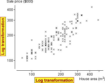
The scatterplot below shows the sale prices ($thousand) and floor areas (square metres) from a sample of 143 houses that were sold in two suburbs of Palmerston North, New Zealand in 1999. All houses had been built in the previous 30 years.
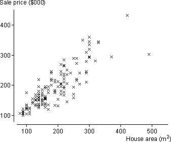
The prices of large houses are more variable than these of small houses, suggesting that a transformed sale price might satisfy a normal linear model better.
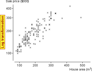
Although the error variance now seems reasonably constant, there is an indication of nonlinearity at high house areas. A log transformation of the house areas fixes this problem too.
A normal linear model for the transformed variables implies that
![]()
and this can be re-expressed in the form
![]()
so the model implies that prices are proportional to area raised to a power. (If b = 1, there is a constant price per m2, on average — a hypothesis test can assess this.)
The transformed variables are shown on the diagram below with the least squares line, both on the transformed scatterplot and on a scatterplot of the original data.
Click on the scatterplot at any house area (or log-area) to see how log(price) is predicted using the least squares slope and intercept. From this, the price is predicted by raising 10 to this power — the inverse transformation to log10.
Prediction intervals
Prediction intervals can be obtained in a similar way.
For example, if the square root of Y is linearly related to X, we find a prediction interval for sqrt(Y), then square both ends of this interval to get a prediction interval for Y itself.
Although the prediction interval for the transformed Y has a similar width over the range of x-values in the data, the resulting prediction interval for Y itself may vary much more in width.
House prices in Palmerston North
The red band on the scatterplot of log(price) against log(area) on the left below shows 95% prediction intervals. Use the slider under the diagram to display the prediction interval for the price of a house of any area.
The scatterplot on the right shows the corresponding data and prediction intervals on a plot of the untransformed variables. Observe that the prediction interval for the price of a large house is much wider than that for a small house.
Outliers and errors
An outlier is a measurement that does not fit in with the pattern exhibited by the rest of the data. By definition, an outlier does not satisfy the normal linear model that fits the rest of the data, so it should be omitted from the analysis.
In a regression situation, an outlier corresponds to a large error, ε.
In a scatterplot, the point is unusually far above or below the regression line.
Standardised residuals
Unfortunately, in a real data set, the errors are unknown, so we must use the residuals from the least squares line as estimates of the errors. The residuals can be used in a similar way to give information about whether there is an outlier.
Hopefully the large error will correspond to an unusually large residual that will stand out from the distribution of the other residuals.
To help assess the residuals, it is common to standardise them — dividing by an estimate of the standard deviation of each. (The details of the standardisation are not important, but it is worth noting that the errors, ε, all have standard deviation σ. The residuals have a standard deviation that is a bit smaller than this.)
![]()
The standardised residuals are each approximately normally distributed with mean 0 and standard deviation 1 if the normal linear model fits. From the properties of the standard normal distribution, only about 5% of the standardised residuals will be outside the range ±2, and hardly any outside the range ±3. Most statistical software will evaluate standardised residuals for you when you fit a line by least squares and automatically report any outside these ranges.
Standadised residual greater than 3 or less than -3 are often taken to indicate possible outliers.
It is worth remembering however that there is still a probability 0.003 that a value from the standard normal distribution will be outside ±3. In a data set of 1,000 values, it would therefore be expected that 3 values would be labelled as 'outliers' by this rule.
In large data sets, do not assume that standardised residuals outside ±3 must be outliers — values a little outside can also occur by chance.
Standardised residuals when there are no outliers
The scatterplot below shows a data set that is sampled from a normal linear model. A plot of the standardised residuals is shown on the right.
Click Another data set a few times and observe that standardised residuals are occasionally outside ±2. When the sample size is increased, there are often some standardised residuals outside this range.
It is unusual for standardised residuals to be outside ±3 when the sample size is small, but even this is not uncommon when the sample size is large.
Standardised residuals would need to be outside ±3.5 or ±4 for us to be really confident that they are outliers.
Problems with residuals as indicators of outliers
All data points pull the least squares line towards themselves — the line is positioned to minimise the sum of squares of the residuals
minimise ![]()
Imagine the blue residuals below as rubber bands, all pulling the least squares line. The further a cross from the line, the stronger its pull on the line.
Large residuals pull very strongly on the line since they are squared in the least squares criterion (the rubber band is extremely tight). As a result,
Outliers will strongly pull the least squares line towards themselves, making their residuals smaller than you might otherwise expect.
Leverage
This effect is strongest when the x-value of a point is very large or small. Using the analogy of rubber bands pulling the least squares line, points with extreme x-values have more leverage on the position of the least squares line.
If an outlier corresponds to a high-leverage point, its residual may therefore still be small.
Illustration
The scatterplot below shows a data set and the corresponding residuals.
The cross on the far right can be dragged with the mouse. Initially, the diagram shows what we would ideally have hoped to see in the residuals — the other points are close to a straight line, so if the final cross is dragged away from this line, we would have hoped that it would result in a large residual.
This is not what actually happens. Choose What you actually get... from the pop-up menu at the top and drag the point again. The least squares line is pulled towards the point, so when it is dragged away from the line followed by the other points, its residual is smaller than might be expected and the residuals for the other points are larger.
This is especially evident when the point being dragged has an x-value of around 4 — i.e. when it is a high leverage point. Drag it down to a y-value of about 40 and observe that its residual is no more extreme than those of the other points.
Do not rely on an extreme residual to tell you whether a high-leverage point is an outlier.
Normal errors
Another assumption in the normal linear model is that the model errors are normally distributed.
![]()
If the model holds, the least squares residuals will also be normally distributed, so a histogram of the residuals can be examined for normality.
Normal errors are the least important of the model assumptions. If the other assumptions hold, it is reasonable to continue with the analysis, even if the errors have a skew distribution.
Normal probability plot
A better way to graphically examine a data set for normality is with a normal probability plot of the residuals. As with other probability plots, if the residuals are from a normal distribution, the crosses in the normal probability plot should lie close to a straight line.
How much curvature is needed to suggest non-normality?
In some data sets, linearity or nonlinearity in the probability plot is clear. In practice however, the randomness of real data means that the probability plot will not be exactly straight even for values that are sampled from a normal population.
How much curvature is needed to conclude that the underlying distribution is not normal?
This is a difficult question to answer. There are formal tests of normality that can be used in conjunction with a probability plot. (We discussed one in an earlier chapter about hypothesis tests.) We however take a less formal approach in the example below.
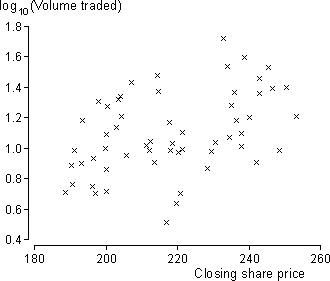
Share prices and volume traded
The scatterplot below shows the volume of British Airways shares traded in each of the first 57 trading days of 2002 — between 2nd January and 21st March — and the closing share price. A probability plot of the residuals from the least squares line are also shown on the right.
There is curvature in the probability plot, suggesting that the error distribution is skew with a long tail towards the high values.
Could this amount of curvature have occurred by chance? Select Random Normal Data from the pop-up menu to generate random data from a normal linear model whose parameters β0, β1 and σ are the same as the least squares estimates from our data. Click Take Sample several times to see the variability in the probability plot when a normal linear model does hold.
The probability plot from the data seems more curved than the random ones, suggesting a problem with the model assumptions.
Warning
If the assumptions of linearity and constant variance are violated, or if there are outliers, the probability plot of residuals will often be curved, irrespective of the error distribution.
Only draw a probability plot if you are sure that the data are linear, have constant variance and have no outliers.
Share price and volume traded
In the British Airways example above, there appears to be greater variability in the volumes traded when the share price is high. This suggests that a transformation of the response might improve the fit of the model. The scatterplot below shows that a normal linear model would be a better description of the relationship between the logarithms of the volume traded and the share price — the distribution of points around the line is more symmetrical and there are no obvious problems with the other assumptions.
Independence of the errors
Although we have not stressed it earlier, an important assumption in the normal linear model is that the different errors are uncorrelated with each other. Occasionally some individuals are 'close' in a way that means an 'unusually' high response measurement will be associated with unusually high measurements in nearby individuals — their errors are correlated.
For example, in an experiment in a greenhouse, adjacent plants will be grown in similar conditions (light, moisture, air flow) so an unusually high growth rate for one plant may be associated with environmental conditions that also cause unusually high growth rates in adjacent plants.
Good experimental design tries to ensure that all experimental units are similar, but correlation between 'adjacent' errors is sometimes unavoidable.
Correlated errors and time series
Correlated errors are most common when the observations are made sequentially in time. There are often influences on the response that are not explicitly recorded or modelled but that change gradually over time resulting in successive errors being correlated. This is called serial correlation.
Serial correlation is especially common when modelling time series — i.e. when we are using a normal linear model with time as the explanatory variable.
Assessing serial correlation
Strong serial correlation may be visible in a plot of residuals against time, but it is often difficult to assess whether the pattern could have arisen by chance. A test statistic called the Durbin-Watson statistic is often used to assess whether there is serial correlation. Writing the successive residuals as e1, e2, ..., en, this statistc is defined as:
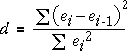
When the serial correlation is high, successive residuals will be similar, their differences will be small and the test statistic will be close to zero.
The p-value for the test based on the Durbin-Watson statistic is the probability of getting such a low value of d when there is no serial correlation. An approximate p-value can be obtained from special statistical tables, but it can also be determined with a simulation, as described in the example below.
World rice production
The time series below shows the total world rice production (million tonnes) between 1961 and 2001.
The scatterplot on the left shows the data and a least squares line. The residuals on the right do not indicate any problems with curvature or non-constant variance.
To assess whether there is serial correlation in the errors, the Durbin-Watson statistic has been evaluated. Is a value of 1.291 indicative of serial correlation?
Select Random Normal Data from the pop-up menu. This shows a randomly generated data set from a linear model with β0, β1 and σ the same as the least squares estimates from the actual time series.
Click Accumulate, then click Simulate about 100 times to build up the sampling distribution of the Durbin-Watson statistic. You should see that a value as low as 1.291 is very unlikely for data like this from a normal linear model, so there is strong evidence that successive errors are correlated.
There is strong evidence that years with unusually high (or low) yield tend to follow each other.
Warning
If a linear model is used for a time series, but the relationship is actually nonlinear, successive residuals also tend to be similar and the Durbin-Watson statistic will also be small.
An unusually small Durbin-Watson statistic can be caused by either serial correlation or nonlinearity.
The test only suggests serial correlation if you are sure that the data are linear.