In a data set, a numerical variable contains a number
from each individual. A categorical variable classifies each
individual into one of several groups. For example,
an investigation of the religions with which a group of 100 individuals identify might
result in the 100 values,
In many data sets, the values are not ordered in any meaningful way. For
example, the 100 individuals above were not surveyed in any particular order.
(If the data were collected in order, time series methods should be used to
analyse them.) We only consider unordered categorical data in this chapter.
Frequency tables
An unordered numerical data set holds much detailed information
about the distribution of values. (A dot plot shows full information about
the distribution, though we may choose to summarise with a histogram or summary
statistics.)
In contrast, an unordered categorical data set contains
much less information. The frequencies for the distinct categories are the
number of times each category occurs in the data set.
The frequencies fully capture all information about the distribution
of values.
These frequencies are usually presented as a frequency table.
Rice survey
As part of a survey of rice producers in Sri Lanka, 36 farmers were randomly
selected from 4 villages. Each sampled farmer was asked about the variety
of rice that he used and the varieties were categorised into 'Old', 'Traditional'
or 'New'. The 36 resulting categorical values are shown on the left of the
diagram below.
To calculate the frequencies for each of the three types of rice by hand,
you would work through the table of values, drawing a line against the appropriate
category name for each value (a tally). These tallies would finally be
counted to give the frequencies.
Click on each of the categorical values in turn to illustrate
how the tallies and frequencies are obtained.
The final table of frequencies on the right summarises usage of the three
types of rice. The frequency table contains all
information about the distribution of rice types.
Examining one variable from many
In surveys like the rice survey above, several measurements are often recorded
from each participant. Although in-depth analysis of the data would investigate
the relationships between the variables, it is often useful to examine the
distributions of the variables one-at-a-time.
Rice survey
In the rice survey that was described above, five variables were measured
from each farmer.
The village name (Sabey, Kesen, Niko or Nanda)
The farm size (hectares)
The amount of fertiliser used (tonnes/hectare)
The rice type (Old, Traditional or New)
The yield of rice (tonnes/hectare)
Frequency tables could be used to summarise the categorical variables whereas
dot plots could summarise the distributions of the three numerical variables.
The diagram below shows the data in tabular form and we will again build
up the frequency distribution of the rice types.
Click on each row (farmer) in turn to build up the frequency
table.
5.1.2 Proportions and percentages
Proportions
The proportions of values in the categories (also called the relative
frequencies of the categories) are the frequencies divided by the
total number of values.
Percentages
The proportions are often expressed as percentages — simply the proportions
multiplied by 100. For example, a proportion of 0.034 is more concisely expressed as 3.4% but contains identical information. It is usually easier to quickly compare a column of percentages than the corresponding column of proportions.
Percentages are usually easier to interpret than the raw frequencies, so
frequency tables are often augmented with an extra column of percentages.
Kestrel causes of death
The frequency table below shows the causes of death of kestrels (a bird of
prey) in Britain between 1963 and 1997. (Carcasses were sent to the researchers
in response to advertisements in bird-watching magazines and journals and the
cause of death was found from information sent by the finder and examination of
the carcass.)
Choose the option Count & proportion under the frequency
table to see the proportion of kestrels dying from each cause.
Finally, choose the option Count & percentage to express
the proportions as percentages. Although the percentages are simply 100 times
the corresponding proportions, the information
in the data stands out better when percentages are used.
5.1.3 Recognising frequency tables
Necessary property of a frequency table
A frequency table distributes each of a collection of 'individuals' into
one of several categories. Each individual must therefore contribute 1
to exactly one of the counts in the table.
Make sure that you can recognise whether a table
of counts or percentages is a frequency table.
UN survey responses
The United Nations conducted a survey about the extent to which countries
implemented a set of 'Fundamental Principles of Official Statistics' in
their National Statistics Offices. The table below was published in a UN
report and describes which countries were sent questionnaires (the recipients)
and which ones returned the questionnaires (respondents).
The highlighted part of the above table is a frequency table that categorises
the recipient countries by region. Each country is in exactly one of the
five regions. The two columns to its right form another frequency table
describing the distribution of respondents between the regions.
However the information that is highlighted below is not
a frequency table — the least developed countries contribute 1 to both
of the top two rows (developing and least developed),
and the percentages therefore do not add to 100%.
Although there is nothing 'wrong' with this table, its format can cause
confusion and it is fairly easy to restructure the information as a proper
frequency table, as shown below.
It is particularly important to recognise frequency tables because the
graphical methods that will be described in the next section are inappropriate
for most other types of data.
Finally, note that the values in the bottom right of the table below do
not form a frequency table either.
Although these values are percentages, they do not add to 100%. Indeed,
each of these percentages actually comes from a simpler frequency table
that categorises the countries in one region into respondents and non-respondents.
For example, the response rate of 81% for Europe comes from the following
frequency table.
When there are only 2 categories, a single value (such as the response
rate of 81% here) adequately summarises the frequency table, so the column
of response rates in the published table is a concise summary.
5.1.4 Changes to the categories
Modifying a frequency table
A frequency table shows the numbers and proportions of 'individuals' in various
categories. There are a few ways in which such tables can be modified, either
to make the information clearer or to highlight particular aspects.
Reordering categories
In some frequency tables, there is a natural ordering of the categories
(e.g. strongly agree, agree, indifferent, disagree and
strongly disagree). The categories should be arranged in this order
in the table. If there is no natural ordering, then it often helps to arrange
the categories by the frequencies, with the highest frequency first and
the lowest frequency last.
Alphabetic ordering of the categories is rarely
best.
Combining categories
The information in the table may be clearer if the number of categories
is reduced by combining some together. For example, published tables often
categorise hospital operations into 50-100 different categories. A coarser
categorisation (e.g. orthopaedic, cancer, ...) gives a more easily understood
overview.
The frequency for a combined category is the
sum of the frequencies for the categories that are being merged. The percentages
are also added.
Looking at subsets of categories
It may be useful to 'hide' some categories in the table, and look only
at the distribution of the remaining categories. This corresponds to looking
only at a sub-group of the individuals.
The frequencies for the categories are unchanged,
but the percentages should divide them by the total for the displayed
categories, so they still add to 100%.
These techniques will be clearer in an example.
Road crashes by road feature
The table below shows the number of road crashes causing injury or death
in New Zealand in 2005, categorised by the type of 'road feature' at the
crash site.
The 'road features' were grouped into Intersections and Non-intersections
in the report and are shown in different colours in the table. However the
ordering of categories within the groups in the report was not particularly
meaningful. Click the two checkboxes Sort by frequency
to reorder the features by their frequency of accidents within each group.
Click the checkboxes Combine categories to combine the
different types of intersections and non-intersections into a frequency
table with two rows. This table highlights the differences between intersections
and non-intersections.
Finally, expand the categories for Intersections and click Hide
categories for the Non-intersections. This shows the distribution
of road features for the accidents that occurred at intersections. Note that
hiding the non-intersection categories restricts attention to the accidents
that occurred at intersections. The total therefore changes to the number
of accidents at intersections and the percentages become percentages out
of this new total.
5.2 Bar and pie charts
Bar charts
Pareto diagrams
Chartjunk and misleading bar charts
Stacked bar charts and pie charts
Comparison of bar and pie charts
Chartjunk for pie charts
Bar and pie charts for quantities
5.2.1 Bar charts
Bar charts
Although a frequency table itself provides a useful description of a categorical
distribution, a graphical display of the frequencies is often easier to absorb.
The main graphical display of categorical data is a bar chart.
Bar charts for categorical data are similar to those that were described earlier for
discrete data. For each
distinct category, a bar is drawn with height equal to the frequency (or equivalently
relative frequency) of that category.
Kestrel causes of death
The bar chart below shows the causes of death of kestrels in Britain between 1963 and 1997, based on carcasses sent to the researchers in response to advertisements in bird-watching magazines and journals.
Clicking on any bar highlights it and the corresponding values on the
frequency table.
Note that the bar chart is shown with both a frequency axis (on the left) and
a proportion axis (on the right). It has the same shape whichever is used.
5.2.2 Pareto diagrams
Ordering categories of ordinal and nominal variables
Some categorical variables have a natural ordering of their categories. These
are called ordinal categorical variables. For example, many
questionnaires request responses to statements on a five-point scale between
'strongly agree' and 'strongly disagree'. For such variables, the categories
on a bar chart should be shown in this natural order.
When there is no natural ordering of the categories (a nominal
categorical variable), the order of the categories in a frequency table or
bar chart is arbitrary. For example, if school children are asked to pick
their favourite subject, there is no natural way to order the subjects English,
Mathematics and Music and these categories can be placed in any order on a
bar chart.
Alphabetical ordering of the categories is rarely best.
Detecting 'important' categories
For nominal categorical variables, it is often useful to arrange the categories
in decreasing order of their frequencies. When the bars of a bar chart are
organised in this way, the diagram is called a Pareto diagram.
The initial bars in the diagram have the highest frequencies and are often
the most 'important' ones.
Pareto diagrams are particularly useful in industrial quality control and
quality improvement where information is collected about the causes of problems
in manufacturing processes. These causes are usually categorical and a Pareto
diagram highlights the most important ones.
The Pareto diagram is named after an Italian economist in the late 1800's
who found that about 80 percent of the wealth of a region was concentrated
in less than 20 percent of the population. This rule-of-thumb has been adapted
to quality improvement, giving the Pareto principle that
A large percentage of instances of any problem result from a small
percentage of the possible causes.
A line is usually added to a Pareto diagram showing the cumulative
proportions for the different causes. For the i'th cause, the height
of the line gives the proportion of problems from any of the
i most common causes.
Defective cereal boxes
A manufacturer of breakfast cereals has received complaints about defective
boxes of corn flakes being shipped to supermarkets. The output from one week was
checked for defects and the following table shows the main reasons for boxes being
rejected as defective.
There is no natural ordering of the defects, so we can reorder them in any way. Select Decreasing frequencies from the pop-up menu. After reordering, the most important reasons for the defective boxes are on the left and the least important are at the right.
Cumulative proportions
The diagram below completes the Pareto diagram with the cumulative proportions.
Click on the bar for Dirty to stack the bars for the three
most common causes. The cumulative proportion line goes through the top of this
stack, so it shows the proportion of boxes that were rejected for these three
causes. Click on other bars to read off other cumulative proportions.
Finally, click the checkbox Separate scale for cumulative propns
to expand the scaling of the individual bars of the bar chart and therefore make
comparisons easier. Note that a different scale is used for the cumulative proportions
(on the right) and the individual proportions (on the left).
5.2.3 Chartjunk and misleading bar charts
Chartjunk
If
a categorical data set has only a few distinct categories, the information in
it can be very simply expressed. For example, consider the sex of each of 160
sparrows that an ecologist trapped. The bar chart on the right only shows that
there were 100 males, 62.5% of the captured birds.
Since the information contained in a bar chart is often simple (only 2 values
above), it is tempting to embellish bar charts 'artistically' to make them more
visually appealing. These additions are collectively called chartjunk.
Many spreadsheets, such as Microsoft Excel, make it easy to add chartjunk to bar
charts.
In general, chartjunk should be avoided — it is usually easier to read information
from a standard bar chart. Rather than adding chartjunk, draw the bar chart small
or replace it with a frequency table.
Three-dimensional chartjunk
A common form of chartjunk is obtained by changing each bar into a 3-dimensional
object. When the resulting 3-dimensional picture is rotated, it often becomes
harder to compare the heights of bars and to read off values from the axes. In
particular, perspective views should be avoided.
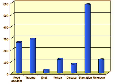
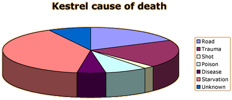
Kestrel causes of death
The diagram below was produced by Microsoft Excel to show the causes of death
of kestrels in Britain.
Although this display is more visually appealing than the original barchart,
it is now harder to assess whether the numbers dying from Trauma were just over
or under 300.
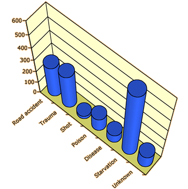
Although the above barchart is still acceptable, the extra rotation and perspective
viewpoint of the diagram below make it an extremely poor representation of the
data.
Avoid drawing bar charts in 3-dimensions.
Replacing bars with objects
A second type of chartjunk is obtained by replacing the rectangular bars in
a barchart with pictures of objects. This a much more serious problem since it
often visually mis-represents the proportions in the different categories. Are
the frequencies proportional to the heights of the objects, their areas on the
paper or their 3-dimensional volumes? At a quick glance, most readers would use
something between area and volume though it is usually the heights of the bars
that actually determine the size of the objects in this type of diagram.
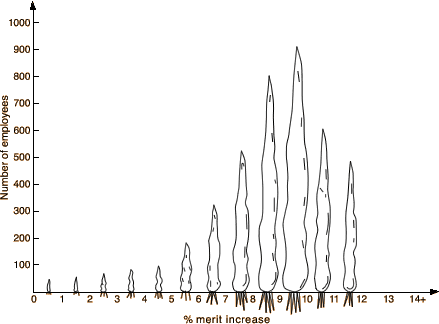
Merit raises
As part of a study of how merit pay policies are tied to employee performance,
data were collected about the merit raises (measured as a percentage of salary)
for 3,990 employees in a large company. The diagram below was published to summarise
the data.
The use of carrots for the bars is very misleading since doubling the height
(corresponding to double the frequency) corresponds to four times the
area of the carrot and eight times its volume.
In particular, the employees getting under 5% merit increase seem visually
unimportant, but they comprise nearly 10% of the total employees.
Using pictures of objects instead of bars in a barchart is
misleading and must be avoided.
(The merit increases above are really continuous
numerical values and a histogram would have been a more appropriate display.
However numerical data are occasionally grouped and treated as categorical
for analysis.)
5.2.4 Stacked bar charts and pie charts
Other displays of categorical data
Two variations of the standard bar chart of categorical data are often encountered.
A stacked bar chart is simply a bar chart in which the bars are
stacked on top of each other. It is particularly useful when comparing several
distributions since the stacked bar charts can be drawn side by side.
In a pie chart, a circle is split into segments according
to the proportion of data values in each category. The angle
for each category is given by the proportion.
Although pie charts seem visually different from the two types of bar chart,
they are closely related.
In bar charts, stacked bar charts and pie charts, the area
of ink for any category equals the proportion of values in that category
Cuckoo eggs
Cuckoos are birds that lay their eggs in the nests of other species then leave
them to be raised by the nest's owner. A high proportion of Great Reed Warbler
(Acrocephalus arundinaceus) nests are parasitised in this way by the
European Cuckoo (Cuculus carnorus) in central Hungary. Ecologists studied
several nests and the bar chart below shows the reaction of the 71 Great Reed
Warblers that had a single Cuckoo eggs laid in their nests. (Egg burial can occur
if the cuckoo egg is laid before any of the host eggs and the nest is then built
up over this egg.)
Drag the slider to the right to stack the bars of the bar chart.
In the diagram below, drag the slider to change the stacked bar chart into
a pie chart.
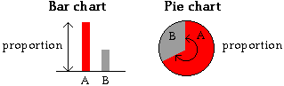
5.2.5 Comparison of bar and pie charts
Bar charts and pie charts highlight different aspects of
the data
Although a bar chart and a pie chart are visual representations of the same
values (the proportions in the categories), they highlight different features
of these proportions.
Bar charts provide better comparisons of the individual proportions, whereas
pie charts allow us to assess the proportions in two or more adjacent categories.
Predators and free-range poultry
Data were collected in the east of France to assess the main predators of free-range
poultry. Typically the chickens are given free access to fields surrounding their
hen house for a period of 9-23 weeks, usually returning to the hen house at night.
The main predators are birds of prey (raptors), crows, foxes and dogs.
Although the predators were usually not sighted, the type of predator could
usually be inferred from the wounds on the chicken bodies and feathers, hair or
droppings around the bodies. The table below shows the numbers of birds that were
killed during the study.
Class
Predator
Frequency
Percentage
Mammal
Fox
Dog
Fox or dog
Other mammal
176
157
231
65
19
17
25
7
Bird
Bird of prey
Crow
Unknown
93
37
102
10
4
11
Unknown
Unknown
64
7
Total
925
100
A pie chart and a bar chart are shown below.
The bar chart shows that fewer chickens were positively identified as killed
by dogs than foxes. This is less obvious from the pie chart. Click
on the categories to read off the exact proportions.
On the other hand, the pie chart shows that about two thirds of the chickens
were killed by mammals (fox, dog, 'fox or dog' and 'other mammal') since these
categories span about two thirds of the circle. This information is not immediately
apparent in the bar chart. Drag over adjacent categories to read
off the proportion of these predators.
5.2.6 Chartjunk for pie charts
Chartjunk
As with bar charts, pie charts are often graphical representations of a small
number of values. For example, a pie chart of the gender of students in a class
is only based on a single value, the proportion of males. As a result, there is
a temptation to 'enhance' pie charts as 3-dimensional objects — chartjunk.
Resist the temptation — it does not make the data any easier to understand
and may indeed be misleading since 3-dimensional pie charts can over-emphasise
the categories closest to the viewer.
Kestrel deaths
The 3-dimensional pie chart below shows causes of death of kestrels in Britain
between 1963 and 1997.
The viewpoint tends to make the closest categories appear too large. In particular,
Disease incorrectly appears to be as common a cause of death as Unknown.
(There were 77 deaths caused by Disease and 114 of Unknown cause.)
Small is beautiful
In general, it is better to draw a standard pie chart smaller rather than embellishing
it with chartjunk.
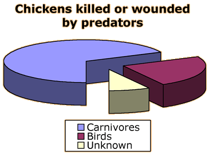
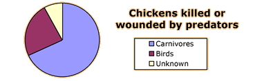
Predators and free-range poultry
The diagram below shows deaths of free-range chickens by predators during a
study in France. The pretators were classified into Carnivores (mainly
foxes and dogs), Birds (mainly buzzards, goshawks and crows) and Unknown.
The 'exploded' pie chart below describes the data.
The simpler small pie chart below shows the data more clearly.
5.2.7 Bar and pie charts for quantities
Bar charts for quantities
Bar charts are most commonly used to show frequencies for discrete or categorical
data.
However it is also acceptable to use a bar chart to display any quantity
data. (Quantity data are 'amounts' of something and are always positive. Since
it is meaningful to say that one quantity is double another, quantity data are
also called ratio variables.)
A bar chart can therefore be used to show how a quantity changes over time
(a kind of time series plot) or to show how a total quantity is split between
categories.
New Zealand wine production
The bar chart below shows how the area in New Zealand used for vinyards changed
between 1962 and 2001. (Area is a quantity — doubling the area is a meaningful
concept.)
Select Production from the pop-up menu to see how wine production
changed over this period. In contrast to the steady increase in vinyard area,
wine production has fluctuated markedly since 1980 and has levelled off.
Another interesting measurement for producers is the ratio of production to
area — the production per acre. Select Production per hectare
from the pop-up menu to see how this has changed. Production per hectare has steadily
dropped since 1970.
Possible explanations are...
The area of vinyards has increased sharply since 1990, so a large part of
the total area will have young vines that are not yet fully productive.
Production has moved to regions that are less well suited to growing grapes.
Vinyards are now growing varieties that produce better quality wine but of
a lower quantity.
Further information is required to assess these explanations and fully understand
this pattern.
Select the option Time Series from the pop-up menu on the
left. Since the data were recorded each year, time series plots can also be used
to display them.
Pie charts for quantities
Pie charts can also be used to display quantity data, but there is an additional
requirement that must be satisfied before a pie chart is used. The total
of all the data that are displayed must itself be meaningful.
It is unfortunately common for pie charts to be used in situations where the
total is not a meaningful quantity. Make sure that you recognise such misleading
pie charts and do not draw them yourself.
World rice production
The pie chart below shows world rice production (in thousand tonnes) in 1996.
The seven major rice-producing countries are separately shown in the diagram.
This pie chart is not based on categorical data (a list of categorical
measurements from individuals), but shows how a continuous total (total
rice production) is split into categories.
The following example shows data that should not
be displayed in a pie chart.
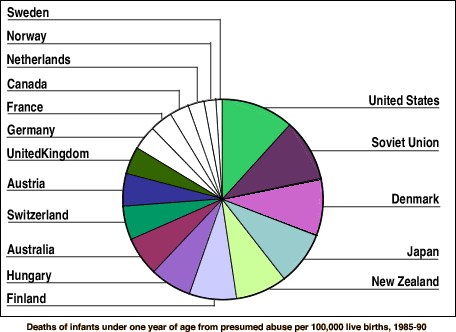
Infant deaths from abuse
The pie chart below was published in a New Zealand newspaper as part of an
article on child abuse.
Since the value from each country is a rate of deaths per 100,000 live births,
it is meaningless to add these for different countries — the total cannot be
interpreted. A pie chart should therefore not be used.
A bar chart would be a better display of these data. (It would also allow more
accurate comparisons between the rates in different countries — it is fairly
difficult to compare the areas of different slices above.)
5.3 Comparing groups
Contingency tables
Contingency table examples
Bar charts using proportions
Stacked bar charts
Two special cases
5.3.1 Contingency tables
Categorical data from several groups
Useful information can sometimes be obtained by examining a single categorical
distribution with bar or pie charts. However more interesting questions can usually
be asked of data when they are obtained from several groups.
Are the types of cancer suffered by different races the same?
Do mature students get similar grades (A, B, C or Fail) to younger students
in a university?
How effective are natural pesticides in reducing the chance of cabbage plants
getting infested with caterpillars?
All questions involve comparisons of a categorical distribution (cancer type,
grade, infestation, ...) for different groups (races, student type, pesticide,
...).
Contingency tables
Assuming again that the ordering of recording the values is unimportant, the categorical
data in each group can be expressed as a frequency table. Combining these frequency
tables into a single rectangular array gives a contingency table.
Rice survey
As part of a survey of rice producers in Sri Lanka, 36 farmers were randomly
selected from 4 villages. Each sampled farmer was asked about the variety
of rice that he used and the varieties were categorised into 'Old', 'Traditional'
or 'New'. The 36 resulting categorical values are grouped by
village on the left of the diagram below.
Click on all the values from Sabey to build up the frequencies in the first
column of the contingency table. Repeat with the values from the other villages
to complete the table.
The data may not be presented as separate lists of values from each group.
The groups may equivalently be defined by a categorical variable in the original
data matrix. Each 'individual' again contributes a count of 1 to a single
cell of the contingency table.
Rice survey
The diagram below shows the full rice survey data with a categorical variable
'village' defining the groups.
Click on each row in turn to add 1 to the appropriate cells of the contingency
table. (The resulting contingency table is identical to the one earlier
in this page.)
5.3.2 Contingency table examples
From experiments
Some contingency tables arise from experiments.
Vitamin C and colds
To test whether vitamin C reduces the risk of catching a cold, a 1961 French
study involved 279 skiers over two periods of 5-7 days. Skiers in one group of
139 were given 1 gram ascorbic acid (vitamin C) per day whereas those in the other
group were given a tablet that looked similar but had no active ingredient (called
a placebo). None of the skiers knew which of the treatments they
had received.
Cold
No cold
Ascorbic acid
17
122
Placebo
31
109
The contingency table above shows the results of the study.
From surveys
Surveys are conducted to ascertain voting intentions, purchases of consumer
goods, satisfaction with courses, and for a variety of other research purposes.
The next chapter will discuss general principles of data collection from surveys.
Individuals from some target group are usually given a questionnaire to complete.
The individual questions are often answered by ticking boxes (e.g. 'Approve',
'Neutral' or 'Disapprove') and are therefore categorical. Some of the resulting
categorical variables can often be considered to split the respondents into groups.
Survey data are often reported using many contingency tables.
Contraception and sexual health
The Office for National Statistics in Britain conducts a variety of surveys
each year relating to health. The contingency tables below present some results
from a survey on contraception and sexual health that was carried out in 2000.
There were slightly over 4,200 respondents to the survey.
Why contraceptives were not used
This table gives the main reason for not using contraception by the 410 women
aged 16-49 who were in a sexual relationship, not using contraception and not
sterilised.
Age
16-29
30-39
40-49
Partner sterilised
6
81
127
Wants to become pregnant
12
28
11
Pregnant now
15
20
2
Menopause
0
2
11
Possibly infertile
6
18
19
Doesn't like contraception
3
7
6
Other reason
15
8
13
Number of sexual partners in previous year
For men:
Men, aged
Sexual partners
16-19
20-24
25-29
30-34
35-39
40-44
None
52
21
13
15
16
18
One
63
113
147
205
223
211
Two or three
37
49
28
25
24
18
Four or more
4
6
2
1
1
0
For women:
Women, aged
Sexual partners
16-19
20-24
25-29
30-34
35-39
40-44
None
68
10
17
17
26
33
One
91
145
195
244
290
280
Two or three
41
37
30
14
10
10
Four or more
8
12
5
3
3
0
Use of emergency contraception
This table gives information about where hormonal emergency contraception
(the 'morning after pill') was obtained by women aged 16-49 who had used it in
the previous year.
Marital status
Single
Married or
cohabiting
Widowed,
divorced or separated
Family planning clinic (at least once)
32
10
3
Other
45
34
10
5.3.3 Bar charts using proportions
Proportions within groups
Although a contingency table fully describes categorical data from two or more
groups, it is a poor way to compare the distributions if there are different total
numbers in the groups.
Rather than tabulating the frequencies for each group, it is more informative
to tabulate the proportions within the groups. Each frequency
in the table is therefore divided by the total for that group.
For example, in the health and contraception data on the previous page,
12 of the women aged 16-29 who did not use contraception did so because they
wanted to become pregnant, but
28 of those aged 30-39 gave this as their reason.
However since there were many more in the 30-39 age group, it is more meaningful
to report that
a proportion 12/57 = 0.21 of those aged 16-29 did so
to become pregnant, whereas
only 28/166 = 0.17 of those aged 30-39 gave this as
their reason.
Blood type and race
In a study of racial differences in blood types, blood specimens from the Blood
Bank of Hawaii were classified by blood type (O, A, B and AB) and by ethnic group
(Hawaiian, Hawaiian-white, Hawaiian-Chinese and White). The contingency table
below describes the data.
Differences between the ethnic groups are clearer if the proportions
of each blood type are displayed within each ethnic group. These proportions are
found by dividing each row of the table by its row total — click on any
row to see the process.
Select the option Propn within Ethnic group from the pop-up
menu to display the resulting proportions. This scales each row, making all row
totals the same, 1.0.
Observe that a larger proportion of
Hawaiian-chinese and Whites have blood types B and AB than the other
ethnic groups.
Multiplying the proportions by 100 rewrites them as percentages. Select
Percent within Ethnic group to display these percentages.
Although percentages and proportions contain the same information, the leading
zeros and decimal points are absent in the percentages and this 'cleaner'
display makes it easier to compare the ethnic groups.
Bar charts of proportions
Bar charts provide a graphical way to compare groups. Although the bar chart
of each group has the same shape whether it is based on frequencies or proportions,
comparisons are made more easily if proportions are used, especially when the
groups are of different sizes.
Doplhin Activity
Groups of dolphins were observed off the coast of Iceland near Keflavik in
1998. The data here give the time of the day and the main activity of the group,
whether travelling quickly, feeding or socializing. The diagram below shows the
number of groups observed at each time of day, categorised by activity type.
From bar charts of the counts, various differences in activity between the
times are evident. In particular, few groups are feeding in the afternoon and
most are feeding in the evening. But it is harder to assess whether a larger proportion
are feeding in the morning or at noon.
Select Propn within Time of day or Percent within
Time of day from the pop-up menu. The effect is to scale each bar
chart to have the same total (1.0 or 100). It can now be seen that a larger
proportion of groups are feeding in the morning than at noon.
Clustering the bars
If the groups correspond to different rows of a table that shows proportions
within groups (so the row totals are 1.0), the most important comparisons are
down columns. For example, we would scan down the 'Crack' column in the table
above to compare the proportions convicted of dealing with that drug in the different
groups.
When separate bar charts are drawn for the different groups, the corresponding
bars are widely separated in the diagram, making comparisons harder. An alternative
display uses the same bars, but clusters them by the values of the categorical
variable, rather than by groups. This type of clustered bar chart makes it easier
to spot subtle differences between the groups.
Blood type and race
The diagram below shows bar charts of the proportions of different blood types
in Hawaii in four ethnic groups.
Comparing the proportions with any particular blood group between the ethnic
groups is difficult because their bars are separated.
Select the option Blood type from the pop-up menu to cluster
the bars by blood type. Observe the greatest difference between the ethnic groups
is in blood type B, though there are also noticeable differences in blood types
A and AB.
5.3.4 Stacked bar charts
Stacking the bars
Bar charts can be effective for comparing categorical distributions in different
groups and we have seen that clustering the bars in different ways can make comparisons
easier. An alternative way to reduce the visual separation of the bars that we
want to compare is to stack them within each group.
Ordinal categorical variables
Stacked bar charts are particularly effective when the categorical variable
is ordinal. An ordinal categorical variable
has categories that are ordered — each category is 'between' those on either
side in some sense. If the categories cannot be meaningfully ordered, the variable
is called a nominal categorical variable.
For example, questionnaires often ask respondents to specify their age by ticking
'Under 20', '20 to 29', '30 to 39', etc. The recorded
age is an ordinal categorical variable since each age category is between these
on either side. On the other hand, the breed of sheep used by farmer (Romney,
Merino, Cheviot, ...) is a nominal categorical variable since the categories are
not ordered.
Stacked bar charts would be particularly useful for comparing age distributions,
but less so for breeds of sheep.
Growth of roses
The data below arose from an investigation into the growth characteristics
of rose cuttings. Thirty cuttings were transplanted with each of four combinations
of
two 'scions' (A and B)
two rootstocks (1 and 2)
The four groups are therefore called A1, B1, A2 and B2. The measurement of
interest from each of these groups is the growth of the roses after a period of time, classified
as
very strong (both stems showing strong shoots)
strong (one stem showing strong shoots)
weak (shoots just initiated)
dead
Since there were equal numbers of roses of all types, the relative sizes
of the bar charts are the same if we select Propn within Rose type
or Percent within Rose type from the pop-up menu at the
top.
Click the checkbox Stacked to change the bar chart into a
stacked bar chart. Since the responses are ordinal (e.g. Strong is between
Weak and Very strong), the stacked bar charts are particularly
effective for comparing the groups. Observe in particular that.
The two rose types involving Scion A have the bigest proportions
with strong or very strong growth.
A very large proportion of roses of type B2 died.
5.3.5 Two special cases
Time series
When sets of categorical measurements are recorded at successive times, time
can be treated as a grouping variable. Stacked barcharts are often informative
displays.
Same-day treatment in hospitals
Trends in the proportion of hospital patients who are treated and released
on the same day affect planning for the number of beds that are required. The
diagram below shows numbers of patients in Australian hospitals, categorised by
the length of their stay in hospital.
Firstly click the checkbox Stacked. This shows the increase
in the total number of patients over this period.
Now choose Propn within Year from the pop-up menu. The stacked
display of these proportions shows how the proportion of same-day
patients increased. The unstacked version of this plot perhaps shows this increase
even more clearly.
Binary variables
When the variable of interest can only take two possible values, it is called
a binary variable. Examples are
Gender (male or female)
Approval (yes or no)
Quality (acceptable or rejected)
This type of variable is often abstracted by calling the two categories success
and failure. Note that either category could be called 'success'
with this notation — there is no 'positive' implication associated with the term.
A single binary variable is described fully by the numbers of successes and
failures and the proportion of successes is the most useful single
summary. Comparison of several groups is based on the proportion of successes
in the groups, and these can be displayed in a single bar chart.
Heart disease and snoring
Are snoring and heart disease related? The table below classifies 2,484 subjects
by the amount that they snored (reported by their spouses) and whether they had
a history of heart disease.
Heart disease
Yes
No
Total
Non-snorer
24
1355
1479
Occasional snorer
35
603
638
Snores most nights
21
192
213
Snores every night
30
224
254
The diagram below shows stacked bar charts for the four groups.
Since the proportions with a history of heart disease are all small, the differences
between the groups are not displayed well. Choose Propns for Disease
from the pop-up menu to hide the bars for 'No disease' and expand the vertical
scale. The resulting diagram looks like a simple bar chart of the proportion with
disease in the four groups.
How does the proportion with heart disease vary with the amount of snoring?
5.4 Bivariate categorical distributions
Relationships between variables
3-dimensional bar charts
Clustered bar charts
Marginal distributions
Conditional distributions
More about conditional distributions
Conditional vs marginal distns
5.4.1 Relationships between variables
Groups and explanatory variables
It was explained earlier that data from different groups can be combined in a single data matrix with a categorical variable that gives group membership. In a similar way, a categorical variable can be used to split a data set into groups.
In some data sets, one categorical variable can be thought of as a response whose values are thought to depend on a second categorical variable — an explanatory variable. We can then think of the explanatory variable as defining different groups and ask how the response distribution differs between the groups.
Do not use the response variable to define the groups.
If one categorical variable is a response and the other is an explanatory variable, the methods in the previous section can be used to see how the explanatory variable affects the response.
Bipolar disorder and family history
In a study of bipolar disorder (a mental disorder involving severe mood
changes), information was collected from a group of subjects with the disorder
about their age at onset of the disorder and their family history of mood
disorders. The contingency table below describes the data that were collected.
Age at onset
Family history
Early (18 or younger)
Late (19 or older)
Negative
28
35
Bipolar disorder
19
38
Unipolar
41
44
Unipolar and bipolar
53
60
In this data set, Age at onset is the response and Family history is the explanatory variable — it is possible for family history
to affect when the subject was first diagnosed with bipolar disorder, but
not the reverse (!).
We can therefore use the methods in the previous section to compare the distributions for people with different family histories. For example, the following table shows the percentages within type of family history.
Age at onset
Family history
Early (18 or younger)
Late (19 or older)
Total
Negative
44.4
55.6
100.0
Bipolar disorder
33.3
66.7
100.0
Unipolar
48.2
51.8
100.0
Unipolar and bipolar
46.9
53.1
100.0
Although the sample size is small, there is an indication that when people have a family history of bipolar disorder, they are more likely to have late onset themselves.
It is however unhelpful to treat Age at onset as defining the groups. For example, the percentages in the following table are much harder to interpret and compare.
Age at onset
Family history
Early (18 or younger)
Late (19 or older)
Negative
19.9
19.8
Bipolar disorder
13.5
21.5
Unipolar
29.1
24.9
Unipolar and bipolar
37.6
33.9
Total
100.0
100.0
Bivariate data without an explanatory variable
Not all data sets have variables that can be categorised as a response and an explanatory variable. Sometimes the relationship between the variables
is more symmetrical but we still want to discover whether particular values of one variable are associated with values of the other.
For numerical variables, we would use a correlation coefficient to describe the strength of the relationship (as opposed to least squares for variables that can be classified as a response and explanatory variable). When the two variables are categorical, different methods are needed to describe the association between the variables.
The remainder of this section describes some methods of analysing data of this
form.
Alcohol and nicotine intake
As part of a study of how drinking and smoking by pregnant women affected
their children, data were collected from 452 mothers about the relationship
between their nicotine intake during pregnancy and their alcohol intake
before their pregnancy was recognised. The contingency table below describes
the relationship between these two ordinal categorical variables.
Nicotine (milligrams/day)
Alcohol (oz/day)
None
1 to 15
Over 15
None
105
7
11
0.01 to 0.10
58
5
13
0.11 to 0.99
84
37
42
1.00 or more
57
16
17
The variables cannot be classified as a response and explanatory variable — both variables have similar status.
However it is reasonable to ask whether high alcohol consumption tends to
be associated with high nicotine intake.
5.4.2 3-dimensional bar charts
Graphical display in a bar chart
When bivariate categorical data are collected, but we do not want to classify
them as a response and explanatory variable, one way to display the data graphically
is with a 3-dimensional bar chart. For each cell in a contingency table of
the data (i.e. each possible combination of values of the two variables),
the bar height is given by the frequency of that combination.
Dividing these frequencies by the total number of values in the table gives
the joint proportions — each resulting value is the proportion
of individuals with that combination of categories. The 3-dimensional bar chart
has the same shape if the bar height is proportional to these joint proportions.
Rank and age in a university
The contingency table below shows the rank and age of all academic staff in
a university in the USA.
Rank
Age
Full
professor
Associate
professor
Assistant
professor
Instructor
Under 30
2
3
57
6
30 to 39
52
170
163
17
40 to 49
156
125
61
6
50 and over
220
83
39
4
We are interested in both comparing the distributions of ages of those in different ranks, and the
comparing the distributions of ranks of staff in different age groups, so there is no unique 'response' variable. The diagram below shows these data in
a 3-dimensional bar chart.
Move the mouse to the middle of the diagram, then drag to rotate. (Or click
the button Spin.)
Select the option Proportion from the pop-up menu to change
the vertical scale. Observe that the bar chart itself is the same whether
the frequencies or joint proportions are used.
Looking across individual rows (or columns) of bars shows the age distribution
for different ranks (or the rank distribution for different ages).
Three-dimensional bar charts are 'interesting' but there are more informative
ways to display the data.
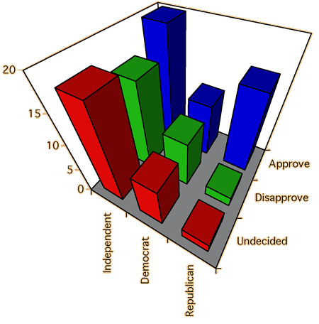
Chartjunk and perspective displays
Beware of adding chartjunk and perspective viewpoints to the display — they
just make it harder to understand the data.
The diagram below was drawn with Microsoft Excel. The perspective viewpoint
may look artistic, but it certainly does not help you to understand the
data!
What is the shape of the Democrat
distribution?
5.4.3 Clustered bar charts
Clustering bars in 2-dimensional bar chart
Rather than using a 3-dimensional bar chart, it is usually easier to assess
the relationships between two variables from 2-dimensional bar charts. The bars
can be clustered by either variable and it is often informative to examine both
of these displays.
Rank and age
The diagram below again shows the rank and ages of academic staff in a university
in the USA.
The bars are initially clustered by rank, allowing us to compare the age distributions
of the different ranks.
Select the option Age from the pop-up menu to cluster the
bars by age, allowing us to compare better the distributions of rank at the different
ages.
5.4.4 Marginal distributions
Examining the variables separately
Although our main interest is usually on the relationship between two categorical
variables, it can also be of interest to examine the overall distribution of each
variable separately. These are called the marginal distributions
of the two variables.
The marginal distributions are determined by the row and column totals of a
contingency table.
Rank and age in a university
Rank
Age
Full professor
Associate professor
Assistant professor
Instructor
Total
Under 30
002
003
057
06
68
30 to 39
052
170
163
17
402
40 to 49
156
125
061
06
348
50 and over
220
083
039
04
346
Total
430
381
320
33
The yellow highlighted values are the overall frequencies for each age category
in the university — i.e. the marginal distribution of age. For example, there
were (52+170+163+17) = 402 staff members who were aged 30 to 39.
Similarly, the green highlighted values give the marginal distribution of the ranks of the
university staff. The diagram below illustrates the two marginal distributions graphically.
Click the checkbox Stacked to stack the four bars for each age group. The height of each combined bar is the sum of the heights (and therefore the sum of the frequencies) for the four ranks at that age, and therefore describes the marginal distribution of ages.
Uncheck Stacked, select Rank from the pop-up menu, then select Stacked again. This stacks the bars for each rank and therefore shows the marginal distribution of ranks.
In a similar way, the marginal proportions for the variables are obtained by
adding the joint proportions across rows and down columns.
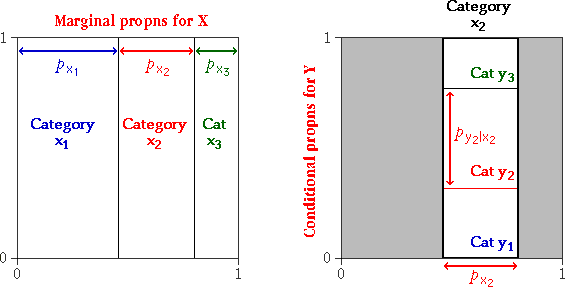
This can be expressed more generally as follows. If the joint proportion with
row-category x and column-category y is denoted by pxy,
then the overall proportion with row-category x is given by
and in a similar way, the marginal proportions for column-category y
are
Rank and age in a university
Rank
Age
Full professor
Associate professor
Assistant professor
Instructor
Total
Under 30
2/1164
3/1164
57/1164
6/1164
68/1164
30 to 39
52/1164
170/1164
163/1164
17/1164
402/1164
40 to 49
156/1164
125/1164
61/1164
6/1164
348/1164
50 and over
220/1164
83/1164
39/1164
4/1164
346/1164
Total
430/1164
381/1164
320/1164
33/1164
The highlighted values are the overall proportions for each age (yellow) and
rank (green) category in the university — i.e. the marginal distributions of
these two variables.
5.4.5 Conditional distributions
Spliting into groups
If the two variables can be treated as a response and an explanatory variable, it is useful to split the data into 'groups' using the explanatory variable, and compare the distributions of the response within the different groups. These are also called the conditional distributions of the response at each value of the explanatory variable.
Even if the two variables cannot be classified into a response and explanatory variable, similar methods can be used. If the variables are called X and Y,
we can either
compare the distributions of Y for each possible value of X
compare the distributions of X for each possible value of Y
These are called the conditional distributions of Y
given X, and the conditional distributions of X given Y, and proportions within
the groups would be used to make comparisons easier.
In the context of a contingency table, the conditional proportions are found
by dividing each frequency in the table by its row (or column) total. This
scales each row (or column) of the table to sum to 1.0.
Rank and age in a university
The following contingency table again shows the rank and age of all academic
staff in a university in the USA.
Select Proportion from the pop-up menu to see the conditional distributions for each Age group. In effect, this scales the frequencies in each row of the contingency table to add to 1.0. Click on the row for Under 30 to see how the conditional proportions are obtained by dividing the joint frequencies by the marginal frequency for Under 30.
Now choose Rank from the pop-up menu on the right to see the conditional distributions for each Rank. Click on columns to see how these conditional proportions are obtained from the joint frequencies.
Graphical displays of conditional distributions
The conditional distributions can be shown graphically on a 3-dimensional
bar chart, but a clustered 2-dimensional display is usually easier to interpret.
Note however that several different types of clustered displays can be drawn
— they make it easier to compare different aspects of the distributions.
Conditional probabilities for X given Y or Y
given X.
Clustered by Y or X.
Rank and age
The clustered bar chart below initially shows the joint frequencies for all combinations of
age and rank.
First select Rank from the pop-up menu under the bar chart to
cluster the bars by rank. The total number of instructors is small, so it is difficult to campare the ages of instructors to those of the other ranks. Select Propn within Rank from the pop-up menu at the top to display the conditional distributions of age within rank. It effectively scales each rank's bars to give the same total (1.0).
It is now easy to see that the age distributions of assistant professors and instructors are very similar, but both are different from those of associate and full professors.
Select Frequency and Age from the two menus to show the raw counts, clustered by age. Select Propn within Age to
display the conditional distributions of the ranks of staff who are in each age group.
This diagram emphasises the spike in assistant professors for the youngest staff, and the increasing proportion of associate and full professors as staff get older.
5.4.6 More about conditional distributions
Conditional distributions of X given Y and
Y given X
The conditional proportions for X given Y can be quite different
from the corresponding conditional proportions for Y given X.
You must be careful to distinguish between these.
Rank and age
The clustered bar chart below is identical to that on the previous page.
Select Propn within Age from the pop-up menu with bars still clustered by Age. This shows a conventional bar chart of the ranks separately for each age group.
Now select Rank from the menu to cluster the same bars by rank. This is a valid display but takes a little more thought to understand than the previous displays in which each cluster of bars was a separate bar chart. In this display, the bar chart giving the conditional distribution of ages for assistant professors is split between all of the clusters of bars.
This diagram clearly shows how the proportion of full professors increases steadily with age, and the proportion of assistant professors decreases steadily with age.
With the bars still clustered by Rank, consider the difference between the bar charts that are found with the options Propn within Age and Propn with Rank. For example, notice that:
84% of those aged under 30 were assistant professors
18% of assistant professors were aged under 30
A more extreme example of the difference between the conditional probabilities of X given Y and of Y given X, is that under 5% of women are pregnant at any time, but 100% of pregnant people are women!
5.4.7 Conditional vs marginal distns
Conditional and marginal distributions
Another important distinction is between the marginal distribution for a variable
and the conditional distributions. The following example illustrates.
Bruising of apples
The contingency table below describes bruising of 96 apples in a packing plant.
The apples were classified by the variety of apple (Granny Smith or Fuji) and
whether or not they were bruised. (The data are not real.)
OK
Bruised
Granny Smith
40
8
Fuji
24
24
The diagram below shows the apples, arranged in rows by variety.
Click on any group of apples to read off the marginal proportion of that type
of apple and its conditional proportion of bruising. Observe the notation
P(Bruised | Fuji)
for the conditional proportion of bruising given Fuji.
Choose Group by Bruising from the pop-up menu to rearrange
the apples according to whether or not they are bruised. The rearranged diagram
shows the marginal proportions for bruising and the conditional proportions for
variety, given bruising. Observe that
half of the apples are Granny Smiths (marginal proportion)
a quarter of the bruised apples are Granny Smiths (conditional proportion)
5/8 of the apples that are not bruised are Granny Smiths
(conditional proportion)
Observe also that
1/6 of the Granny Smiths are bruised
1/4 of the bruised apples are Granny Smiths
Proportional Venn diagrams
The diagrams above are closely related to stacked bar charts, where the widths
of the bars are given by the marginal proportions. This type of diagram is called
a proportional Venn diagram.
Note that the area of each rectangle is given by the joint
frequency of that pair of categories. (It is determined by the number of apples
in it!)
Although proportional Venn diagrams do not help greatly in understanding
this section of CAST, they will be useful for explaining various concepts in later
sections.
Click the checkbox Hide Icons in the diagram above. Depending
on whether the apples have been grouped by bruising or by variety, the diagram
will be similar to stacked bar charts of the other variable.
Change the grouping variable and observe that the four areas remain the same
— they are determined by the four joint frequencies.
5.5 Presenting data in tables
Gridlines and white space
Layout and annotation
Significant digits and data noise
Meaningful variables
Swapping rows and columns
Reordering rows
Example
5.5.1 Gridlines and white space
Tables from spreadsheets
Tables are often initially produced in a spreadsheet such as Microsoft Excel.
Spreadsheets usually box all cells with horizontal and vertical gridlines
as a default and many reports include tables that are copied from a spreadsheet
without further formatting. Never publish
tables that box all values.
Lines should only be used in tables to separate headings or
groups of related rows and columns.
It is best to use as few lines as possible. Consider using a bold typeface
for headings or using extra white space to separate rows and columns as an
alternative to lines.
Reasons for HIV testing
Botswana has an extremely high incidence of HIV/AIDS and instituted Routine
HIV testing in 2004. The table below shows the reasons given for getting
an HIV test by those who were tested in 2006, as published in a report by
the Botswana Ministry of Health.
Reason
No.
%
Needle/Surg. Injuries
279
0.2
Rape
1502
0.8
TB
1564
0.9
STI
2745
1.5
Med Exam
4717
2.6
Clinical Suspicion
15387
8.5
PMTCT
45590
25.0
VCT
102443
56.3
Other
7825
4.3
The centring of values in this frequency table make it harder to scan down
columns and the gridlines are distracting and unnecessary. The table below
presents the data more effectively.
Reason
No.
%
Needle/Surg. Injuries
279
.2
Rape
1,502
.8
TB
1,564
.9
STI
2,745
1.5
Med Exam
4,717
2.6
Clinical Suspicion
15,387
8.5
PMTCT (pregnancy)
45,590
25.0
VCT (voluntary)
102,443
56.3
Other
7,825
4.3
Reading across rows of large tables
Simple frequency tables such as the HIV-testing table above only have a single
column of values (or two columns if both counts and percentages are shown).
Published tables often have many more columns — perhaps combining several
frequency tables (e.g. separate counts for both males and females) or with
other information about each row category.
In large multi-column tables, the first column usually contains names that
label the rows (e.g. a region or company name) and it can be difficult associating
values in the rightmost columns with their row label.
Although regular gridlines should be avoided in small tables,
subtle gridlines can help read across rows of very large tables with many
columns.
Hairlines can be drawn between occasional rows, or some rows can be printed
over a very light grey background.
Some very large tables have so many columns that they stretch over two facing
pages. The column of row labels can be repeated in the rightmost column of
the table to make it easier to associate values with their row label.
Populations of countries
The first few rows of a table published by the United Nations Statistics
Division about the populations in all UN countries in mid-2007 (or the most
recent figures) are shown below. Light shading behind some rows makes it
easier to read across from the country names to the annual population growth
rates.
Country
or area
Population
(in thousands)
Sex ratio
of
Annual population
population
growth rate
2005-2010
Year
Total
Men
Women
men/100 women
%
Afghanistan
2007
27,145.3
14,059.5
13,085.8
107
3.85
Albania
2007
3,190.0
1,587.6
1,602.5
99
0.57
Algeria
2007
33,857.9
17,091.2
16,766.7
102
1.51
American Samoa1
2000
**
57.3
28.0
29.3
96
2.31
c
Andorra
2007
74.6
...
...
...
0.36
Angola
2007
17,024.1
8,394.5
8,629.6
97
2.78
Anguilla
2001
*
11.4
5.8
5.6
103
1.66
c
Antigua and Barbuda
2001
*
77.4
40.4
37.0
109
1.27
c
Argentina
2007
39,531.1
19,330.7
20,200.4
96
1.00
Armenia
2007
3,002.3
1,396.6
1,605.6
87
-0.21
Aruba
2007
103.9
49.7
54.2
92
0.01
Australia2
2007
20,743.2
10,322.0
10,421.2
99
1.01
Austria
2007
8,360.7
4,099.4
4,261.4
96
0.36
Azerbaijan
2007
8,467.2
4,115.5
4,351.7
95
0.75
Bahamas
2007
331.3
162.0
169.3
96
1.20
Bahrain
2007
752.6
430.7
321.9
134
1.79
Bangladesh
2007
158,665.0
81,164.0
77,500.9
105
1.67
Barbados
2007
293.9
142.4
151.5
94
0.32
Belarus
2007
9,688.8
4,509.3
5,179.5
87
-0.55
Belgium
2007
10,457.3
5,119.7
5,337.6
96
0.24
Belize
2007
287.7
145.0
142.7
102
2.08
(The table was followed by several footnotes which are not repeated here.)
5.5.2 Layout and annotation
Layout of columns
Think carefully about how to arrange the rows and columns.
Values that you are interested in comparing should be close
to each other.
Reordering the rows and columns should be considered. Judicious use of white
space can help to separate different groups of values and therefore bring
related values closer together.
Annotation
When a table is included in a report, the main information that can be gained
from the table should also be summarised in the body of the report in words.
Do not simply repeat the values in the table. The annotation
should summarise and interpret.
UN survey responses
The table below was published in a United Nations report describing the
results of a survey of countries about implementation of a set of 'Fundamental
Principles of Official Statistics' by their National Statistics Offices.
The table summarises which countries responded to the survey questionnaire.
This table contains:
Two frequency tables — separately categorising the
countries that were sent the questionnaire (recipients) and those returning
the completed questionnaire (respondents) by region.
Two tables that categorise recipients and respondents
by development category. (Their presentation is non-standard since the
least developed countries are included in both of the first two rows.)
A column of response rates for each development category and region.
Because the columns of frequencies are not adjacent and the columns of percentages are not adjacent,
comparisons are harder. A better format for the table groups together the
columns of related values and separates these groups with white space.
(We have also made improvements to the column headings and replaced the
first two rows of the table with the country categories Least developed
and Other developing to form a standard frequency table.)
Textual summary
A description of the table in the report should point out the much higher
response rates in the developed countries, and particularly in Asia and
Europe. As a result, the
least developed countries (especially Oceania, the Americas and Africa)
are under-represented in the survey and in the remainder of the report.
5.5.3 Significant digits and data noise
Signal and noise
Any graphical or tabular display of data should be designed to highlight
important features of the data. This useful information in the display is
called its signal. Other aspects of the display that do not
contain information that can be usefully interpreted are called the noise
in the display.
Edward Tufte, in an excellent book about data presentation (The Visual
Display of Quantitative Information, 1983), distinguished different kinds
of noise in displays.
Non-data noise
This refers to unnecessary graphics and gridlines that are added to displays.
Tufte recommends minimising the amount of 'non-data ink' in any display.
Data noise
Data noise is information about the data that does not help the reader
to understand the 'signal' in the data. Many reports are full of data noise
— the writer has spent time collecting data and does not want to miss any
of it out, even if it is not relevant!
Both kinds of noise make it harder to detect the signal in a display, so
noise should be avoided.
Significant digits
One type of data noise is very common, but easily removed. Many tables contain
values that are reported with more significant digits than necessary. Usually
the pattern of values in a table can be understood from only their first 2
or 3 digits — the remaining digits are data noise.
(If the complete data may be needed by others for further analysis, the full
data can be included in an appendix or made available on a web site, but not
in the body of a report.)
Car colours in New Zealand
The table below describes the colours of all cars registered in New Zealand
in 2006.
Nobody reading the table would be interested in the final few digits of
the values. Use the '-' button under the frequencies to reduce the number
of significant digits displayed.
Showing the frequencies to the nearest thousand removes data
noise from the table but retains all useful information.
In a similar way, round the proportions to 3 decimals — further digits
do not help you to understand the data.
Finally click the Percentage checkbox to display percentages
instead of proportions. This simply multiplies the proportions by 100, but
it removes some of the leading zeros and therefore makes the values stand
out better
Licensed vehicles in New Zealand
The next table was also published on the Land Transport New Zealand web
site. It describes the types of vehicles licensed in June 2006 and the changes
during the previous two years.
June 2006
June 2005
June 2004
Total
% variation from prev year
Total
% variation from prev year
Total
Cars
2,232,915
2.00
2,189,187
3.35
2,118,240
Rental cars
21,754
-3.76
22,604
2.15
22,128
Taxis
8,011
-1.97
8,172
1.03
8,089
Trucks
408,757
2.23
399,843
3.51
386,295
Buses/coaches
16,486
5.20
15,671
4.95
14,932
Trailers/caravans
420,289
2.76
408,982
2.99
397,113
Motorcycles
43,513
15.37
37,717
8.16
34,873
Mopeds
14,171
37.82
10,282
19.32
8,617
Tractors
27,124
2.27
26,521
4.91
25,279
Exempt vehicles
11,130
7.77
10,328
6.39
9,708
Miscellaneous
22,464
7.25
20,946
9.06
19,206
Total
3,226,614
2.42
3,150,253
3.47
3,044,480
The last 2 or 3 digits of the counts are of little relevence to most policy
makers or other readers of the table. These values could be made available
in a separate appendix (or as a linked file in spreadsheet format), but
most users would get the same information more clearly if the vehicle counts
were given to the nearest thousand and the percentage changes were shown
with a single decimal digit.
The table below also rearranges the columns to separate the columns of
vehicle counts from the columns of percentage change. This makes it easier
to compare related values.
Number in June (thousand)
Percentage change
2006
2005
2004
2005-6
2004-5
Cars
2,233
2,189
2,118
2.0
3.4
Rental cars
22
23
22
-3.8
2.2
Taxis
8
8
8
-2.0
1.0
Trucks
409
400
386
2.2
3.5
Buses/coaches
17
16
15
5.2
5.0
Trailers/caravans
420
409
397
2.8
3.0
Motorcycles
44
38
35
15.4
8.2
Mopeds
14
10
9
37.8
19.3
Tractors
27
27
25
2.3
4.9
Exempt vehicles
11
10
10
7.8
6.4
Miscellaneous
22
21
19
7.3
9.1
All licensed vehicles
3,227
3,150
3,044
2.4
3.5
It could be argued that one decimal digit for the category Taxis since the numbers are so small that they do not change
when rounded to thousands. However the columns of percentage change adequately describe the differences
between the years for these categories.
5.5.4 Meaningful variables
Displaying meaningful data
It is important to think carefully about which values to present in tables.
In some situations, the most obvious data are not the easiest to interpret,
but a simple ratio or difference of values is much more easily understood
and meaningful. A few examples will illustrate.
Percentages and proportions
In simple frequency tables, it is often easier to understand the proportions
(or percentages) in the different categories than the raw counts.
This is even more important when comparing the distribution of a categorical
variable in several groups, especially if the total number of individuals
differs between the groups.
It is much easier to compare proportions or percentages between
groups than to compare raw frequencies.
Tourists in Hawaii
In 2005, a survey was conducted of tourists arriving in Hawaii. The following
table is based on the results of that survey and shows the total number
of tourists (in thousands) who arrived in Hawaii in 2005 from the most important
originating regions, and categorised by their 'lifestage'.
US West
US East
Japan
Canada
Europe
Wedding/honeymoon
103.1
110.0
192.7
8.0
131.5
Family (with children)
667.1
297.1
485.6
44.5
94.4
Young (18-34)
403.3
243.1
229.1
38.8
210.1
Middle aged (35-54)
955.2
634.7
308.0
75.1
374.2
Seniors (55+)
903.7
643.5
303.5
82.3
314.6
Total
3,032.5
1,929.3
1,517.4
248.6
1,123.7
Each column of this table is a frequency table for tourists arriving from
one region. However it is difficult to make meaningful comparisons between
the regions since their totals are so different.
The following table shows each column as percentages.
US
West
US
East
Japan
Canada
Europe
Wedding/honeymoon
3.4
5.7
12.7
3.2
11.7
Family
(with children)
22.0
15.4
32.0
17.9
8.4
Young
(18-34)
13.3
12.6
15.1
15.6
18.7
Middle
aged (35-54)
31.5
32.9
20.3
30.2
33.3
Seniors
(55+)
29.8
33.3
20.0
33.1
28.0
Total
100.0
100.0
100.0
100.0
100.0
In this form, it is much easier to understand the differences between the
types of tourist from the different regions. In particular, it is clearer
that:
A bigger proportion of tourists from Japan are Wedding/honeymoon
and Family than from the other regions. Also, more tourists
from Europe are Wedding/honeymoon but very few are Family.
Ratios
In some situations, the rows of a table correspond to items of different
'size'. Dividing values by a measure of size can then make it easier to compare
rows. For example,
For comparisons of GDP, exports, and other 'dollar' amounts between countries,
the data are usually divided by population size to give a 'per capita' value.
If financial quantities are tracked over years in which there is inflation,
they are usually divided by a price index such as the consumer price index
(CPI) in order to see how the 'value' of the quantities changes.
TB cases in SADC countries
The next table shows the numbers reported cases of TB in the countries
of the Southern African Development Community (SADC) in 2005. (Figures from
Mauritius were unavailable.)
The largest numbers are associated with the countries with the biggest
population, so the table mainly tells you about the sizes of the countries.
Click Show Cases per 1000 to add a column showing the
populations of the countries and a final column containing the ratio of
TB cases to the population size. This last column shows the TB cases per
1000 of population, so the values in different countries can be more meaningfully
compared.
Note that the table only describes reported
TB cases, so some of the smaller rates are caused by under-reporting,
not just better health.
Finally, use the '-' button to reduce the digits displayed for the TB rates.
Two significant digits would be sufficient in most reports.
Wine production in New Zealand
The table below gives the wine production (in tonnes) in New Zealand from
1986 to 2001.
Although these values show considerable variation in wine production between
1986 and 2001, with a slightly increasing trend, there was also a great
increase in the area of vinyards in this period. Click Show Yield
to see the area of vinyards (hectares) and the yield (tonnes per hectare).
Use the '-' button to reduce the number of decimal digits in the column
of yields.
The yield from vinyards in New Zealand increased until about
1990, but has dropped sharply in more recent years.
Various factors might explain the drop in wine yields — for example, use
of land that is less well suited to vines or a move to higher-quality varieties.
5.5.5 Swapping rows and columns
Comparing values down columns
We have mentioned that it is easiest to compare values if they are close
together in a table. The layout and use of white space should be used to encourage
comparison of related values.
In particular, it is easier to compare values down columns than across rows
— their most significant digits are closer.
Consider swapping the rows and columns of a table so that the most
meaningful comparisons are made by scanning down columns.
Tourists in Hawaii
On the previous page, we showed the 'lifestage' of tourists arriving in
Hawaii in 2005. The table below again shows the percentages of tourists
from the different regions who were in each 'lifestage' category.
US West
US East
Japan
Canada
Europe
Wedding/honeymoon
3.4
5.7
12.7
3.2
11.7
Family
(with children)
22.0
15.4
32.0
17.9
8.4
Young
(18-34)
13.3
12.6
15.1
15.6
18.7
Middle
aged (35-54)
31.5
32.9
20.3
30.2
33.3
Seniors
(55+)
29.8
33.3
20.0
33.1
28.0
Total
100.0
100.0
100.0
100.0
100.0
In this table, the values that stand out are:
the high percentage of wedding/honeymoon for Japan and Europe
compared to the other regions
the relatively high percentage of family for Japan and low
percentage of family for Europe.
These features are detected by scanning across the rows of the table.
They are clearer if the rows and columns of the table are swapped, so the
comparisons are made down columns.
Wedding /honey -moon
Family (plus children)
Young (18-34)
Middle aged (35-54)
Seniors (55+)
Total
US West
3.4
22.0
13.3
31.5
29.8
100.0
US East
5.7
15.4
12.6
32.9
33.3
100.0
Japan
12.7
32.0
15.1
20.3
20.0
100.0
Canada
3.2
17.9
15.6
30.2
33.1
100.0
Europe
11.7
8.4
18.7
33.3
28.0
100.0
5.5.6 Reordering rows
Order for the rows of a table
In many tables, the rows are ordered alphabetically by their row names, but
it is usually better to reorder them in another meaningful way.
Some data about Africa
The table below shows three columns of health information about some African
countries (mostly data from 2003). Only countries with populations over
10 million have been included to keep the table to a managable size.
The countries are initially sorted into alphabetic order. This helps to
quickly find the values for any particular country, but
rarely helps you to see what is associated with differences between the
values in the columns.
Use the pop-up menu to reorder the countries from North to South.
This ordering helps to show whether there are any geographical patterns.
Next try ordering the countries by their GDP per capita (with
the wealthiest countries at the top). This might show whether the wealth of the
countries are associated with the variables.
Finally, try ordering the countries based on the variables that are displayed
in the table. For example, order by TB rates. Do the countries with high TB rates
also have high HIV/AIDS rates? Fewer nurses?
There is no 'correct' way to order the rows of a large table
and the 'best' order depends on the information that you want to highlight.
However there are usually better ways than alphabetic order.
5.5.7 Example
We end this section with a published table that can be improved using many
of the techiques described in the last few pages.
Tourist arrivals in South Africa
The following table was published as part of a report on tourism in South
Africa. It describes the origin of tourist arrivals in 2004 and the amounts
that they spent in South Africa (excluding capital expenditure).
Average spend in SA
Number of arrivals
ALL FOREIGN TOURISTS
R 7,920
6,677,839
R 43,220,861,797
AFRICA & MIDDLE
EAST
R
7,333
4,673,724
R 27,572,457,398
Angola
R 9,561
28,543
R 272,899,623
Botswana
R 3,678
802,715
R 2,952,385,770
Kenya
R 7,235
19,549
R 141,437,015
Lesotho
R 2,629
1,470,953
R 3,867,135,437
Malawi
R 7,164
89,205
R 639,064,620
Mozambique
R 20,990
355,840
R 7,469,081,600
Namibia
R 6,141
225,882
R 1,387,141,362
Nigeria
R 8,091
23,441
R 189,661,131
Swaziland
R 3,754
849,176
R 3,187,806,704
Tanzania
R 11,474
10,991
R 126,110,734
Zambia
R 7,186
121,384
R 872,265,424
Zimbabwe
R 7,702
551,113
R 4,244,672,326
Unspecified
R 8,043
151,432
R 1,217,967,576
Other Africa and Middle East
R 8,043
124,932
R 1,004,828,076
AMERICAS
R 8,838
290,625
R 2,281,015,481
Brazil
R 7,561
21,137
159,816,857
Canada
R 8,281
37,170
R 307,804,770
USA
R 7,872
208,159
R 1,638,627,648
Other Americas
R 7,234
24,159
R 174,766,206
ASIA & AUSTRALASIA
R 8,331
275,001
R 2,328,135,275
Australia
R 8,867
75,675
R 671,010,225
China (including
Hong Kong)
R 9,567
51,080
R 488,682,360
India
R 8,834
36,172
R 319,543,448
Japan
R 6,555
23,091
R 151,361,505
Other Asia
and Australasia
R 7,839
88,983
R 697,537,737
EUROPE
R 8,480
1,287,057
R 11,039,253,643
France
R 6,647
109,276
R 726,357,572
Germany
R 8,824
245,452
R 2,165,868,448
Italy
R 7,496
50,429
R 378,015,784
Netherlands
R 8,199
120,838
R 990,750,762
Sweden
R 9,017
32,247
R 290,771,199
UK
R 8,956
456,368
R 4,087,231,808
Other Europe
R 8,810
272,447
R 2,400,258,070
This table can be improved in several ways:
Grid lines
Every entry in the table is boxed. Removal of the lines brings the values
closer together and makes it easier to make comparisons.
Significant digits
Far too many significant digits are shown. The accuracy of the collected
data is unlikely to be as high as the reported values (especially for
the total expenditures) and it is hard to envisage any use of the data
that would require such accuracy. (The 'R' indicating the currency can
also be removed.)
Reordering categories
The countries in each region have been ordered alphabetically. Reordering
by either the number of arrivals or the total expenditure is better —
makes it easier to spot unusual values in other columns. (Reordering the
columns may also help.)
The table below presents the data more clearly. The eye is encouraged to
scan down columns looking for patterns and unusual values.
Arrivals
(000)
Total expenditure
(R 000,000)
Average
spend (R 000)
ALL FOREIGN TOURISTS
6,678
43,221
7.9
AFRICA & MIDDLE EAST
4,674
27,572
7.3
Lesotho
1,471
3,867
2.6
Swaziland
849
3,188
3.8
Botswana
803
2,952
3.7
Zimbabwe
551
4,245
7.7
Mozambique
356
7,469
21.0
Namibia
226
1,387
6.1
Zambia
121
872
7.2
Malawi
89
639
7.2
Angola
29
273
9.6
Nigeria
23
190
8.1
Kenya
20
141
7.2
Tanzania
11
126
11.5
Unspecified
151
1,218
8.0
Other Africa and Middle East
125
1,005
8.0
EUROPE
1,287
11,039
8.5
UK
456
4,087
9.0
Germany
245
2,166
8.8
Netherlands
121
991
8.2
France
109
726
6.6
Italy
50
378
7.5
Sweden
32
291
9.0
Other Europe
272
2,400
8.8
AMERICAS
291
2,281
8.8
USA
208
1,639
7.9
Canada
37
308
8.3
Brazil
21
160
7.6
Other Americas
24
175
7.2
ASIA & AUSTRALASIA
275
2,328
8.3
Australia
76
671
8.9
China (including Hong Kong)
51
489
9.6
India
36
320
8.8
Japan
23
151
6.6
Other Asia and Australasia
89
698
7.8
5.6 Logistic regression
Categorical responses
Fitted values and predictions
Logistic curve
Obtaining a good fit
5.6.1 Categorical responses
Data with one categorical and one numerical variable
We have previously examined bivariate data sets with...
Two numerical variables
Scatterplots show the relationship; correlation and least squares lines summarise
it.
Two categorical variables
Clustered and stacked bar charts help you to understand the relationship.
This section briefly examines the remaining combination...
One numerical and one categorical variable
Analysis depends on how the two variables are classified into a response and
and explanatory variable.
Numerical response and categorical explanatory variable
An ecologist traps 50 rats in a nature reserve and records the weight and sex
of each. Weight should be treated as the response variable since gender could
affect weight, but the weight could not affect the rat's gender.
When the explanatory variable is categorical, it should be used to split the
individuals into groups. The methods that were described earlier for comparison
of numerical distributions can be used. For example, the distributions might be
compared with box
plots.
This diagram helps us to understand how weight depends on sex.
Categorical response and numerical explanatory variable
When the categorical variable is the response, a different analysis is required.
If we were analysing the relationship between scarring and weight of male rats
in the above survey, presence of scarring should be treated as the response variable.
Analysis is harder, but we might split weights into categories (e.g. under
200g, 200g to 300g, ...) and use this to split the individuals into groups. Stacked
bar charts might then be used to display the relationship.
This diagram helps us to understand how the proportion with scars depends on
weight.
When there is no unique response...
In other situations, the classification of variables into a response and explanatory
variable is less clear. If rats were classified by weight and their willingness
to take a poisoned bait, it cannot be argued that one variable cannot
affect the other. (More 'inquisitive' rats may find more food, or larger rats
may be 'bolder'.)
To examine the association between the variables, there are therefore two
complementary ways to examine the data.
The remainder of this section expands on how we might explain a categorical
response in terms of a numerical explanatory variable.
Menstruation and age
A study was conducted in Warsaw to determine the proportions of girls who
had started menstruating at different ages. A total of 3,898 girls of various
ages between 8 and 19 were asked whether they had started menstruating.
Menstruation
Age class (to nearest month)
Menstruating
Total girls
8 yr 6 mths - 9 yr 11 mths
9 yr 12 mths - 10 yr 5 mths
10 yr 6 mths - 10 yr 8 mths
10 yr 9 mths - 10 yr 11 mths
10 yr 12 mths - 11 yr 2 mths
11 yr 3 mths - 11 yr 5 mths
11 yr 6 mths - 11 yr 8 mths
11 yr 9 mths - 11 yr 11 mths
11 yr 12 mths - 12 yr 2 mths
12 yr 3 mths - 12 yr 5 mths
12 yr 6 mths - 12 yr 8 mths
12 yr 9 mths - 12 yr 11 mths
12 yr 12 mths - 13 yr 2 mths
13 yr 3 mths - 13 yr 5 mths
13 yr 6 mths - 13 yr 8 mths
13 yr 9 mths - 13 yr 11 mths
13 yr 12 mths - 14 yr 2 mths
14 yr 3 mths - 14 yr 5 mths
14 yr 6 mths - 14 yr 8 mths
14 yr 9 mths - 14 yr 11 mths
14 yr 12 mths - 15 yr 2 mths
15 yr 3 mths - 15 yr 5 mths
15 yr 6 mths - 15 yr 8 mths
15 yr 9 mths - 15 yr 11 mths
15 yr 12 mths - 19 yr 3 mths
The response is a categorical variable with two possible values (menstruating
or not menstruating). How does the proportion menstruating depends on the explanatory
variable age?
The bar charts below help to explain the relationship. The bar chart for each
age group is centred on the middle age in the class.
Click the checkbox Stacked. Both the stacked and unstacked
displays show clearly the increase in the proportion menstruating with age.
Bad displays of the data
Choose the option Frequency from the pop-up menu. There
are two problems with the stacked and unstacked bar charts of the counts.
They highlight the distribution of ages in the data. This is largely determined
by how the researcher selected girls for the study and is not a feature of interest
The bar charts are misleading displays of the distribution of ages! Although
most age classes are 3 months wide, one is 6 months wide and the extreme classes
are much wider. As a result, the wider classes have disproportionately high counts.
To properly represent the distribution of ages of the girls, a histogram should
be used. (See histograms
with unequal class widths.)
5.6.2 Fitted values and predictions
A linear model for proportions?
When we tried to model how a numerical explanatory variable effected a
numerical response variable, we used a linear equation to model the
relationship,
When the response variable is categorical, it is tempting to try a similar linear
equation to explain how the proportion in one response category is affected by the explanatory
variable,
predicted proportion,
Unfortunately however, ...
... a linear equation is not
appropriate for a proportion since it may result in predicted proportions
greater than 1.0 or less than 0.0.
Nonlinear models
To model how a proportion depends on a numerical explanatory variable, X,
an equation should give values between 0 and 1 for all possible values
of X. This means that the equation must be nonlinear in X.
Fruit flies on mangoes
In an experiment to assess the effectiveness of heat-treatment of mangoes as
a method of killing fruit fly eggs and larvae, several infested fruit were heat-treated
at temperatures ranging from 39 to 46 degrees Celsius. The numbers of fruit fly eggs
surviving at each temperature are shown in the table below.
Temp
Alive
Dead
Total
39 degrees
41 degrees
43 degrees
44 degrees
45 degrees
46 degrees
117
222
132
366
64
526
30
542
1
588
0
607
339
498
590
572
589
607
The proportions surviving are shown in the following stacked barchart. A straight line
has been drawn on the diagram to model how the proportion dying might depend on temperature.
Drag the vertical red line on the axis to obtain the predicted
proportion dying at different temperatures.
The linear model is a reasonably close fit to the data between 39 and 45 degrees.
From the slope of the line (approximately 0.056), we can tell that aproximately 5 percent
of eggs are killed for each extra degree in temperature.
However the linear model predicts that more than 100% of eggs will be
killed at temperatures greater than 46 degrees. Any linear model will predict
proportions outside the range 0-1 for extreme enough values of X.
Now select the option Nonlinear model from the pop-up menu.
This curve is better than the previous straight line since it remains between 0.0 and
1.0 for all ages.
Again drag the vertical red line on the axis to obtain the predicted
proportion dying at different temperatures. A nonlinear model can provide reasonable
predictions at all temperatures.
5.6.3 Logistic curve
A curve that lies between 0 and 1 for all values of X
A linear equation cannot provide adequate predictions of the
proportion in a response category at extreme values of X. There are various
nonlinear equations that satisfy the requirement that their value is between 0
and 1 for all values of X, but the simplest of these is a logistic
curve,
predicted proportion,
Logistic curves satisfy the requirement because...
The numerator and denominator are always positive, so their ratio must be
positive too.
The denominator is 1.0 greater than the numerator, so the ratio must be less
than 1.
The parameters of the logistic curve
The constants b0
and b1
have a similar effect on the shape of the logistic curve to the corresponding
parameters of a linear equation.
The parameter b0
determines the horizontal position of the curve. Increasing it shifts the curve
to the left.
The parameter b1
determines the slope of the curve. Increasing it makes the curve steeper, and
its sign determines whether the curve slopes upwards or downwards.
We again call b0
the intercept of the curve and we call b1
the slope.
The diagram below shows a logistic curve, and has two sliders that can be used
to adjust the values of the two logistic parameters.
Use the sliders to observe that ...
Changing the intercept parameter shifts the logistic curve to the left or right.
Changing the slope parameter affects how steep the curve is.
When the slope is positive, the curve predicts that the proportion will increase
with increasing x. When the slope is negative, the curve predicts that the
proportion will decrease with increasing x.
Changing the slope does not affect the predicted proportion at x = 0.
These properties are shared with linear models.
5.6.4 Obtaining a good fit
Computers can find good values for the model's constants
Linear models are fitted to data by selecting the values of the two parameters
b0
and b1
to minimise the sum of squares of residuals.
Unfortunately the parameters b0
and b1
of a logistic model cannot be obtained with such a simple criterion. Model-fitting
for proportions is based on a method called maximum likelihood
that is beyond the scope of CAST.
However many statistical programs will do the appropriate calculations for you.
We therefore take a 'black box' approach and show what parameter estimation gives
without further justification.
The diagram below again shows the data on survival of fruit fly eggs.
Drag the two red arrows on the logistic curve to change the parameters
of the curve. Try to match the curve as closely as possible to the data.
Finally, click the button Best fit to observe the 'best' values for
the parameters.


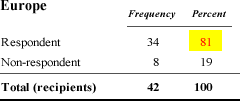
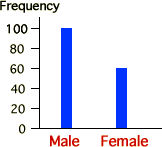 If
a categorical data set has only a few distinct categories, the information in
it can be very simply expressed. For example, consider the sex of each of 160
sparrows that an ecologist trapped. The bar chart on the right only shows that
there were 100 males, 62.5% of the captured birds.
If
a categorical data set has only a few distinct categories, the information in
it can be very simply expressed. For example, consider the sex of each of 160
sparrows that an ecologist trapped. The bar chart on the right only shows that
there were 100 males, 62.5% of the captured birds.