Variation in data is not simply an annoyance — the variation itself can
hold important information. An important role of statistics is to display
and describe this variation in ways that highlight the information in it.
Yam growth data
The table below shows the growth (cm) of the main stalks of 20 yam plants over a period
of seven days.
Growth of yam plants (cm)
10.1
9.2
11.9
6.3
7.4
5.4
9.3
11.1
7.2
6.8
9.1
10.9
10.1
7.4
9.2
9.5
6.0
5.3
8.9
10.4
What can you see?
There is clearly variability between yam plants and a quick scan shows that
all values are between 5 and 12 cm. But what else can be easily learned
from the table?
Sorting the data can help
It is not easy to obtain further useful information from a table of raw
data. Different displays of the data may however highlight meaningful patterns.
Graphical displays are usually most effective, but even sorting the data
into order gives some insight into the values.
The list below again shows the yam growth data. Firstly, examine the unordered
list of values. It is difficult to see any unusual features in the raw data.
Drag the slider to the right to sort the data into increasing order,
then look for features in the sorted list of values.
Perhaps the two clusters correspond to different varieties of yam? Or yams
grown in different types of soil? This analysis suggests further investigation
by the researcher.
2.1.2 Basic dot plot
Graphical displays of density
Sorting a batch of numbers into order can highlight which ranges of values
are most and least common — in other words, the values with highest and lowest
density. Density is the key to understanding the distribution
of numbers in a batch, but there are better ways to display density than a
sorted list.
Dot plots
The simplest graphical display of a batch of numbers is a dot
plot. This shows each value as a cross (or dot) against a
numerical axis.
Yam growth data
The sorted list on the left below shows growth (cm) of the main stalks
of 20 yam plants over a period of seven days. The data are also displayed
in a dot plot on the right.
Drag with the mouse over values on the list to
highlight the corresponding cross in the dot plot. Drag
over crosses to highlight the corresponding value in the list.
Observe that when successive values in the list are similar, the corresponding
crosses are close together. High density is therefore shown in the dot plot with
closely grouped crosses.
Note that the 'gap' in the list between 7.4 and 8.9 is clearer in the dot plot.
Two modifications to the basic dot plot make it more effective at displaying
density in larger batches of values. These will be described in the following pages.
2.1.3 Jittered dot plot
In large data sets, jittering the crosses helps show density
A simple dot plot is often adequate for small data sets. However in larger data sets,
the crosses often overlap. Indeed, if several crosses
coincide, they become indistinguishable from a single cross, so high
density may be obscured.
One solution is to randomly move the crosses perpendicularly to the axis in order
to separate them somewhat. This is called jittering the points.
(You should rely on a computer to do the jittering
for you, but it could be done by hand by rolling a 6- or 10-sided die for
each cross to determine its jittering in millimetres.)
Coyote Length data
The diagram below plots the lengths (cm) of 83 coyotes that were captured
in Nova Scotia, against a horizontal axis.
Drag the slider to jitter the points. Click
the button on the right to change the jittering — i.e. to change the random
vertical position of the crosses.
Only enough jittering should be used to separate the high density of crosses —
moving the slider about half way is best for the data above. Without jittering,
too many crosses overlap to allow us to assess the distribution of values.
Note that the vertical positions of the crosses have no importance
— the vertical movement of crosses is 'random' and is only intended to separate
overlapping crosses.
An alternative solution to the problem of overlapping crosses will be described on
the next page.
2.1.4 Stacked dot plots
Stacking the crosses shows density better
Jittering large batches of values can provide an effective display of ranges of high
and low densities of values. However the randomness of the jittering
can be disconcerting.
A stacked dot plot uses the perpendicular axis more directly to
show density. A stacked dot plot is obtained by ...
grouping values into classes, then
stacking the crosses in each class on top of each other.
The diagram below illustrates this stacking.
Coyote Length data
The jittered dot plot below shows the body lengths (cm) of 83 coyotes that were captured
in Nova Scotia.
Click the button Animate Stacking.
Blue vertical lines are first drawn to define the classes.
Each cross is then moved horizontally to the centre of its class.
Finally, the crosses are stacked.
The slider can be used to replay the animation more slowly.
Jittered vs stacked dot plots
For data analysis purposes,
Stacked dot plots show the distribution of values in a data
set better than jittered dot plots.
For teaching purposes in CAST however, jittered dot plots are often the most
effective way to explain statistical concepts, so it is important that you understand
them.
Jittered dot plots are extensively used in CAST.
Grouping and loss of detailed information
Stacked dot plots involve some loss of detailed information about the individual
values. The bigger the crosses, the coarser the grouping and the greater the loss
of detailed information.
However stacked dot plots more clearly show density through the heights of
the stacks.
The loss of detailed information in a stacked dot plot is rarely
important.
Select different cross sizes in the diagram above and replay the animation.
Large crosses require a coarser grouping of values, so the stacks tend to be higher.
Many of the raw data values were recorded to the nearest cm, so little information
is lost from the grouping..
2.1.5 Stem and leaf plots
Digits instead of crosses
Stacked dot plots group the values into classes, so some detailed information
about the values is lost.
A clever way to retain some of this lost detail replaces each cross with a
digit (0 to 9) that shows information about the position of the value within its
stack.
Nursing home residents
You are interested in establishing a nursing home for retired people in the
USA. Where should it be sited? Information about current nursing home usage in
the different states would be useful.
The stacked dot plot below shows the number per 500 population aged 65 or more
who are nursing home residents in each state.
Drag with the mouse over the crosses to discover the names
of the states.
The crosses only allow you to read off the 'units' digits of the values —
Michigan (18.0) and Wyoming (18.9) are on the same stack of crosses. Select Digits
from the pop-up menu. The crosses are replaced by the 'tenths' digits of the values.
(Unfortunately neither display directly
helps your decision on where to site the new nursing home. Should you pick the
state with the lowest number of nursing home residents since there is a lack of
facilities? Or would that be the worst choice since elderly people in the state
do not seem to like using nursing homes? Further information is needed!)
Stem and leaf plots
A stem and leaf plot is basically a stacked dot plot using
digits instead of crosses. However the layout of the display is slightly different.
The 'axis' is drawn vertically.
A value is printed on the axis for each stack, giving the most significant
digits that are common for all values on that stack. This is called the stem
for the stack.
The digits representing the values are called the leaf digits
and are drawn in a row to the right of the stems.
Decimal points are not shown in the stems or the leaves, so a key must be
shown giving an example. (The stem '12' and leaf '3' could represent 123 or 12.3
or 1.23 or 0.123, etc. so the key must explain how to translate the stem and leaf
into a data value.)
The layout of a stem and leaf plot makes it particularly easy to read off the
values that the leaves represent:
Writing the digit displayed for any value (called its leaf
digit) after the stack's stem digits gives the most significant digits of the
value.
The format is most easily understood with an example.
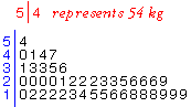
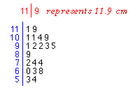
Yam Growth data
The stem and leaf plot below shows growth (cm) of the main stalks of 20 yam
plants over a period of seven days.
Click on any leaf in the plot (a black digit). The corresponding data value
is shown above the plot.
Observe that the stem is the 'tens' and 'units' digits of the value and the
leaf is its 'tenths' digit.
2.1.6 Splitting the stems
Too many or too few stems
Sometimes a basic stem and leaf plot has
only between 2 and 5 distinct stems. Changing the stem units would give
between 20 and 50 stems — too many classes to clearly show the density of
values by the heights of the stacks of leaves.
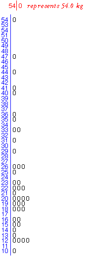
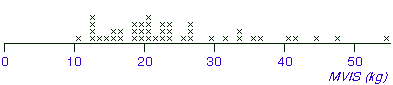
Isometric Strength data
In an ergonomic study involving a group of 41 male students from the University
of Hong Kong, each student was asked to exert maximum upward force on a
horizontal bar which was close to floor level, with his feet 400mm away
from the bar. The force was averaged over a 5-second period is called the
'maximum voluntary isometric strength' (MVIS) and is recorded in kilograms.
With the leaves as the 'units' digits, most values are stacked on stems '1'
and '2'. The stem-and-leaf plot does not show the shape of the distribution well
within the interval 10 to 29 kg.
However making the leaves the 'tenths' digits results in too many distinct
stems for a data set of this size.
The stem and leaf plot is rather jagged. Also, all leaves are '0' since the
raw data were recorded as whole numbers, so there is no advantage over a stacked
dot plot.
Extra flexibility
It is possible to extend the basic stem and leaf plot to display an intermediate
number of classes (stacks of leaves).
Each distinct stem from the basic plot can be split into either 2
or 5 different classes.
This increases the number of stems by a factor or either 2 or 5.
If the stems are split into two, each stem is listed twice in the stem
and leaf plot, with leaf values 0, 1, 2, 3 and 4 stacked on the lower of the repeats
and leaves 5, 6, 7, 8 and 9 on the higher repeat.
If the stems are split into five, each stem is listed five times in the stem
and leaf plot, with leaf values (0 and 1), (2 and 3), (4 and 5), (6 and 7) and (8 and 9)
on the different repeats of the stem.
Again the idea is explained more clearly with an example than in words.
Isometric Strength data
Click on the Animate button to see the stems split
into two. Note the leaves that end on each stem. The slider can be used
to repeat the animation more slowly.
Select Split into 5 from the pop-up menu, then repeat the animation.
Another example
Guinea Pig Survival
The stem and leaf plot below shows the survival times (in days) of 72 guinea
pigs that were injected with tubercle bacilli.
The survival times ranged between 43 and 598 days, so the stems are hundreds
and each leaf is the 'tens' digit of a value. Note that the 'units' digits of
the values are not shown on the stem and leaf plot.
The stem and leaf provide the most significant digits of each value.
Click on the top leaf of '9' that is drawn against the stem
'5' and observe that it corresponds
to the value 598
days. Drag with the mouse over other leaves and observe how each survival time
is represented in the diagram.
(You may notice that the values are not rounded to the
nearest leaf digit, but are truncated. This is done to simplify drawing the plot
by hand and should not affect your interpretation of the plot.)
Interpretation
Most survival times are between 40 and 150 days, but a few guinea
pigs survive for over a year. They are possibly unaffected by the bacilli.
2.1.7 Drawing stem and leaf plots
Value of stem and leaf plots
Although a stem and leaf plot contains more detail about the values than the
corresponding stacked dot plot, this extra information rarely helps you to understand
the data.
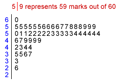
Project marks
One situation in which the author has found stem and leaf plots useful is to
show the distribution of marks to students. The stem and leaf plot below shows
the marks that students attained in a recent statistics project that was marked
out of 60.
The stem and leaf plot shows the distribution of marks well, but also allows
any student to determine exactly his/her place in the class. For example, a student
who got 57/60 can easily count that 7 students got a higher mark in the class.
In most situations however, stem and leaf plots have few advantages over stacked
dot plots as graphical displays of data.
Drawing a stem and leaf plot by hand
Stem and leaf plots are mostly used because they are easy
to draw by hand.
We now explain how to draw a stem and leaf plot with pencil and paper.
Identify the stem and leaf digits
The most significant digits of any value are its stem, the
next digit is called its leaf and any further less significant
digits are discarded.
The position of the leaf digits should usually be done to give between 10 and
20 distinct stems. If this is not possible, the stems can be split to give this
number of classes for the plot.
Examples
Drag the slider to split each value in the list into a stem and a leaf digit.
Use the pop-up menu to see how other values might be split into stems and leaves.
Observe that:
In the data set Multi-digit stems, the decimal point is not
included in the stems. The position of the decimal point is indicated by key that
must be drawn at the top of the stem and leaf plot.
In the data set Values that must be truncated, some digits
from each value are ignored. Note that the values are truncated, not rounded.
Note also that the leading zeros are removed from the stems.
Drawing the stem and leaf plot
After identifying the stems and leaf digits for the values:
Write stems in a column
All possible distinct stems within the range of the data should be written
down. If a split stem and leaf plot is to be drawn, each stem should be repeated
2 or 5 times. The stems can be ordered with either the highest or lowest stem
at the top, but be consistent.
Add the leaves
Scan through all data values, writing the leaf digits in rows against the
corresponding stems. This can be done quickly by hand.
Sort the leaves
Sort the leaves against each stem into increasing order. This final step may
be omitted for a quick look at the distribution of values.
Example
The example below illustrates the process of constructing a stem and leaf plot
from a list of values (on the right below).
Click on the first value. The digits to the left of the decimal point identify
the value's stem and its 'tenths' digit is written against it. Continue clicking
the values in the list to build up the stem and leaf plot.
Finally, click Sort Leaves to sort the leaves into order on
each stem.
Guinea Pig Survival
Our final example shows how a split stem and leaf plot for the guinea pig survival
data on the previous page is drawn. The data set is presented on the right as
a sorted list, so the final step of sorting the leaves is unnecessary if the values
are added in order.
Again, click the values to split them into stems and leaves and add the leaves
to the plot. Note that the 'units' digits of the values are ignored.
2.2 Understanding distributions
Outliers
Clusters
Distribution of values
Extra information about individuals
Distinguishing known groups
Dangers of overinterpretation
2.2.1 Outliers
Outliers
Values that are considerably larger or smaller than the bulk of the data are
called outliers.
Detection of outliers is particularly important. An outlier may have been
incorrectly recorded, or there may have been other anomalous circumstances
associated with it. Outliers must be carefully checked if possible. If anything
atypical can be found, outliers should be deleted from the data set and their deletion noted in any reports about the data.
Health of newborn calves
As part of a study of newborn calves at the author's university, a researcher
observed several births and recorded the time it took each calf to get onto
its feet after birth. The stem and leaf plot on the right displays these
times for Friesian calves.
One calf took 8 hours to stand — more than double the time for any other
calf.
What was different about this calf? Further study showed that it had the
lowest birth weight of the calves, but it was healthy and did survive (unlike
some of the other calves in the study).
Outliers and skew distributions
An extreme data value that stands out from the rest of the data does not necessarily
indicate that there is a mistake in the data or something unusual about the
individual. Our interpretation of the extreme value should also take into
account the shape of the distribution of values for the rest of the data.
Symmetric distribution
Skew distribution
If the distribution of values has its peak at one side and a long tail
to the other side, the distribution is called skew. It
is not unusual for the extreme value in a very skew distribution to be a
fair distance from the other values.
If the tail is to the right we call this a right of positively skewed distribution. Similarly, if the tail is to the left the distribution is left (or negatively) skewed.
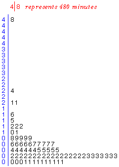
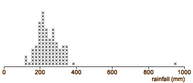
Storm duration
The stem and leaf plot below shows the durations (in minutes) of the first
50 storms in the 1983/4 rainy season in the Bvumbwe catchment in Malawi.
One storm lasted much longer than the others (880 minutes). It is certainly
worth checking the records for this storm (was the duration perhaps really
88 minutes?). However the value is not necessarily a mistake.
Most storms are short, with durations less than 100 minutes, so the longest
rows of leaves are at the bottom of the stem and leaf plot. There are fewer
storms lasting 100-200 minutes, fewer still of 200-300 minutes and this
pattern continues, with the frequency of storms decreasing steadily up the
stem and leaf plot. This shape of distribution is called a skew
distribution, as opposed to a symmetric distribution whose
tails decrease at similar speed on both sides of the peak density.
Perhaps this 'outlier' is a continuation of the pattern into the tail of the distribution
and is just a long storm that could be expected once every hundred
or so storms.
2.2.2 Clusters
Clusters
If a dot plot, stem and leaf plot or histogram separates into two or more groups of
values (clusters), this suggests that the 'individuals' from which the data
were recorded may similarly be split into two or more groups. Further investigation
might reveal that the clusters correspond to ...
males and females
different varieties of plant
measurements made on weekdays and weekends, ...
Detecting the cause of differences between the groups may lead to valuable
insights into the data. For example, if the data are yields of corn, one variety
may give a higher yield than the other. Growing only this variety would improve
yields.
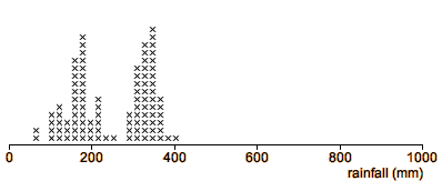
Eruptions of Old Faithful geyser
The Old Faithful is a geyser in the Yellowstone National Park in the USA
that is known for its regular eruptions. Volunteers collected information
about all eruptions in October 1980 (except for those from midnight to 6 am).
The dot plot below shows the durations of these eruptions.
The eruption durations form two distinct clusters, so there seem to be
two different types of eruption. What other characteristics of the eruptions
are different between the two types?
The next dot plot shows the distribution of the intervals between successive
eruptions. Again, there are two clusters, though not quite as distinct.
Are the same eruptions in the same clusters for both variables? Are successive
eruptions in the same or different clusters? (More advanced statistical
methods are needed to answer these questions.)
Discovery of clusters is important information that should
lead to further research.
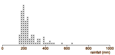
Yam growth
The stem and leaf plot on the right describes weekly growth in 20 yam plants.
There is considerable variation in the growth, ranging from about 5 cm to
12 cm.
There appears to be a low-density gap in the distribution between 7 and
9 cm, suggesting that the plants may be split into two separate clusters.
Although this is only a small data set and the clusters are
not well separated, they should be further investigated.
The data collector should further examine the samples for other systematic
differences between the clusters — perhaps there are two different varieties
of yam, or there might be differences in soil characteristics of the two
groups of plants?
Information about clustering is often of great importance to the data analyst.
If the two clusters were found to correspond to different yam varieties,
it would be misleading to examine all the data together — we should separately
display (and contrast) data from the two varieties.
2.2.3 Distribution of values
Displays show the distribution of values in the data
Even when a data set has no outliers or clusters, graphical displays such as
dot plots, stem and leaf plots or histograms show clearly the distribution of values in the data — what kind of values are most common in the data and what values are less common. Three important features of the distribution are:
The centre or location of the distribution — a 'typical value'
The spread or variability of the distribution
The shape of the distribution
We will examine the
concepts of centre and spread in more detail later.
Isometric Strength Data
The stacked dot plot below shows the distribution of strengths of 41 male Hong Kong students
when lifting a horizontal bar 400 mm away from their feet.
There are no outliers or noteworthy clusters in the data.
However the display shows clearly the student-to-student variability in
strengths. If similar data were collected from other students, we would
expect about three quarters to be able to exert a force of between 10kg
and 30kg, with perhaps one in ten being over 40kg and hardly anyone being
below 10kg.
Symmetry and skewness
If the density tails off in a similar way at both ends of the distribution,
we call the distribution symmetric. If one side of the distribution
tails off more slowly, we say that the distribution is skew.
The centre of the Isometric Strength distribution describes a 'typical'
value — say just over 20 kg. Although no individuals have strength 15 kg
below this, a few have strengths up to 30 kg above this 'centre'. The distribution
is therefore slightly skew with a long tail towards the higher strengths.
2.2.4 Extra information about individuals
Extra information
When only a single value is known from each individual (or plant, item, etc),
all that can be revealed is the shape of the distribution of these values.
However there is often additional information available which can be used in conjunction
with dot plots or stem and leaf plots to give more insight into the data.
In some data sets, each individual or item has a unique name — a textual
label. Even this extra information can provide insight into the data in a
dot plot or stem and leaf plot.
Wheat yields
The following stacked
dot plot shows the wheat yields (tonnes per hectare) of the countries
producing over 1 million tonnes of wheat in late 1996 or early 1997.
Drag the mouse over the crosses to see which countries (and regions
of the world) each cross refers to. Does this tell you anything more about the data?
Heights of states in USA
In the next example, knowledge of the names of the items from which the
values were measured again helps us to understand the variation in the data.
The stacked dot plot shows the heights (ft) of the highest points in each
of the states in the USA. As with the wheat yields example, drag
over the crosses to identify the states. What extra information can you
extract from the state names?
You should observe that the outlier is Alaska, which is also an outlier geographically!
Also, the cluster of high values corresponds mostly to states in the west of the USA which
contain parts of the Rockies.
The next page describes a different type of extra information that may be available
about each individual.
2.2.5 Distinguishing known groups
Displaying prior knowledge about grouping of individuals
Occasionally the values in a dot plot or stem and leaf plot separate into clusters,
but this is rare. However we sometimes know beforehand that the
individuals belong to two or more groups.
Dot plots or stem and leaf plots should
be modified to show this extra information. Different colours or symbols might be used to distinguish the
groups. However it is easier to compare the groups if they are separately displayed against a common axis.
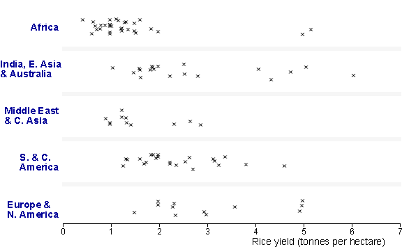
Rice yields
The display below shows the rice yields (tonnes/hectare) in
all major rice-producing countries of the world in 1996/97.
(Note that Central America has been grouped with South
America, North Asia has been grouped with West Asia, and Australia has been included
in East Asia.)
Click on crosses to display the names of the countries.
To look for regional differences, we can group the countries into regions and use colour to distinguish them. Click the checkbox Colour groups to do this.
Finally click the button Animate Grouping to separate the groups. Regional differences are clearest in this display.
Several differences between the regions stand out. In particular,
Rice yields are extremely low in Africa, with the exception of 2 outliers
(Morocco and Egypt) which are both in North Africa.
Rice yields are also low in 'West and North Asia'.
There is a wide spread of yields in 'East Asia and Australia'.
(The demonstration can be repeated with jittered dot plots by choosing jittered instead of stacked from the pop-up menu.)
Back-to-back stem and leaf plots (optional)
For effective comparisons, all dot plots must be drawn against the same axis.
Using this principle is harder for stem and leaf plots, but is possible when
there are only two groups, using a central column of stems. The leaves for
one group are drawn to the right of the stems, and those for the other group
are drawn to the left, giving a back-to-back stem and leaf plot.
Rice yields
As an illustration, a back-to-back stem and leaf plot comparing African
rice yield to those in Central and South America is shown below.
Click on leaves to display the countries.
2.2.6 Dangers of overinterpretation
In small data sets, features of displays may not be meaningful
Be careful not to overinterpret patterns in small
data sets. Clusters, outliers or skewness may appear by chance even if there is
no meaningful basis to these features.
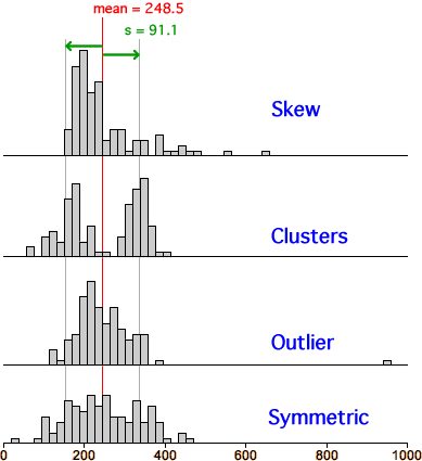
Random data
To investigate this further, we will examine some samples of 50 values
from a homogeneous process with no separate sub-groups or clusters.
The stem and leaf plot on the left above describes 50 values from this
process. Do you think that there are clusters or outliers?
Click the button Another sample several times to examine
other samples. Even though the sample size is not particularly small, there
is surprising variability in the shape of the distribution. By chance, there
are occasionally gaps and occasionally values that are separated from the
others and appear to be outliers.
Look at several samples and click Remember to retain the
data set that gives the greatest appearance of separating into two clusters.
Then do the same, retaining the data set that looks most likely to have
an outlier.
In this example, we know that these features in the samples
do not reflect real clusters or outliers
in the underlying process.
Steel Works Slag
In steel works, iron ore is smelted to extract as much iron as possible,
but some iron remains in the waste from the process (slag) in the form of
iron oxide (FeO). The stacked dot plot below shows the percentage of FeO in slag sampled
from 20 batches of iron ore.
The display seems to split into two clusters. However without outside supporting evidence, you should not conclude that
a gap such as this must correspond
to a meaningful grouping of the iron ore batches into two clusters — the appearance of clusters may be caused only by the randomness of the data.
If outliers or clusters are pronounced, they may be taken as indicative of
something meaningful in the underlying process. However less pronounced
outliers or clusters must be supported by outside evidence before these features
can be interpreted as meaningful.
2.3 Histograms and density
Density of values
Histogram with equal class widths
Choice of classes
Histograms of small data sets
Relative frequency and area
Comparing groups
Histograms with varying class widths
Understanding histograms
Frequency polygons
Kernel density estimates
Drawing histograms by hand
2.3.1 Density of values
Density
In a stacked dot plot (or stem and leaf plot), the highest stacks contain the most values. These stacks have the highest
density of values.
When looking at a stacked dot plot or stem and leaf plot, we sub-consciously round off the jagged columns of crosses or leaves with a curve. This smoothed curve describes the density of values and helps us to understand the distribution of values.
The stacked dot plot below describes a large data set.
The useful information in the dot plot about the shape of the distribution comes from the 'shape' of the tops of the
columns of crosses. Select Dot plot plus density from the pop-up menu to see this.
Finally select Density only from the pop-up menu. The curve effectively describes the distribution of values without the distraction of the individual crosses.
2.3.2 Histogram with equal class widths
Histograms
A hand-drawn smooth curve on a stacked dot plot can describe the density of values well but is a subjective method — different people would draw slightly different curves to smooth out the irregularities in the stack heights. A histogram is an objective graphical display of a data set with the same objective.
In a simple histogram, the axis is split into sub-intervals of equal width called classes. A rectangle is drawn above each class with height equal to the number of values in the class — the frequency of the class.
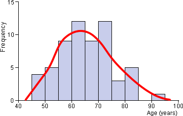
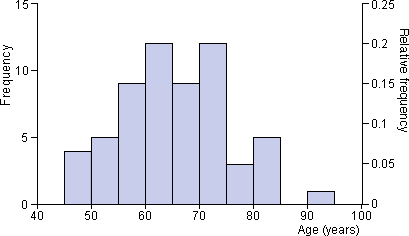
Ages of patients admitted to cardiac unit
The stacked plot below shows the distribution of ages of patients admitted
to a hospital's cardiac emergency unit during a four-month period.
Drag the slider to change the stacked dot plot into
a simple histogram. Note that the height of each rectangle equals the number of crosses.
The diagram below generalises by allowing classes that are wider than the dot plot stacks.
Click on any histogram rectangle to verify that the rectangle height equals the number of values in that class.
Use the two buttons on the left to adjust the class width and observe that the rectangle heights are again equal to the frequency of values in the class.
Finally, hide the crosses by clicking the checkbox. Histograms generally do not display the individual values in a data set.
2.3.3 Choice of classes
Aim of a 'smooth' histogram
There is much more freedom in the choice of histogram classes than in the corresponding
classes for stem and leaf plots. When drawing histograms, we usually choose classes with the aim of smoothness in the outline
of the histogram rectangles.
Ages of patients admitted to cardiac unit
The histogram of the hospital admission data below is a little jagged — we
informally interpret the histogram in the same way as the smooth red curve that
has been superimposed 'by eye' on it.
Flexibility in class width
Unfortunately there is no unique way to draw a histogram — different definitions of the histogram classes result in different histograms. The histogram classes should be chosen with the goal of smoothness and the main choice that determines smoothness is class width.
When the classes are too narrow, the outline becomes jagged.
When the classes are wide, the outline becomes blocky.
It is relatively easy to reject histograms with extremely narrow or wide classes, but there are usually several alternative histograms with moderate class widths that display the data equally well.
Use the smallest class width that is not too jagged.
There is no substitution for trial-and-error in the choice of histogram classes!
Flexibility in starting point of classes
Choosing a good class width is most important but there is also flexibility in where the first class starts — it does not need to be on a multiple of the class width. Shifting the classes to the left or right affects a histogram's shape but does not usually have a major impact on its smoothness.
Pesticide in golden delicious apples
The histogram below shows the distribution of 200 values which are concentrations
of a pesticide in Golden Delicious apples (parts per million).
The four buttons under the histogram adjust the histogram classes. Use them to investigate how the histogram shape is affected by the choice of classes and, in particular, by the class width. Which histogram
is smoothest (and therefore best)?
When class width is less than 4.0, the histogram starts to look jagged
When class width is greater than 8.0, the histogram becomes blocky and
shape information between 0 and 10 is lost by the grouping.
Choice of a 'best' class width is a subjective judgement and any class width
between 4.0 and 8.0 would be acceptable for this data set, though a class width at the lower
end of this range is better.
Choosing histogram classes to get a 'smooth picture' makes its 'message' clearer when you include it in reports. However the choice of histogram classes, within reason, should not affect your conclusions about the data.
If your conclusions about what a histogram tells you about a data set depend on the choice of histogram classes, you are over-interpreting its shape.
2.3.4 Histograms of small data sets
Warning about over-interpreting histograms of small data sets
Adjusting the class width and the starting position for the first class can
give a surprising amount of variability in histogram shape for small data sets. As a result, you must be extremely wary of over-interpreting features
such as clusters or skewness in such histograms.
Indeed, it is probably better to avoid using histograms to display small data sets — stacked dot plots are far less likely to mislead you over minor features.
Yam Growth Data
The histogram below shows the weekly growth in 20 yam plants. There is
some indication that the plants may separate into two clusters.
Use the buttons under the histogram to adjust the class width and to shift
the histogram classes to the left or right. Note that the appearance of
splitting into clusters is only apparent in some of the histograms, but
not in others.
Are the clusters real, or are they just an artifact
of our choice of classes?
Without further supporting evidence, the clusters are
not pronounced enough for us to conclude that the yam plants must
form into two meaningful groups. However they do give an indication of clustering
that a good 'data detective' would investigate further.
Because the shape of a small data set's histogram is so dependent of the
choice of classes,...
Dot plots should be used in preference to histograms
for small data sets.
Dot plots show the size of the data set more clearly and hence give some warning
about the risk of over-interpretation.
2.3.5 Relative frequency and area
Relative frequency
When all histogram classes are of equal width, histograms are often drawn
with a vertical axis giving the frequencies (counts) for each class. An alternative
is to label the axis with the proportions of values in the
classes. These proportions are also called relative frequencies.
Ages of patients admitted to cardiac unit
Both frequencies and relative frequencies are shown on the following histogram
of the ages of patients admitted to a hospital's cardiac emergency unit
during a four-month period.
Area equals relative frequency
A stacked dot plot can be changed into a histogram by changing each
cross into a rectangle. In this histogram, each value therefore corresponds
to a rectangle of the same area.
In a similar way, for all histograms, the area contributed by any value in the data set
is the same. The proportion of the total histogram area for each value is:
where n is the number of values in the data set. Therefore,
The proportion of values (relative frequency) in any classes is the proportion of the total
area above these classes.
Wood chip length
A batch of wood chips from various species of softwood is analysed for fibre
length by a pulp and paper company that has just taken delivery of a large batch.
The grade of chips is determined by the average fibre length since the longer
fibres make stronger paper. The histogram below summarises the data.
Each of the 50 values in the data set is represented by a rectangle.
Click on the histogram at the value 2.3 on the axis and drag to the right,
highlighting the classes of values from 2.2 to 2.8. There are 7 out of 50
values in these classes, so a proportion 7/50 = 0.14 of the values are in
the classes. This is also the proportion of the histogram area that is highlighted.
2.3.6 Comparing groups
Superimposing histograms
To compare the distributions in two groups of values (e.g. measurements for males and females), histograms for the two groups can be superimposed on the same axes.
Colour or shading should be used to help distinguish
the two histograms — in ordinary black-and-white histograms it can
be difficult to tell which lines belong to which histograms.
Relative frequencies to compare two groups
If the number of values in the two groups differ, when two standard histograms are drawn against a common frequency axis, one histogram can be much smaller than the other. This makes the two distributions much harder to compare.
The solution is to
make each rectangle height equal to the proportion in that
class instead of the class frequency. These proportions are also called the relative frequencies in the classes.
Use relative frequency histograms to compare groups.
An individual relative frequency histogram has the same shape as the corresponding frequency
histogram — each bar height is simply divided by the total number of observations
which rescales the histogram height. However using relative frequencies allows
us to make more meaningful comparisons between the distributions of different
groups.
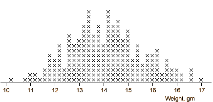
Weights of newborn calves
As part of a study of newborn calves at the author's university, a researcher
recorded their birth weights. The calves were of two breeds, Friesian
and Angus.
The area of the histogram of Friesian calf weights is about three
times that for the Angus calves (since there were about three times
the number of Friesian calves in the study) and this makes comparisons
a little harder.
Select Relative frequency from the pop-up menu to scale
both histograms to have the same area.
It is easier to compare the relative frequency histograms. For example,
we can now determine visually that a higher proportion of Angus
calves have weights between 34 and 40 kg than the corresponding proportion
of Friesian calves.
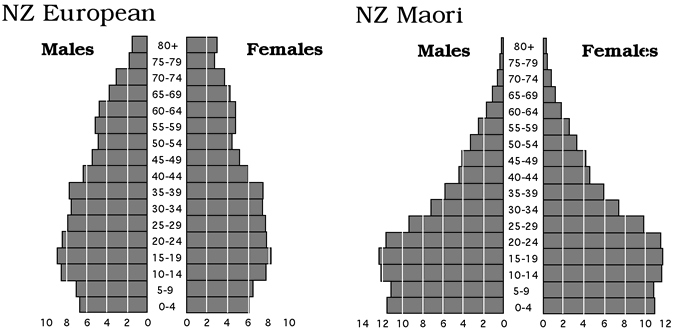
Population pyramids
When two groups are to be compared, an alternative to superimposition is
to draw their two histograms back-to-back (in a similar way to back-to-back
stem and leaf plots).
When used to compare age distributions of males and females in a population,
these back-to-back histograms are called population pyramids
— a common tool in demography.
The population pyramids below show the age distributions of New Zealanders
of European and Maori descent in 1989.
Since the two ethnic groups are of different sizes, relative frequency
(in the form of a percentage) is used rather than frequency, permitting
easier comparison of the groups. Note that...
The Maori population pyramid has a wider base than that of the Europeans,
indicating high birth rates and a relatively youthful population.
In the population pyramid for those of European descent, a bigger proportion of females than males is older than 65.
2.3.7 Histograms with varying class widths
Combining classes
In all previous histograms, the classes have had the same width, but this is
not essential. Histograms can be drawn with mixed class widths. Indeed,
a histogram can be drawn corresponding to any choice of classes, but drawing a histogram with mixed class widths is harder.
The vertical axis of a histogram with mixed class widths must not be 'frequency'.
To retain the correct visual impression, in a histogram with classes of different
widths, the vertical axis must be labeled 'density'. (We will not give a precise definition
here.) The guiding principle is...
In a correctly drawn histogram, each value contributes the same area.
For example, if there are the same number of values in two classes but one class is twice the width of the other, its height should be half that of the other in order to ensure that their class rectangles have the same area.
Yam growth data
The histogram below shows the 20 values in the Yam Growth data.
Each rectangle represents one value — click on any rectangle to see the
value.
Select Wider classes from the pop-up menu to combine the
highlighted classes. Observe that each value is still represented by a rectangle
of the same area, but of a different shape. The total highlighted area remains
the same.
If the height had been 'frequency', the height of the combined class would
have been doubled, incorrectly distorting the visual impact of the class.
The correct height is the average height of the two classes
that have been combined.
Select Narrower classes from the pop-up menu and observe
that the areas contributed by each value again remain the same.
Why use mixed class widths?
When all class widths are the same, frequencies can be written on the vertical
axis, simplifying interpretation. If possible, histograms should therefore
be drawn with constant class widths.
However the goal of smoothness can sometimes be attained better by using
narrower classes in regions of high density.
The histogram below shows a skew data set.
Although the histogram is fairly smooth on the left of the axis with narrow
classes, it becomes more jagged at higher values where the density is lower.
However increasing all class widths to smooth the higher classes leaves
the histogram blocky on the left. (Select All classes wide
from the pop-up menu.)
Select Mixed classes from the pop-up menu and observe
that it gives a smoother picture of the distribution.
2.3.8 Understanding histograms
Using area to interpret a histogram's shape
For all histograms, whether drawn with equal class widths or mixed classes, the area above any class is the proportion of values in that class. This is the most important property of a histogram and should be used to help you understand the distribution of values.
For example, if half the area of a histogram is to the
right of a particular value, then half of the data are above that value.
Skew data
The histogram below shows 100 values from a skew distribution using classes
of mixed widths.
Drag over the two classes that cover the range of values from 2 to 6. The area is 47% of the total
histogram, so 47% of the values are between 2 and 6.
2.3.9 Frequency polygons
Other displays of density
A few other graphical displays are sometimes encountered that can look smoother
than histograms. The simplest is a frequency polygon which
simply joins the midpoints of all histogram classes.
In the diagram below, drag the slider to change the histogram into a frequency polygon.
The frequency polygon is a little smoother (less blocky) than the histogram.
Note that the frequency polygon begins on the horizontal axis (zero height) at the midpoint of the empty class immediately to the left of the histogram and ends on the horizontal axis at the midpoint of the first empty class to the right of the histogram.
Frequency polygons to compare groups
Two or more histograms are sometimes drawn on the same axes to compare groups but careful colouring is needed to distinguish them since parts of the histogram outlines often coincide.
When two or more are superimposed, frequency polygons are easier to distinguish than histograms.
The lines in frequency polygons coincide less often than those in histograms.
Coyote lengths
The histograms below show the lengths (cm) of male and female coyotes that
were captured in Nova Scotia. (The blue histogram shows the lengths of the
female coyotes and the red histogram shows the males.)
Again drag the slider to change the histograms into frequency polygons.
The two distributions are easier to distinguish when frequency polygons
are used. Observe that the two distributions overlap considerably but the
male coyotes tend to be slightly longer.
2.3.10 Kernel density estimates
Histograms are 'boxy'
Histograms tend to have a rather 'boxy' outline unless the data set is very
large. A kernel density estimate is an alternative display
of density that is smoother than a histogram.
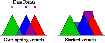
Kernel density estimate
In a kernel density estimate, each sample value is represented by an area
of 'ink' called a kernel that is centred on the value. Where
the kernels for adjacent sample values overlap, the areas of ink are stacked
on top of each other. The diagram below shows triangular kernels for 3 data
points. The areas where the triangles overlap are stacked on top of the triangles
to their left.
Although triangular kernels can be used, a rounded kernel is more common. The width
of the kernels can be adjusted to give the smoothest display. Very narrow
kernels result in a peak at each data value, whereas very wide kernels spread the density
estimate wider than the actual data. Some intermediate width will provide the best compromise
between smoothness and closeness to the data.
The diagram below shows a dot plot of six values. Above it is a kernel density estimate
based on these values.
Use the slider to adjust the width of the kernels and observe how the stacking of the
kernels smoothes the density when the kernels are widened.
Click on individual
crosses in the dot plot to highlight the corresponding kernel on the density estimate,
then adjust the kernel width again to show how individual crosses' kernels are stacked.
Strength measurements
The next diagram shows a kernel density estimate for the Hong Kong student
isometric strength data.
Use the slider to adjust the width of the kernels and give a smooth density estimate.
If the kernels are too wide, the density estimate spreads out too far on each side of the data,
but narrow kernels give a spiky estimate. An intermediate kernel width is the best compromise.
2.3.11 Drawing histograms by hand
Frequency tables
A computer is normally used to draw histograms, but it is instructive to
consider how one might be drawn by hand. The data are first summarised in
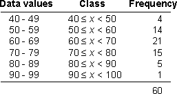
a frequency table.
The histogram classes are defined in the first two columns. The first of
these describes the range of data values that are included in each class.
The second column extends these ranges to give touching ranges of values —
the classes that will be used to draw the histogram. The final column shows
the frequencies for the classes — the number of values within each class.
Provided all classes have the same width, the heights of the histogram rectangles
are given by the frequencies.
Ages of patients admitted to cardiac unit
For the hospital admission data described at the start of this chapter, the
ages of the patients ranged from 46 to 90, so the data covers 45 years (including
both extremes). We will use a class width of 10 years for our initial histogram,
giving 6 classes. Starting the initial class at 40 leads to the following frequency
table.
Care should be taken when translating the column of data values into classes.
For the hospital admissions data, the values are ages, so '40' corresponds
to any age between 40 and 41.
In most other types of data set, the recorded values are rounded,
rather than truncated, and the class boundaries should reflect this. Rounded
values should never coincide with class boundaries.
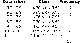
Yam growth
For example, the Yam Growth data contain values that are rounded to one decimal
place (10.1, 5.4, ...) so the value 10.1 could be anywhere in the range 10.05
to 10.15. A histogram might be drawn from the frequency table below.
The diagram below illustrates the problem with allowing data values to
fall on class boundaries.
Use the mouse to identify the rectangle in the histogram corresponding
to the value 6.0. You should observe that it has been included in the class
(5.0 to 6.0), rather than the class (6.0 to 7.0). Although definitions can
be given to ensure that values are consistently placed, the class boundaries
should be shifted 0.05 to the left to avoid the visual
ambiguity.
Click the checkbox Shift Left under the histogram to redraw the histogram
correctly.
Drawing histograms with mixed class widths
When all classes do not have the same width, the rectangle heights are not
the frequency of the classes. (Otherwise the visual impact of the wider classes
will be over-emphasised.) Instead, the rectangle height for a class is its
density,
Since the area of a rectangle is given by its height (the density) times
the class width, this definition ensures that area equals relative
frequency.
If all classes have the same width, using frequency or density results in
a histogram of the same shape, so this extra complication is only necessary
when there are mixed class widths.
Lengths of wood chips
The histogram below shows chip lengths of 50 wood chips sampled from a batch
delivered to a paper mill. Use the pop-up menu to base the histogram on density.
Observe that the shape of the histogram is unchanged since all classes have the
same width.
2.4 Median, quartiles & box plots
The need to summarise
Median, quartiles and box plot
Interpreting a box plot's shape
Displaying outliers
Clusters
Comparison of groups
Dangers of over-interpretation
2.4.1 The need to summarise
Comparing groups
Dot plots and stem and leaf plots retain a lot of detailed information about
the individual values in a data set. Although this detailed information may be
useful when examining the distribution of values in a single data set, it is distracting
when two or more groups are being compared.
Too much detail can attract attention away from the main
differences between the groups.
We usually want to answer the following questions:
Which groups tend to have highest and lowest values?
How variable are the values in the groups?
How much overlap exists between the distributions in the different groups?
Dot plots and stem and leaf plots do contain the answers to these questions,
but the information does not 'jump out at you'. Histograms and frequency polygons are better for making
comparisons since they hide the detailed information about individual values,
but many data sets can be effectively summarised much further.
Rice yields
The jittered dot plots below show the rice yields (tonnes per hectare) in 1996/97
from the major rice-producing countries of the world.
Use the pop-up menu to compare the regions with stacked dot plots and histograms.
The main information from the displays is:
Low rice yields in Africa with 2 outliers (Egypt and Morocco).
Fairly low rice yields in the Middle East and Central Asia.
A very large spread of rice yields in India and East Asia (including Australia).
Although the main differences are easily seen, the eye
is also distracted by other irregularities in the displays.
The remainder of this section describes a new way to summarise the distribution of values in a data set. This graphical summary concisely captures much of the 'important' features of the distribution and is particularly effective for comparing two or more groups of values.
2.4.2 Median, quartiles and box plot
Five-number summary
The distribution of values in many data sets can be effectively summarised
by a few numerical values called summary statistics. In this
section we describe a graphical display that is based on five summary statistics
called the 5-number summary.
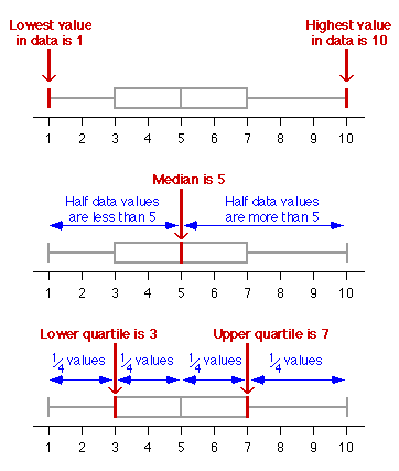
The two extremes of the batch (i.e. the minimum and maximum values).
Three other values that split the batch into groups that contain (as closely
as possible) equal numbers of values (the lower quartile,
the median and the upper quartile).
Box plot
The box plot of a batch of values displays these five values
graphically.
A box plot therefore splits the data set into four quarters with (approximately) equal numbers
of values.
The diagram below shows a batch of values as a jittered dot plot and a box plot.
Click on the different regions of the box plot to verify
that the box plot does indeed split the batch into quarters.
Drag over the central box (click on the left half of the
box and move the mouse to the right half with the button held down) to verify
that half the values are between the upper and lower quartiles.
Details
We have skipped over some details in our description of the median and quartiles.
You should usually rely on a computer to evaluate them, so a precise definition
is not strictly necessary. The idea of splitting the data into 4 equal-sized
groups allows you to interpret the shape of box plots.
However, for those interested, we fill in the details below.
Definition of median
If there is an even number of values, any value between the middle two will
split the batch into two equal halves.
The median, m, of an even number of values is defined to be the
average of the middle two values.
If there is an odd number of values, the batch cannot be split into two halves
The median, m, of an odd number of values is defined to be the
middle value.
Definition of quartiles
To define the lower quartile, we take all values lower than the median, m.
The lower quartile is the median of these values. Note that we exclude the
median itself from this calculation if there is an odd number of values in
the data set. The upper quartile is similarly defined as the median of the
upper half of the values.
Different authors give slightly different definitions for the upper and lower
quartiles.
Provided you are consistent with your definitions, the box plots that you
will draw should lead you to the same conclusions about the differences between
groups.
2.4.3 Interpreting a box plot's shape
Box plots and histograms
It is instructive to consider how the median and quartiles relate to a histogram
of a data set.
The data set is split into quarters by the median and quartiles, so each
section of the box plot contains equal numbers of data values and therefore
has relative frequency 1/4. Since histogram area is
proportional to relative frequency, the median and quartiles therefore split
the histogram into four equal areas.
Although this result does not hold exactly if the median and quartiles do
not coincide with class boundaries, the median and quartiles always approximately
split a histogram into equal areas.
The diagram below shows the box plot of a symmetric distribution under
the corresponding histogram.
Use the pop-up menu to change the shape of the underlying distribution.
Observe that the histogram is split into four equal areas, corresponding
to the median and quartiles of the distribution, and therefore the sections
of the box plot.
Change the extremes, median and quartiles by dragging them on the diagram.
Observe how the histogram shape reflects their values — when any two are
close together, the density must be high (since the corresponding histogram
area is always a quarter of the total area.
What does a box plot tell you about the distribution?
Centre
The vertical line inside the box (the median) gives an indication of the
centre of the distribution.
Spread
The width of the box (the interquartile range) gives an indication of the
spread of values in the distribution.
Shape
High density corresponds to adjacent box plot values being close
together. In particular, if the extreme and quartile on one side
are closer to the median than the extreme and quartile on the other side,
this shows that the distribution is skew.
The diagram below shows the jittered dot plot and box plot of a batch of
100 values.
Use the Centre slider to observe how the box plot shows
the 'centre' of the distribution of values.
Use the Spread slider to observe how the box plot shows
the spread of values in the data.
Return the Spread slider to its maximum, then investigate
the effect of the Skewness slider. For example, a high
density to the left of the distribution and a long tail to the right results
in the lower extreme and quartile being close to the median.
With the Spread slider at its maximum and the Skewness
slider in the middle, investigate the effect of the Tails
slider. Moving this slider to the right concentrates values in the centre
of the distribution, so the tails of the box plot become relatively longer.
From any box plot, you should now have a reasonable impression of the distribution
of values, and should be able to sketch the corresponding histogram.
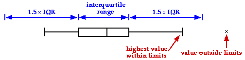
2.4.4 Displaying outliers
Improved box plot
One problem with the basic box plot that was described in the previous pages
is that it cannot show whether there are outliers in the data set. A common
modification draws some of the most extreme values as separate crosses on
the box plot and extends the 'whisker' only as far as the most extreme observations
that are not drawn separately.
The modified box plot makes outliers stand out.
(The rule that is used to decide on which values to display as crosses is
explained below.)
In many practical applications, skew distributions with a long tail towards
the higher values are common. For example, experiments involving survival
times of plants or insects, or times until failure of manufactured items
usually result in data with occasional high values.
In the data set below is a skew distribution with no outliers and no values
stand out as unusual.
Drag the slider to change the data set into one with a
fairly symmetric distribution and a single outlier. The basic box plot does
not show the existence of the outlier.
The basic box plot cannot distinguish between a very
long-tailed distribution and an outlier.
Now select Box plot showing outliers from the pop-up menu
and again use the slider to see how the improved box plot distinguishes
between a skew distribution and one with an outlier.
Which extreme values are displayed as crosses?
We firstly define the interquartile range to be the distance
between the upper and lower quartiles (i.e. the length of the central box
in the box plot). Any values more than 1.5 times this distance from the box
are displayed with a separate cross. The 'whiskers' that are drawn to the
sides of the central box extend only as far as the most extreme values within
these limits.
The diagram below allows you to investigate these improved box plots.
Drag the cross on the jittered dot plot corresponding to the highest
value (6.5) to the right, increasing its value to turn it into an outlier.
The other crosses on the jittered dot plot can be similarly dragged to
change the distributions of values. When are the extreme values separately
displayed as crosses in the box plot?
2.4.5 Clusters
What a box plot can show
Box plots are highly summarised descriptions of the distribution of values
in a data set. They capture well:
The 'centre' of the distribution
The spread of values
The degree of symmetry or skewness
Outliers (in enhanced box plots)
What a box plot cannot show
While these are the most important features of most distributions, some distributions
have features that a box plot cannot show. In particular,
a box plot cannot give any indication of clusters in a data set.
Before box plots are used, a dot plot, stem and leaf plot or
a histogram must be examined to check that clusters do not exist.
If clustering is present, a box plot should not be used to summarise the
data.
The diagram below illustrates the inability of box plots to show clusters
Drag the slider to separate the data into two clusters. There is no clear indication from the box plot that the data separate into two clusters with a 'gap' in the middle of the distribution. (The closeness of the quartiles to the extremes relative to the width of the central box does give a hint that there could be clusters. However clusters are an extremely important feature whose existence should be immediately obvious in any good graphical display.)
Eruptions of Old Faithful Geyser
The Old Faithful Geyser in the Yellowstone National Park in the USA erupts
regularly. The dot plot below shows the durations of these eruptions in
October 1980.
The dot plot clearly shows two clusters of eruption durations, so there
seem to be two different types of eruption. However the box plot gives no
indication of clustering and you would miss this important feature of the
eruptions if you only examined a box plot of the data.
2.4.6 Comparison of groups
Box plots are especially effective for comparing batches
Although the box plot of a single data set shows various useful aspects of the distribution
of values, it is no more informative than a dot plot, stem and leaf plot or histogram.
However box plots come into their own when two or more batches of data are
compared. The most important differences between the batches are usually precisely
the aspects that are highlighted by their box plots. Since box plots hide
the individual values, these differences become more prominent.
Rice yields
The diagram below shows jittered dot plots of the rice yields (tonnes/hectare)
in all major rice-producing countries of the world in 1996/97.
Use the pop-up menu to display the data as box plots. The major differences
between the regions should now be more apparent.
Monthly rainfall in Samaru, Nigeria
Rainfall is highly seasonal in most of Africa and its timing and amount
is critical for agriculture. The diagram below shows monthly rainfalls in
Samaru in northern Nigeria between 1928 and 1983 as a jittered dot plot
for each month.
Again use box plots to highlight the differences between the monthly rainfall
distributions.
2.4.7 Dangers of over-interpretation
Stability of the shape of box plots
We saw earlier that features in dot plots, stem and leaf plots and histograms
are relatively unstable when used with small data sets. There is high sample-to-sample
variability if different data are collected from the same process. Care must
therefore be taken not to over-interpret their shape.
The same happens with box plots, but to a lesser extent. Box plots summarise
the data further and are therefore more stable descriptions of the distribution
of values than those that we described earlier.
As with other displays, the larger the data set, the more stable the box
plots become.
Lengths of kidney beans
The box plot below describes the lengths (mm) of 20 kidney beans.
Click the button Another sample several times to see the box plots
that might arise from different samples of 20 beans of the same variety.
Observe that there is considerable variability in the box plots, especially
in the extremes, but there are fewer distracting artifacts such as clusters
than in the corresponding dot plots.
Use the pop-up menu to change the sample size from 20 to 50, then repeat the sampling
a few times. The box plots become less variable.
Finally, repeat with a sample size of 150. The box plot now gives a fairly consistent
display, showing clearly that the middle half of the data (between the upper and lower quartiles)
is approximately between the values 8.37 and 8.43.
2.5 Describing centre and spread
Centre and spread
Median, range and IQR
Summaries of centre
Properties of median and mean
Standard deviation
Rules of thumb for st devn
Understanding means and st devns
Warnings about mean & st devn
2.5.1 Centre and spread
Summarising centre and spread
Most data sets exhibit variability — all values are not the same! Two important
aspects of the distribution of values are particularly important.
Centre
The centre of a distribution is a 'typical' value around which the data
are located.
Spread
The spread of a distribution of values describes the distance of the individual
values from the centre.
In this section, we examine how to describe centre and spread with numerical
values called summary statistics. Numerical summaries of
centre and spread give particularly concise and meaningful comparisons of
different groups.
A pharmaceutical company is in the final stages of testing a new class
of drugs that are effective at reducing high blood pressure. Some patients
have however reported side effects — in particular some felt that their
perception of distance had been affected.
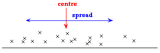
The diagram below shows results from an experiment that was conducted to
measure whether the ability to assess distance was worse for patients receiving
the drugs. A 'control' group of 20 male patients were not given any drug,
whereas two other groups were given drug A and drug B. Each subject was
asked to position himself 3 metres from a wall and the actual distance was
recorded.
There is considerable variation in the estimates of the 3-metre distance
from the patients — their estimates were up to 1 metre in error.
The centre of the Control group's distribution is close to zero
— patients who got no drug were usually close to the correct length.
Patients getting Drug A tended to choose a position that was too
close to the wall. The centre of Drug A's distribution is about
2.5 metres.
Patients getting Drug B tended to position themselves too far
from the wall. The centre of Drug B's distribution is about 3.5
metres.
A numerical measure of centre should describe this tendency to over-
or under-estimate the distance.
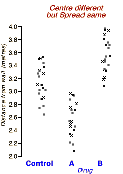
After further development, a similar trial was conducted with two different
drugs.
There is no tendency to over- or under-estimate a 3 metre distance
with these drugs — the centres of all three distributions are close
to zero. However
With Drug C, there is far more variability — patients can be
in error by as much as 1 metre in their assessment of a 3-metre
distance.
Patients getting Drug D can be wildly inaccurate in their assessment
of difference — they sometimes over- or under-estimate the distance
by as much as 2 metres.
A numerical measure of spread should describe this tendency for greater
errors with drugs C and D.
2.5.2 Median, range and IQR
Simple summaries of centre and spread
The simplest summary statistics that describe centre and spread are based
on the five-number summary (and box plot).
Centre
The median is the simplest measure of centre. Half the
data are more than it, and half less.
Spread
The range (maximum - minimum) and interquartile
range (upper quartile - lower quartile) are two different summary
statistics that describe the spread of values in a data set.
Distance perception (side-effect of drug)
The diagram below describes a similar context to the examples on the previous page.
An experiment is conducted with a control group of 30 subjects (who get no drug) and another group of 30 subjects who
are given a new drug whose side-effects may affect distance perception.
Each subject is told to stand 3 metres from a wall and the actual distance from the wall is exactly measured.
Use the two sliders to adjust the centre and spread of distances for those getting the new drug.
Observe that the differences between the medians and inter-quartile ranges of the two drugs concisely summarise:
Whether the new drug tends to make subjects stand closer or farther from the wall. (Subjects in the control group have a median distance that is close to 3 metres.)
Whether the drug makes subjects judge distance more consistently (i.e. less variable distances) or less consistently (i.e. more variable distances) than those in the control group.
Usefulness of summary statistics
Although a single measure of centre and one of spread provide only limited
information about the shape of a distribution of values, they do often give
a suprisingly accurate impression of the distribution.
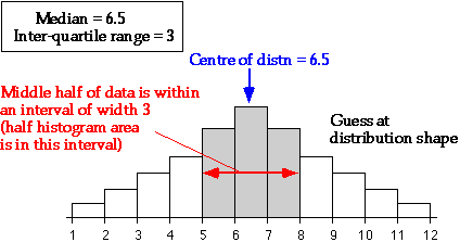
Given the median and interquartile range, it is possible to sketch a bell-shaped
histogram that matches these values. Such a 'guess' is often close to the
actual distribution of values.
2.5.3 Summaries of centre
Median
The two most commonly used measures of centre in a data set are the median
and mean.
The median is one of the values displayed in a box plot;
it is the middle value in a batch, so the same number of values is above and
below it. (If the number of values is even, the median is defined to be half
way between the two middle values.)
Mean
The mean of a data set is found by adding all the values, then dividing by the
number of values, n.
The best way to understand how the mean behaves is to imagine each cross on
an unjittered dot plot to be a solid object resting on a beam
with negligible mass.
The mean is the value at which the
beam will balance.
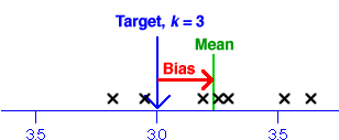
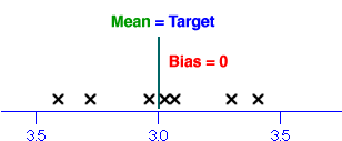
Yam growth data
The diagram below shows growth (cm) of the main stalks
of 20 yam plants over a period of seven days.
Drag the red arrow to change the value of k. When the beam is balanced,
k is equal to the mean.
Sunshine hours
Solar cookers are potentially a cheap and environmentally friendly alternative to
wood in the developing world. As part of a study of their potential in Botswana, data were
collected on the number of sunshine hours in Gaborone. The diagram below shows the
total sunshine hours on 25th February each year from 1978 to 1997.
This data set has a skew distribution with a long tail to the left. The point of balance,
and hence the mean, are strongly affected by the two years (1980 and 1985) when there were
less than 7 sunshine hours.
Drag the red arrow to find the point of balance (i.e the mean) and observe
that only 7 of the 20 values are less than the mean.
For a skew distribution such
as this, the mean is further into the long tail than you might have
expected!
2.5.4 Properties of median and mean
Are the median and mean the same?
Although both describe aspects of the 'centre' of a distribution, they are
not the same and can occasionally have very different values. This page describes
some differences between the interpretation and properties of the median and
mean.
Social vs economic indicator
For some data sets, the median can be considered to be a social indicator,
whereas the mean can be interpreted as an economic indicator. For example,
if a batch of values consists of the salaries of all employees in a company,
the median salary indicates what the 'average employee' earns
(half of the employees earn more and half earn less)
the mean salary reflects the total amount paid as salaries in the company
(since it is the total of the salaries, divided by the number of employees)
Outliers
An outlier has little effect on the numerical value of the median,
whereas an outlier affects the mean more strongly. The median is
therefore called a more robust measure of centre than the mean.
The distribution of values in the data set below is fairly symmetric, so
the mean and median are similar.
Drag the cross for one of the larger values with the mouse
towards the right of the axis (approx 8.0) and observe the effect on the
mean and median.
You should observe that the median remains unchanged at 2.4, but the mean
increases considerably. If
this change had been caused by incorrect recording of the value, the resulting outlier would
therefore have badly effected the mean, but not the median.
Skew distributions
When the distribution of a batch of values is fairly symmetrical, the mean and median
are similar. However if the distribution is skew, then the mean is usually further into the
tail of the distribution than the median.
This can be readily understood in relation to the balance interpretation
of the mean — values far from the 'centre' have relatively high leverage,
so the point of balance (the mean) is further into the tail of the distribution.
Guinea pig survival
The diagram below shows the number of days that 72 guinea pigs survived after being injected with tubercle bacilli.
Since the data have a long tail of high survival times, the mean is further into the tail (i.e. larger) than the median.
Sunshine hours in Gaborone
In a study of the viability of solar cookers in Botswana, sunshine data
from the years 1978 to 1997 were analysed. The following jittered dot plot
shows the total sunshine hours on 25th February each year from 1978 to 1997.
In this data set, the data have a skew distribution with a long tail to the left so the mean
daily hours of sunshine is much less than the median (but again further into the long
tail of the distribution).
2.5.5 Standard deviation
Simple measures of spread
The range and inter-quartile range are summaries of the spread of values in a data set that are (relatively) easy to understand and to explain to others.
Range
Difference between maximum and minimum values
Inter-quartile range
The middle half of the values are within an interval of this length
However for several reasons, some of which will be explained later in this e-book, neither of these values is commonly used either as a summary of spread in reports or for further data analysis.
Standard deviation
The value that is most often used to summarise the spread of values in a data set is its standard deviation.
The standard deviation is a 'typical' distance of values from the sample mean.
The diagram below illustrates.
Unfortunately the exact formula for the standard deviation is relatively complex:
The standard deviation of a data set is denoted by the letter s and will be widely used in later chapters.
Brief explanation
It is easier to explain the properties of the standard deviation than to justify its precise formula. However note that the term,
in the formula depends on the squared differences between the individual values and the sample mean. The closer the values to the mean (corresponding to a small spread), the smaller this sum and therefore the smaller the standard deviation.
The standard deviation is small when the spread of values is small and large when the spread of values is large, so it works as a summary of spread.
Variance
The square of the standard deviation, s2, is called the sample variance and is sometimes used as an alternative description of spread. However the value of s has the same units as the original data (e.g. kilograms or dollars) so is more easily interpreted than s2, and standard deviations are usually prefered to summarise spread.
The diagram below shows 20 values whose mean is exactly 8.
Click on crosses to see the difference between the values and the mean. The standard deviation is 'typical' of the magnitude of these differences.
Use the slider to adjust the spread of values and observe that the standard deviation is small when the values are all close to their mean and large when they are more variable.
2.5.6 Rules of thumb for st devn
'Quarter-range' rule of thumb
Unfortunately the definition of the standard deviation is rather complex
and this makes its value difficult to interpret. The best we can do is to
give some guidelines. For many data sets, the standard deviation is just under
a quarter of the range.
This is a simple rule, but is only very approximate. The standard deviation
can be more than a quarter the range in distributions with short tails or
much less if there are long tails or outliers.
The following rule of thumb works for more data sets.
The 70-95-100 rule of thumb
A more accurate rule-of-thumb that helps you to interpret the standard deviation
is called the 70-95-100 rule. In many distributions,
Approximately 70% of the values are within 1 standard deviation of the mean.
Approximately 95% of the values are within 2 standard deviations of the mean.
Nearly all of the values are within 3 standard deviations of the mean.
The 70-95-100 rule holds approximately for most reasonably symmetric data
sets.
For skew data, or data sets with long tails,
outliers or clusters the 70-95-100 rule is often less accurate.
Examples
The pale blue bands on the diagram below show values that are within 1 and 2 standard deviations from the mean. (All values are within 3s of the mean.)
After checking the 70-95-100 rule of thumb for this data set, use the pop-up menu to check how well it works for a few other data sets with reasonably symmetric distributions.
The 70-95-100 rule of thumb helps to understand and explain what the value
of the standard deviation tells you about the spread of distributions that
are reasonably symmetric and bell-shaped. However if the distribution is
highly skew, the mean and standard deviation only give a partial description
of the shape of the distribution.
Hours of sunshine in Gaborone
As part of a study about the use of solar cookers, the number of hours
of sunshine (a value between 0 and 6) was recorded in Gaborone each February
morning between 1978 and 1997. The stacked dot plot below shows these 554
values and is highly skew. The mean and standard deviation on their own give no indication of the skewness in the
data and are therefore a very incomplete description of the distribution.
The standard deviation does still summarises the spread of values. However considerably more than 70% of the values are within 1s of
the mean and none are more than 1s above it. (However about 95%
are still within 2s of the mean.)
The mean and standard deviation are only 'complete'
summaries of the shape of a distribution when it is fairly symmetric.
2.5.7 Understanding means and st devns
Standard deviation and histogram
Students usually find the standard deviation a difficult concept. Luckily, understanding its
definition is much less important than knowing its properties and having a feel
for what its numerical value means.
If you have understood the 70-95-100 rule, you should be able to make a fairly
accurate guess at the standard deviation of a batch of values from a histogram
or dot plot (without doing any calculations). About 95% of the values should
be within 2 standard deviations of the mean, so after dropping the top 2.5%
and bottom 2.5% of the crosses (or area of the histogram), the remainder should
span approximately 4 standard deviations. So dividing this range by 4 should
approximate the standard deviation.
Similarly, given the mean and standard deviation for a data set, you should
be able to draw a rough sketch of a symmetric histogram with that mean and
standard deviation. (It would be centred on the mean and 95% of the area would
be within 2 standard deviations of this.)
Exercise capacity of the elderly
The table below was published in the Official Journal of the
American College of Sports Medicine. The table describes 'anthropometric data and maximal exercises capacity' of
two groups of elderly men — 10 who continued to do regular exercise (athletes) and another 12 who had not continued
with exercise into old age (controls). All values are printed in the form
(mean ± standard deviation).
Athletes
(N = 10)
Controls
(N = 12)
Age (yr)
Height (m)
Weight (kg)
BSA (sqr m)
BMI (kg per sqr m)
Systolic BP at rest (mm Hg)
Diastolic BP at rest (mm Hg)
Max VO2 (L)
Max VO2 (mL per kg per min)
Max Exercise capacity (W)
Max Exercise capacity (W per kg)
Max heart rate (bpm)
BSA, body size area; BMI, body mass index; Max VO2, maximal oxygen uptake
The table summarises the main differences between the groups.
Guessed histograms
Using the 70-95-100 rule of thumb, we can sketch a rough histogram to match each mean and standard deviation — about 70% of each histogram's area should be within s of the mean, 95% within 2s of the mean and about all within 3s. These can be used to compare the 'Athletes' and 'Controls' for any variable.
Use the pop-up menu to investigate the differences between the athletes and controls for the different variables.
The actual histograms may not be symmetric and would certainly be more 'boxy' than those above, but this is the best we can do from the available information.
A few interpretations...
The data set is small, but from the means and standard deviations, we can
either use the approximate histograms or use the 70-95-100 rule directly to infer that...
Approximately 70% of the athletes have heights between 1.73 and 1.85
metres, whereas about 70% of the controls are between 1.69 and 1.81. There
is considerable overlap in these distributions.
Approximately 70% of the athletes have Max VO2 between 2.39
and 3.43 litres, whereas about 70% of the controls are between 1.81 and
2.39 litres. These distributions overlap less, suggesting that there may
be a more important difference in oxygen uptake between the groups.
In later chapters of CAST, you will meet statistical methods that allow
you to properly compare two groups such as these, but we mention here that
these methods will be based on the group means and standard deviations.
2.5.8 Warnings about mean & st devn
The shape of a distribution
Many different distributions have the same mean and standard deviation.
The mean and standard deviation hold no information about the shape of a distribution, other than its centre
and spread.
In particular, the mean and standard deviation give no indication about whether
a data set contains:
two or more clusters
an outlier
a skew distribution with a long tail to one side
These are important features of a data set and should influence the analysis
that you perform and the conclusions that you reach. In particular, if you
ignore outliers or clusters, you could easily reach the wrong conclusions.
It is therefore essential
that you look at the distribution with a dot plot, histogram or box plot
before 'condensing' the data into a mean and standard deviation for further
analysis.
Distributions with the same mean and standard deviation
The following four data sets all contain the same number of values, n = 100,
and have the same mean, = 248.5,
and standard deviation, s = 91.1, but should be analysed
in different ways.
Symmetric bell-shaped distribution
The data set above has a distribution whose shape is what would be imagined
from the mean and standard deviation. Its shape is well described by these
two summary statistics.
Outlier
This data set contains an outlier. It is probably a measurement or recording
error or the 'individual' is in some other way different from the rest
of the data and should not be analysed with them.
After deleting the outlier, the mean reduces from 248.5 to 241.4 and
the standard deviation drops from 91.1 to 57.6. The measurements are therefore
much less variable than the raw standard deviation suggests.
Clusters
In this data set, the values separate into two distinct clusters. The
researcher should investigate what is different about the 'individuals'
in the two clusters. For example, annual rainfalls may have been recorded
in two types of years (e.g. La Nina and El Nino), or two different varieties
of maize may have been grown in a survey of crop yields.
The two clusters have different means and the standard deviation within
each cluster is much smaller than 91.1, so again, the overall mean and
standard deviation do not adequately describe the data.
Skew distribution
This data set is skew with a long tail towards the high values. The 70-95-100
rule suggests that about 15% of values are below - s
and 15% above + s
(and 70% between these values), but this distribution has no
values lower than - s,
but 14% are above + s,
6% are above + 2s
and 2% are above + 3s.
The 70-95-100 rule does not give a good impression of this distribution
— the percentages are only approximately correct for fairly symmetric,
bell-shaped distributions.
In the presence of an outlier, clusters
or skewness, the mean and standard deviation fail to capture an important
aspect of the distribution's shape. They are particularly misleading
in the presence of outliers or clusters.
The diagram below shows the four distributions together as histograms to
make comparison easier.
A histogram or dot plot is needed to describe the clustered distribution,
but a box plot would capture the main features of the skew distribution
and distribution with an outlier.
2.6 More about variation (optional)
Effect of outliers
Standard deviation of grouped data
Explained and unexplained variation
Variance and degrees of freedom
Root mean squared error
Distances from the mean
2.6.1 Effect of outliers
Outliers and the standard deviation
The mean and standard deviation of a data set summarise the centre and spread of values but contain no further information about the shape of the distribution. They are therefore poor descriptions
of distributions that have clusters, outliers or skewness.
It is worth spending
a little more time investigating the effect of an outlier on the mean and
standard deviation. Although an outlier has a reasonably strong influence on the mean of the
data,
Outliers have an extremely
strong effect on the standard deviation.
By applying the 70-95-100 rule of thumb and thinking about whether the resulting proportions of values within 1, 2 and 3 standard deviations are reasonable in the context of the data, you may be able to tell that something is wrong. (E.g. is it reasonable that 70% of the values are between say 14 and 18, and 30% are outside this interval?)
The mean and standard deviation are bad summaries of data sets with outliers.
A graphical display such as a dot plot is the best way to detect an outlier and you should always look at the data before summarising with a mean and standard deviation.
An outlier should be carefully examined. Was the value incorrectly recorded? Was there something unusual about the individual from which the measurement was obtained? If we are convinced that there was something wrong about the value, it should be removed from the data set before further analysis.
Date of first rains in Samaru, Nigeria
The stacked dot plot below shows the date of the first planting rain in
Samaru each year from 1928 to 1983, defined as the first occasion after
1st April when there was more than 20 mm of rain within one or two
days.
The dates are recorded as the day number after 1st January (e.g. 1st April = day 92,
1st May = day 122).
We will now consider adding an 'outlier' to this data set — we will pretend
that it is an incorrectly recorded date for the first rains in 1927. Click
High outlier to add a value of 240 to the data set. The
mean date is increased by only 2 days, but the standard deviation increases
from 18.7 to 23.9 days, a much greater increase.
Drag the outlier to 300, increasing the standard deviation to 29.5. The
70-95-100 rule with this standard deviation gives a misleading impression
of the chance of a very early or late date for the first rains.
Missing value
When a data value is missing (e.g. the date of the first rains in 1927
may not have been recorded), it is often coded as an 'impossible' value,
such as '999'. Click Missing value (coded 999) to change
the value for 1927 to 999. Observe that:
The mean (day 141.5) is still a 'reasonable' value for the data set,
even though it is incorrect.
The standard deviation (117.1 days) is not reasonable.
It should be obvious to any climatologist that there would not be 30%
of years with first rains outside days 141.5 ± 117.1, as predicted
by the 70-95-100 rule.
No planting rain
Another complication with rainfall data in Africa is that sometimes the
rains do not start at all. Consider what would happen if
there was no planting rain in 1984. Such a year might be coded as the value
'0'. Such zeros are important information (unlike missing values) but they
should not be included with calculating means and standard
deviations.
Click Low outlier and then No planting rain (coded
0) to see the effect of erroneously treating the value 0 for 1984
as a proper date. Again the standard deviation is badly affected.
The mean and standard deviation may appear
'reasonable' even if there are outliers. Always
examine a dot plot, histogram or box plot before analysis.
2.6.2 Standard deviation of grouped data
Within-group and overall standard deviation
In some data sets, the 'individuals' can be split into groups. For example,
Monthly rainfall data over several years can be grouped by month or season
Rice yields of countries can be grouped by continent or region (Asia,
Africa, ...)
Annual data about natural disasters can be grouped by climate pattern
(El Nino or La Nina)
For grouped data, we can:
summarise the overall distribution with a single mean and standard deviation,
or
report separate means and standard deviations for the different groups.
When the groups are combined, you lose all information about the differences
between the groups. Not only are differences between the group means lost,
but the differences between the group means make the overall variability larger
than variability within the groups.
The standard deviation of the combined data
set is often considerably higher than that of the separate groups.
It is therefore better to separately describe the distributions within the
groups than to describe the overall distribution with a single mean and standard
deviation.
Maximum temperatures in Bulawayo
The data set below shows the maximum temperatures in Bulawayo each month
from July 1951 to April 2001. The jittered dot plot at the top gives the
complete data set (598 monthly values).
The maximum temperatures in each January are shown at the bottom. Drag
the slider to show the distributions of maximum temperature within the other
months.
Observe that the standard deviation is much
lower within the months than the overall standard deviation.
2.6.3 Explained and unexplained variation
Types of variation
The overall variation of values is usually larger than the variation within
individual groups. A general way to explain this effect is in terms of explained
and unexplained variation.
Overall variation
This is variation in the values if the grouping of values is ignored.
Unexplained variation
We have no information that helps us to understand the variability of
values within each group, so the within-group variability is unexplained
by the groups.
Explained variation
This describes the difference between the overall and unexplained variation.
For example, if the groups corresponded to seasons, knowledge of the season
would help to predict rainfall, so the season explains
part of the variation in rainfalls.
Reducing the unexplained variability
Low unexplained variability means that the values within each group are relatively
close to their group mean. As a result, the group mean will be a relatively
accurate prediction of future values.
It is good to split data into groups in a
way that has high explained variation (differences between group means)
and low unexplained variation (within groups).
Finding a way to group data such that there is low standard deviation within
groups is therefore worthwhile.
Forecasts of rainfall in Moorings (Monze), Zambia
The most important planting time in Southern Zambia is October-December,
and availability of good rainfall forecasts for that period would help farmers
to decide which crops to plant and when the planting should take place.
The upper jittered dot plot below shows the rainfall totals for October-December
at Moorings for the years 1922 to 2003.
Imagine a forecast of rainfall for this period that is provided in September
each year. Such forecasts are often provided in the form High,
Average or Low rather than numerically. The lower section
of the diagram shows one type of forecast for each year — each rainfall
is drawn on a row corresponding to the forecast for that year. (Click on
any cross to see the year, prediction and actual rainfall.)
Observe that the distribution has lower
spread within each forecast group than the overall spread of rainfalls.
Use the slider to adjust the characteristics of the forecast. The better
the forecast, the lower the standard deviation within the groups and the
more the forecast narrows the range of likely rainfalls.
The lower the variation of rainfall for
years that are forecast as Low, etc, the better the quality
of the forecast.
Predicting a future value
In most practical examples, the grouping of values is fixed by the nature
of the data set. The lower variation within groups, compared to the overall
variation, means that we should be able to predict a future value more accurately
(with the group mean) if we know its group membership.
Maximum temperatures in Bulawayo
The table below summarises the maximum monthly temperatures in Bulawayo
from July 1951 to April 2001.
Month
Mean
Standard deviation
January
32.13
2.11
February
31.44
2.17
March
31.24
2.08
April
30.46
1.73
May
28.53
1.69
June
26.10
1.37
July
26.43
1.32
August
30.04
1.28
September
33.44
1.24
October
34.93
1.01
November
34.34
1.49
December
32.62
1.75
Overall
30.99
3.17
Consider prediction of the maximum temperature in Bulawayo in a future
month, assuming no long-term trend.
If we are not told which month:
The best prediction would be 30.99 degrees, the overall mean in our
combined data set. The standard deviation, s = 3.17,
describes the likely errors in this prediction. Using the 70-95-100 rule
of thumb, our prediction has about 95% chance of being within 2s = 6.34
degrees of the actual temperature.
If we know that the month is July:
There is much less variation within the July temperatures. Using only
historical data from July, we would predict the maximum temperature to
be 26.43 degrees (the group mean) and the standard deviation within July
temperatures, s = 1.32, would describe the likely prediction
errors. This prediction has about 95% chance of being within 2s = 2.64
degrees of the actual temperature.
Using knowledge of the month, we get a much
more accurate prediction.
This results from the lower standard deviations within months than the
overall standard deviation.
The overall standard deviation, s = 3.17,
describes the variation if we do not take into account differences between
the months. Some of this variation is explained by differences
between the months.
The within-July standard deviation, s = 1.32, describes
year-to-year variation in the July maximum temperatures. This variation
is unexplained from the available information.
2.6.4 Variance and degrees of freedom
Variance
The square of the standard deviation is called the variance
of the data.
variance = (standard deviation)2 =
Since the variance is a kind of average of squared differences from the sample mean, the units of the variance are the square of
the units of the original values. For example, if the values are weights in kg, the variance is a number of square kg. The standard deviation has the same units as the original values (e.g. it is a number of kg in the example above), so the numerical value of the standard deviation is easier to understand. The use of variance as a summary of
spread is therefore discouraged.
However
variances play a central role in more advanced statistical methods. Indeed,
an important collection of methods for analysing relationships between variables
is called analysis of variance. (Analysis of variance investigates
the causes of variability in a measurement — some variability
may be explained, and perhaps controlled, in terms of other variables whereas
other aspects of variability are unexplained.)
Degrees of freedom (optional)
The divisor (n - 1) in the formula for the sample standard
deviation is called its degrees of freedom. This can be thought
of as the number of 'independent pieces of information' that contribute to
it.
Sample of size n = 1
With only a single value, there is no information about the spread of
values, so there are 0 degrees of freedom and the sample standard deviation
is undefined — the numerator and denominator of the formula are both zero.
Sample of size n = 2
With two values, x1 and x2, there
is only a single piece of information about the spread — the difference
between the values, x1 - x2,
and there is one degree of freedom. With a little algebraic manipulation,
the sample standard deviation can be written in terms of this difference
as:
Sample of size n
In general, there is one less 'piece of information about the spread'
in the sample than the number of data points because the sample mean, ,
is one piece of information that does not give any information about the
spread of the data. We therefore say that there are (n - 1)
degrees of freedom.
2.6.5 Root mean squared error
Distance from a target
Bags of potatoes at a supermarket are labelled with weight 3kg. How close
are the actual weights to this target?
Single value
The distance of a single value, x , from
a target, k , is called its error,
error = (x − k)
However if we measure n bags of potatoes,
how do we combine the errors to give a single measure of accuracy?
Mean error (bias)
The average of the individual errors is equal to the difference between the
sample mean and k ,
This quantity is called the bias and clearly tells us
something about the accuracy of the weights of the bags of potatoes.
However even if the bias is zero, individual values may be very different
from the target, k .
Mean squared error
One solution to the problem of negative errors is to square them before averaging,
mean squared error =
Root mean squared error
The main problem with the mean squared error is that its units are the square
of those of the raw data. For example, the weights of the bags of potatoes (and
therefore the errors) are measured in kg so the squared errors are 'squared kg'
and the mean squared error is also 'squared kg'. How do you interpret a value
with these units? The solution is to take the square root to return the value
to the original units.
root mean squared error =
The root mean squared error is a
'typical' error.
Weights of 3kg bags of potatoes
The diagram below shows the weights of seven bags of potatoes labelled '3 kg'.
A square is drawn for each data value whose sides have length equal to the
error for that bag of potatoes.
The area
of each square is the squared error for the value.
The root mean squared error is the side length of the square whose area is
the average of the areas of the squares. It is shown in red on
the diagram.
Drag the crosses to see how the values affect the root mean
squared error.
You may notice that an outlier corresponds to a square with a very large area,
so it has a disproportionate effect on the root mean squared error.
2.6.6 Distances from the mean
Distances from the centre of the
distribution
The root mean squared error summarises the distances of data values from a
target constant, k .
root mean squared error =
The population standard deviation is a similar summary statistic
that summarises the distances of the values from the centre of their
distribution.
population standard deviation =
The standard deviation summarises the spread of values in the data.
Sample standard deviation
The sample standard deviation
is more often encountered. The only difference is that the sum of the squared
deviations is divided by (n - 1)
rather than n .
sample standard deviation = s =
When you read of a standard deviation
in a report, it is likely to be the sample standard deviation that is intended.
In CAST,
the term 'standard deviation' always refers to the sample
standard deviation.
There is little practical difference between the population and sample standard
deviation provided the sample size is reasonably large. Even when the sample
size is small, both definitions should lead you to the same conclusions about
your data. (Otherwise, you are probably over-interpreting your data!)
Illustration of standard deviation
The diagram below shows 7 values and represents their squared deviations (distances
from the mean) by squares.
The red square has area equal to the average area of the
blue squares.
The population standard deviation is the
side length of this red square.
Select Sample standard deviation from the pop-up menu. The
sample standard deviation uses (n - 1) = 6 instead
of n = 7 in the denominatory of formula for the standard deviation
so it is slightly larger. In larger data sets, the difference is smaller.
Drag the crosses to see how the standard deviation relates
to the data values. (Note that the mean also changes when a value is dragged.)
If you drag the lowest cross to turn it into an outlier, you may notice that
it has a disproportionately large influence on the standard deviation.
The standard deviation is strongly affected by outliers,
so it is not a robust summary of spread.
2.7 Proportions and percentiles
Illustrative data set
Cumulative proportions
Graph of cumulative proportions
Percentiles
Displaying percentiles
Comparing groups
Comparing groups with other percentiles
Better definition of percentiles
2.7.1 Illustrative data set
Data set
In earlier sections, we summarised aspects of the distribution of values
in a data set using measures of centre (e.g. the mean and median) and spread
(standard deviation and interquartile range). In this section, we introduce
a different kind of statistic that describes other aspects of the distribution.
We mainly use one data set for illustration.
Annual rainfall in Samaru, Nigeria
In most of Africa, the most important climatic variable is rainfall. Rainfall
is usually highly seasonal and failure of crops is normally associated with
late arrival of rain or low rainfall. A better understanding of the distribution
of rainfall can affect the crops that are grown and when they are planted.
The table below shows the annual rainfall in Samaru, Northern Nigeria between
1928 and 1983. (In a later page, we will examine the
monthly rainfalls.)
The total rainfall varies considerably with a minimum of 608.2 mm
in 1983 and a maximum of 1481.8 mm in 1954. It is an interesting research
question to ask whether there is a decreasing trend in rainfall over these
56 years, but the year-to-year variation is much higher than any such trend,
so we will ignore the ordering of the data and simply examine their distribution.
The diagram below shows the annual rainfall data as both a stacked and
a jittered dot plot.
Click on crosses to see the exact rainfall and year.
2.7.2 Cumulative proportions
Cumulative proportions and relationship to box plot
In any data set, approximately 1/4 of the values are
lower than the lower quartile, 1/2 are lower than the
median and 3/4 are lower than the upper quartile.
Value
Proportion below
Lower quartile
0.25
Median
0.5
Upper quartile
0.75
For any other value, x, we can similarly find the proportion of
values in the data set that are less than or equal to x. This is
called the cumulative proportion for x.
Annual rainfall in Samaru
In the diagram above, the vertical red line represents the value 'x'.
The annual rainfalls that were lower than this are highlighted and the equation
shows how the cumulative proportion for this value is obtained.
Drag the vertical red line to change 'x'. Observe that when x
is the lower quartile, median and upper quartile (shown in the box plot),
the cumulative proportion is 0.25, 0.5 and 0.75.
Proportion greater than x
The proportion of values greater than x is one minus its cumulative
proportion,
Pr(values > x) = 1 -
Pr(values <= x)
Annual rainfall in Samaru
In the diagram above, select larger values from the pop-up
menu to highlight the values to the right of the red line. Observe that
the proportion of highlighted values is one minus the proportion of smaller
values to the left.
Equality
We have not distinguished between the proportion of values less thanx and the proportion that are less than or equal tox. The two proportions are the same unless there are values at exactly
x. For continuous measurements such as rainfall totals,
these two proportions are usually equal for most x of interest,
and
since the same value rarely appears more than once, the difference is
unlikely to be more than 1/n.
We therefore do not distinguish between the two terms in the rest of this
section.
Note however that for discrete data (counts), it is important to be
precise about the terms 'less than' and 'less than or equal to'.
Hurricanes in the North Atlantic
The table below shows the numbers of hurricanes in the North Atlantic each
year in the 20th century.
Decade
Year
Beginning
0
1
2
3
4
5
6
7
8
9
1900
1910
1920
1930
1940
1950
1960
1970
1980
1990
3
3
4
2
4
11
4
5
9
8
3
3
4
2
4
8
8
6
7
4
3
4
2
6
4
6
3
3
2
4
8
3
3
9
5
6
7
4
3
4
2
0
5
6
7
6
6
4
5
3
1
4
1
5
5
9
4
6
7
11
6
11
8
7
3
4
7
6
4
9
0
2
4
3
5
3
6
5
3
3
5
3
4
3
6
7
5
5
5
10
4
1
3
3
7
7
12
5
7
8
These data are discrete.
The proportion of years with less than 3 hurricanes is 11/100 = 0.11
However since there were 20 years with exactly 3 hurricanes,
The proportion with less than or equal to 3 hurricanes
is 31/100 = 0.31
Note that the latter is the cumulative proportion for x = 3.
2.7.3 Graph of cumulative proportions
Cumulative distribution function
The cumulative proportion of values less than or equal to x can
be found for any x. They can be shown together in a single graph
of the cumulative proportion against x. This is called the cumulative
distribution function of the variable.
Annual rainfall in Samaru
The diagram below shows the cumulative counts for the annual rainfalls
in Samaru.
Drag the vertical red line horizontally and observe that the cumulative
count increases by 1 at each data point. Select Cumulative proportion
to change the scale on the vertical axis. This is the cumulative distribution
function for the rainfall data.
The cumulative distribution function for a data set with n values
is a step function that rises from 0.0 at low values of x to 1.0
at high values and increases by 1/n at each
value in the data set.
2.7.4 Percentiles
Finding percentiles
From any value, x, it is fairly easy to calculate the proportion
of values in a data set that are x or lower — that is, the cumulative
distribution function at x.
It is also possible to do the inverse operation. Given any proportion, p,
between 0 and 1, we can find a value x such that approximately this
proportion, p, of values is x or lower in our data set.
This is called the p'th quantile in the data set.
When p is given as a percentage, the same value is called the p'th
percentile.
The p'th percentile is the value x
such that p percent of the data set are x or lower.
Percentiles can be read from a graph of the cumulative distribution function
— they are the x-values for which the height is p percent.
Annual rainfall in Samaru
The diagram below again shows the cumulative distribution function for
the annual rainfall in Samaru, Nigeria.
Drag the horizontal red line up or down to read off different percentiles
from the cumulative distribution function. Observe that:
The 50th percentile is 1057, so the rainfall was 1057 or less in half
(i.e. 50%) of the years.
The 20th percentile is 927, so the rainfall was 927 or less on approx
20% of the years.
Details (optional)
The following two points are mentioned for completeness but are not needed
to understand the concept of percentiles.
Exact percentage
It may not be possible to find a value, x, such that exactly
p percent of the data are lower, expecially if the sample
size is not a multiple of 100. In the Samaru rainfall data above, there
are n = 56 values and the cumulative distribution function
is therefore a step function that rises by 1/56 at
each data value, so it is impossible to find an x-value for which
exactly say 43% of values are lower.
Precise definition
There is no universally accepted general definition of percentiles and
different statistical software give slightly different values. For example,
in the Samaru rainfall data, a proportion 0.429 of years have rainfall below
1019 mm and a proportion 0.446 have rainfall below 1020 mm. We
have used 1019 mm as the 43rd percentile, but other software
may report different values close to 1019. The differences are minor and
should not affect your interpretation of the data.
2.7.5 Displaying percentiles
25, 50 and 75% percentiles
The 50th percentile is the median and the 25th and 75th percentiles are the
lower and upper quartiles. The median and quartiles are therefore the x-values
at which the height of the cumulative distribution function is 0.25, 0.50
and 0.75.
These three percentiles are therefore the positions of the central box of
a box plot of the data.
Rainfall in Samaru
The diagram below shows how the median and quartiles relate to a box plot
of the Samaru rainfall data.
Displaying other percentiles
A box plot is a graphical display of the minimum, maximum and the 25th, 50th
and 75th percentiles that is particularly useful for comparing the distribution
of values in different data sets.
In some data sets, other percentiles are more important than the 25th and
75th ones. A similar 'box' can be used to graphically display any other percentiles.
It is best to alter the way the box is drawn to avoid confusion with the standard
box plot.
Rainfall in Samaru
Drag the horizontal red lines to 10, 20 and 50% to display the 10th, 20th
and 50th percentiles for these data.
If there is no climate change, you would expect rainfall below the 10th
percentile in 1 year out of 10, and below the 20th percentile in 1 year
out of 5.
2.7.6 Comparing groups
Joined-up box plots
Box plots are an effective way to compare the distributions of different
groups of values. When the groups are ordered, an alternative to the conventional
display of the box plots is to join up the medians, quartiles and extremes
of the groups in shaded bands.
Monthly rainfall in Samaru, Nigeria
Rainfall is highly seasonal in most of Africa. The diagram below shows
monthly rainfalls in Samaru in northern Nigeria between 1928 and 1983 as
a jittered dot plot for each month.
Select Box plots from the pop-up menu. Box plots effectively
summarise the dot plots in a way that captures the main differences between
the months.
Select Box plots and percentile bands from the pop-up
menu. Shaded bands now join the monthly median rainfalls and the monthly
quartiles and extremes.
Select Percentile bands only to show only the percentile
monthly rainfalls. This is a common way to display monthly rainfall data.
2.7.7 Comparing groups with other percentiles
Joined-up percentiles
Although the joined-up median-quartiles-extremes bands are an effective way
to compare the distributions in ordered groups (months for the Samaru monthly
rainfall data), sometimes other percentiles are also important. This type
of display can show any percentiles.
Monthly rainfall in Samaru
The diagram below again shows jittered dot plots for the monthly rainfall
in Samaru.
Select Dot plots and percentile bands from the pop-up
menu. Initially the median and quartiles for the months are joined. Drag
the slider to show the 10'th, 50'th and 90'th percentiles. Note that the
dark blue band is wider since it now includes 80% of the data values for
each month. (Click on any month to show how its percentiles relate to its
jittered dot plot.)
This display of the 10'th and 90'th percentiles may be of more practical
use to climatologists since it shows the rainfalls that are exceeded in
1-in-10 years and that are not reached in 1-in-10 years.
Tables of percentiles
Percentiles are often presented in tabular form as well as graphically.
Monthly rainfall in Samaru
The extremes and 10'th, 50'th and 90'th percentiles are shown as bands
in the diagram below and also in tabular form
Click any month in the diagram or any row of the table to see how these
displays are related.
2.7.8 Better definition of percentiles
Different definitions of the quartiles
There is universal agreement that the median of a data set is the middle
value if there is an odd number of observations, or half-way between the middle
two values if the size of the data set is even.
However it was mentioned earlier that there are several competing definitions
of the upper and lower quartile. All such definitions split the data approximately
into quarters but there is not a unique way to do this. For example, if there
are n = 16 values in the data set, any value between the
4th and 5th values would cut off a quarter of the data. In this situation,
we have defined here the lower quartile to be half-way between these values,
but other authors and computer software define the lower quartile to be nearer
to the 4th value.
The differences are of little practical importance.
If your conclusion about the data would change
with a different definition of the quartiles, you are over-interpreting
the data.
Smoothing the cumulative proportions
There is even less agreement about the precise definition of other percentiles,
and different computer software finds them in different ways. In the earlier
pages of this section, we defined the percentiles as the values that are found
from reading across and down the cumulative distribution function.
Most statistical computer software replaces the cumulative distribution
function (a step function) with a smoothed version before reading off the
percentiles.
In practical terms, the difference is unimportant. If the data set is large,
there is likely to be little difference in the value of most percentiles.
If the data set is small, the percentile is likely to be more affected by
'randomness' of the data so the precise value is less important.
If your conclusion about the data would change
with a different definition of the percentiles, you are over-interpreting
the data.
Annual rainfall in Samaru, 1968 to 1983
The diagram below shows the last 16 years of the Samaru annual rainfall data.
Drag the red horizontal line to read off different quartiles. Observe that
the percentiles do not change smoothly, due to the steps in the cumulative
distribution function.
Click the checkbox Smoothed to replace the cumulative
distribution function with a smoothed version. Again drag the horizontal
line to read the percentiles from this graph and observe that the percentiles
change without sharp jumps.
(This smoothed graph gives the definition of the percentiles that is used
in many statistical computer programs.)
Annual rainfall in Samaru, 1928 to 1983
The diagram below shows the full 56 years of Samaru annual rainfall data.
Again drag the red horizontal line to read off different quartiles for
the actual cumulative distribution function and the smoothed version. Observe
that the differences between the two definitions of the percentiles are
much smaller with this larger data set.
2.8 Transformations
Linear transformations
Log transformations
When to use log transform?
Power transformations
Power transforms & skewness
2.8.1 Linear transformations
General idea of transformations
Sometimes it is convenient to express numbers on a different scale. For example,
an American would easily recognise that a human body temperature of 102 degrees
Fahrenheit indicates is unusually high, whereas in other countries temperatures
are more easily 'understood' on the Celsius scale. This is called transformation.
Some transformations are performed for the convenience of the reader (such
as the Fahrenheit to Celsius conversion above), but transformation can also
be a useful tool that can help us understand a data set.
Linear transformations
Sometimes the values in a data set can be replaced by others holding exactly
the same information. For example, a fisheries researcher might record the
weights in grams of 28 trout that were caught in a particular river. If the
weights had been recorded in imperial measurements (ounces), the data set
would have contained equivalent information.
When the new values are found from the original data by
an equation of the form
it is called a linear transformation of the original values.
A linear transformation can change the centre and spread of the data, but
its shape otherwise remains unchanged. For graphical displays, only the numbers
labelling the axis changes.
Linear transformation changes the centre and
spread, but not the shape of a distribution.
Since the shape of the distribution is unaffected, linear transformations
do not help you to understand the distribution of values in the data.
Weights of trout
Weights in ounces and grams are related by the equation
The dot plot below shows the trout weights that a fisheries researcher recorded.
The two axes allow the weights to be read off in grams and ounces
— separate dot plots are not necessary.
Drag over the individual crosses to see the weight of the trout in grams and ounces.
Centre and spread
The centre and spread of linearly transformed data can be easily found from
those of the original measurements. After a transformation of the form
the mean (and other measures of centre such as the median) are similarly
related
The standard deviation (and other measures of spread that are expressed in
the same units as the raw data, such as the inter-quartile range) are related
with the equation.
Note that if the scale factor, b, is negative, we must change its sign since
the standard deviation must be positive.
2.8.2 Log transformations
Nonlinear transformations
There are several types of data where alternative units of measurement are not linearly
related. For example,
The wavelength of radiation (in metres) may alternatively be recorded
as a frequency (in cycles per second) — a reciprocal relationship.
A medical researcher might record the mean time between seizures for acute
epileptic patients, or the rate of seizures per year — another reciprocal
relationship.
The Richter scale transforms the measured intensity of earthquakes to
a logarithmic scale.
Nonlinear transformations of the values in a data set have a more fundamental effect on
the shape of the distribution, and this may be used to extract further information from the
data.
Nonlinear transformation changes the shape of
a distribution.
Logarithmic transformations
The most commonly used nonlinear transformation replaces each value by its
logarithm,
We use base-10 logarithms in CAST since their values are easier to interpret,
but natural logarithms (base e) have a similar effect on the distribution
of values.
Effect on the shape of a distribution
Important properties of logarithms are
Multiplying any value by 10 increases its logarithm by 1.
In a similar way, doubling any value increases its logarithm by the same
constant
Consider four values 1, 10, 100 and 1000. The first two values are much closer
to each other than the last two values. However their logarithms are 0, 1,
2 and 3, so their logarithms are evenly spaced out.
As a result, a logarithmic transformation selectively spreads out low values
in a distribution and compresses high values. It is therefore useful for skew
data with a long tail towards the high values. It will spread out a dense
cluster of low values and may detect clustering or outliers that would not
be visible in graphical displays of the original data.
Mammal brain weights
The dot plot below shows the average brain weights (grams) of 62 species
of mammals.
Drag over the crosses to display the names of the mammals.
The data set is so highly skewed that little can be determined about the
distribution for small mammals.
The diagram below also shows a jittered dot plot of the data.
A second axis is drawn under the plot labelling the values 0.1, 1, 10,
100, 1000 and 10,000. These values are not evenly spaced
and the leftmost labels overlap. The axis above the dot plot shows the logarithms
of these six values (-1, 0, 1, 2, 3 and 4).
Drag the slider under the diagram towards the right to change the display
into a dot plot of the logarithms of the brain weights.
The transformation turns the log axis above the plot into a conventionally
spaced axis.
The transformation spreads out the dense cluster of mammals with
low brain weights in the original plot and compresses the long tail of mammals
with high brain weights.
From the transformed data, we might conclude that:
There are no distinct clusters of mammals.
The 2 elephants, despite having brain that are 3 times the weight of
the next heaviest mammals (humans), may be interpreted as the extreme
values in a very long-tailed distribution rather than as 'errors'. (There
is more than one type of outlier!)
To help explain the transformation, the diagram below shows only five of
the mammals
Mammal
Brain weight
Asian elephant
4603 g
Chimpanzee
440 g
Arctic fox
44.5 g
Ground squirrel
4 g
Mouse
0.4 g
These mammals differ by approximately a factor of 10.
Again drag the slider to apply a logarithmic transformation.
Observe that the five mammals become evenly spaced on a log scale.
2.8.3 When to use log transform?
'Quantities'
Logarithmic transformation can only be used for data sets consisting of positive
values — logarithms are not defined for negative or zero values.
They are therefore particularly useful for quantities —
i.e. amounts of something. Examples are:
population
income
oil production
amount of a hormone in a blood sample
Indeed, many researchers routinely apply logarithmic transformation
to quantity data before analysis.
When are they effective?
Logarithmic transformation does not always have a major effect on the shape
of a distribution. Its effect depends on the ratio of the largest to smallest
value in the data. For example, the highest mammal brain weight on the previous
page (African elephant, 5712 g) is over 40,000 times the smallest brain weight
(Lesser short-tailed shrew, 0.14 g). Since this is greater than 104,
we say that the data cover over 4 orders of magnitude.
When a data set covers less than 1 order of magnitude (the biggest value
is less than 10 times the smallest value), the effect of a logarithmic transformation
is less.
Strength data
The dot plot below shows the 'maximum voluntary isometric strength' (MVIS) of
a group of Hong Kong students. The highest value (54 kg) is 5.4 times the
smallest value (10 kg).
Drag the slider to apply a logarithmic transformation.
Observe that the transformation makes the distribution a little more symmetric,
but the effect is much less than in the previous page.
2.8.4 Power transformations
A family of nonlinear transformations
Many data sets that arise in practice involve quantities that have skew distributions.
A logarithmic transformation may remove skewness, but sometimes a more flexible
class of transformations is needed.
A group of transformations called power transformations
is often used. A power transformation raises each value in the data
set to a power p, where p is usually some constant
between -2 and 2. Common examples are given in the table below.
Although these values of p are most easily interpreted, intermediate
values can also be used.
(Note that any value, x, raised to the power 0 is
1.0, so it initially seems that p = 0 would not give a useful
transformation. However when p becomes close to 0,
the effect is similar to a log transformation.)
African populations
The dot plot below describes the 1987 populations of all
countries in Africa. Drag over the crosses to investigate the outliers.
We will use power transformations of the populations to spread out the countries with lower
populations and reduce the visual impact of the outlier.
Drag
the vertical red line on the axis towards the right. This reduces the power used in the
transformation from its initial value of p = 1.
After clicking on the axis, the arrow keys on your
keyboard may also be used for finer adjustment of p. Note that ...
p = 1 corresponds to no transformation.
Decreasing p spreads out the lower values and
compresses the higher values.
Increasing p spreads out the higher values and
compresses the lower values.
When p < 0, the least populous country (Seychelles) still appears at
the bottom of the plot. This results from the change of sign.
As the value of p approaches 0, all values become closer to 1.0 (or -1.0 when
p is negative). The scale for the log transformation (corresponding to
p = 0) is very different from those for p = 0.01
or p = -0.01, but its effect on the shape
of the distribution is intermediate.
We labelled the axis with the transformed values to help explain
the mechanics of power transformations. In practice, it is better to label the axis with
the original measurements. Select the option Raw Values from the pop-up menu.
The labels on the axis become the populations of the countries.
Adjust the power again and observe the effect on the labels. Note the smooth
transition between the logarithmic transformation and the powers on either
side.
For these data, a logarithmic transformation is again close to best for
removing skewness. Observe that the 'outlier', Nigeria, no longer stands
out from the rest of the countries — it is consistent with distribution
of populations in the rest of Africa.
Precise definition
Power transformations are flexible enough to reduce or eliminate the skewness
in a wide range of data sets.
The family of transformations that we use is:
Note that if we did not change the sign of the values when p < 0,
the order of the values would be swapped. For example,
Changing the sign keeps the original ordering.
2.8.5 Power transforms & skewness
Power transformations change the shape of a distribution
The effect of power transformations on the shape of a distribution can be seen in
all graphical displays. The diagrams on this page show their effect on box plots and
stacked dot plots.
Drag the red vertical line on the axis of the display below to observe
how transforming the data set affects a box plot. The raw data are fairly
symmetric, so high and low powers make the distribution skew, and the box plots display
outliers.
Stacked dot plots similarly show the skewness evident in these data
after transformation. (Histograms are affected in a similar way.)
2.9 Discrete data (counts)
Discrete and continuous data
Histograms for counts
Bar charts
Mean and st devn
2.9.1 Discrete and continuous data
Discrete and continuous data
In this section, we distinguish between two types of numerical data.
Discrete data
When the values in the batch are whole numbers (counts),
the data set is called discrete. Examples of discrete measurements
are:
the number of catterpillars on each cabbage in a field,
the number of extracted teeth in patients aged 50-60 from a dentist's
practice,
the number of bruised apples in each of 20 crates of 100 apples,
the number of eggs laid by birds of a particular species,
the number of admissions in a hospital's accident and emergency unit
each day over a period of two months.
Continuous data
When the data are not constrained to be whole numbers, the data set is
called continuous. Examples are:
the weights of blue cod caught by a fishing boat,
the yield of wheat (tonnes per hectare) in a sample of farms from a region,
the concentration of a pollutant in each of 20 samples or river water that were collected over
a period of 1 week,
cholesterol levels in 50 patients who were admitted to hospital with mild heart attacks.
Dot plots for counts
Dot plots can be used to display count data. However when the counts are all small, many of the values usually appear several times. Basic dot plots are therefore misleading since repeated values are superimposed
and appear as a single cross.
However stacked and jittered dot plots can still be used. If the counts are all small, no information need be lost by stacking since there can be a column of crosses for each distinct value.
Morally 'right' actions
The following table gives scores from 106 volunteers on a 'motivation scale'.
The subjects were presented with 37 situations and could choose one of two possible
actions in response to each situation. One of these satisfied short-term gains
and the other was a more morally "right" action. The score for each subject was
the number of morally right actions chosen (a count between 0 and 37).
13
17 13 8 7 10 10 21 18 17
19
15 15 23 12 12 15 27 19 23
6
2 9 11 5 18 20 24 15 14
11
2 4 4 13 10 13 19 25 14
11
4 14 12 23 19 17 16 17 13
7
9 12 11 30 19 4 11 18 18
24
15 13 12 6 17 27 3 10 7
1
14 22 16 10 2 7 9 5 21
18
17 18 12 15 13 13 15 6 25
13
15 5 28 20 19 14 11 14 4
8
10
7 23 18 24
The diagram below shows an unjittered dot plot of the data.
Observe that the basic dot plot gives no indication of the distribution
of choices — there is a cross for most possible counts, even though some
of these crosses represent several volunteers.
Use the pop-up menu to display jittered and stacked dot plots of the data.
The stacked dot plot is the best display of these data.
2.9.2 Histograms for counts
Displaying moderate or large counts
Some discrete data sets contain large values. Counts of red blood cells (per
ml of blood) provide an example — all counts would be greater than 1,000.
A histogram can be used for a 'smooth' summary of the shape of the distribution of values.
If the counts are a bit smaller, the exact definition of the histogram classes becomes important. The class boundaries should end in '.5' to ensure that data values
do not occur on the boundary of two classes.
Morally 'right' actions
The diagram below shows a histogram of the data on the previous page.
Use the Narrower and Wider buttons to adjust class width. As with previous examples of histograms, class width should be chosen to give a fairly smooth picture of the shape of the distribution.
Note that:
Class width is always a whole number to ensure that each class contains the same number of possible values.
It makes no sense to use a class width less than 1 — otherwise some classes could not include any values.
Class boundaries always end in '.5'. For example, when the class width is 1, the classes are centred on 0, 1, 2, ...
2.9.3 Bar charts
Displaying small counts
When the range of values in a discrete data set is small, a histogram can be drawn with class width 1 without appearing too jagged. These classes are centred
on the possible values in the data set (i.e. 1, 2, 3, etc).
Such a histogram can be improved by narrowing the rectangles so that they
do not touch, since this emphasises the discrete nature of the data. The resulting
display is called a bar chart of the data.
For discrete data, bar charts are preferable to histograms, provided this
does not result in too many classes.
Hurricanes in the North Atlantic
The table below shows the numbers of hurricanes in the North Atlantic each
year in the 20th century.
Decade
Year
Beginning
0
1
2
3
4
5
6
7
8
9
1900
1910
1920
1930
1940
1950
1960
1970
1980
1990
3
3
4
2
4
11
4
5
9
8
3
3
4
2
4
8
8
6
7
4
3
4
2
6
4
6
3
3
2
4
8
3
3
9
5
6
7
4
3
4
2
0
5
6
7
6
6
4
5
3
1
4
1
5
5
9
4
6
7
11
6
11
8
7
3
4
7
6
4
9
0
2
4
3
5
3
6
5
3
3
5
3
4
3
6
7
5
5
5
10
4
1
3
3
7
7
12
5
7
8
The diagram below shows a histogram of the data.
Use the slider to change the histogram
into a bar chart — the best display of the data.
2.9.4 Mean and st devn
Frequency table
Bar charts for discrete data are based on the frequencies
of the different values — i.e. the number of times each value occurs in the
data set.
In data sets with a small number of possible counts (say 20 or fewer), a
frequency table is a useful summary in its own right. Unlike frequency tables
for continuous data, no grouping is involved so no information is lost.
Calculating the mean from a frequency table
The mean of a discrete data set can be easily calculated from a frequency
table.
The following frequency table describes the sizes of 600 groups of one species
of parrot that were observed in Queensland.
Group size
Frequency
1
2
3
4
5
6
7
140
180
60
100
60
40
20
total
600
The mean group size is found by adding the sizes of all 600 groups of parrot
then dividing by 600,
Note that the numerator, 1760, is the total number of parrots in the 600
groups, so the mean number of parrots per sighting, ,
equals the total number of parrots divided by the total number of groups observed.
The second line in the above calculation can be generalised to give the folowing
formula for the mean, based on a frequency table.
where the summation is over the distinct values in the data set, rather than
all individuals.
Note that the mean number of parrots per group is not a whole number.
This is perfectly reasonable for the mean of a discrete variable.
Using a spreadsheet (Optional)
The above calculation can be easily performed on a spreadsheet. The diagram
below indicates how this may be done using Microsoft Excel.
Calculating the standard deviation
A similar simplification holds for the standard deviation of a discrete data
set, making use of the formula
Note that the summation on the left would be over all 600 groups of parrot,
whereas the summation on the right is only over the 7 distinct group sizes.
A spreadsheet is again a convenient way to perform the calculations.