More about the normal distribution
We start this section, Z-scores and stanines, with some extra information about normal distributions. Remember that a normal curve has the same properties as a histogram. Indeed, a normal distribution can be treated as an extremely large 'population' of values that might underly the data that we have collected.
As a result, a normal distribution has a mean, median, standard deviation, and interquartile range that are defined in a similar way to these summaries of a data set. For example, the median of a normal distribution splits its area into two. Since the distribution is symmetric, the distribution's median is equal to its mean. The quartiles similarly split the area under the normal curve into four equal parts.
Normal mean and standard deviation
The mean and standard deviation of the normal distribution are its most important characteristics because the two parameters of the normal distribution, µ and σ, and are equal to its mean and standard deviation.
If a normal distribution is fitted to a data set, the best fit to the data is obtained by setting the two parameters to the corresponding values from the data -- the sample mean and sample standard deviation.
The diagram below shows a histogram of marks (out of 60) for 60 year 7 students in a vocabulary test, with a superimposed normal probability density function.
Use the sliders to adjust the normal parameters to obtain as close as possible a match to the histogram.
Click the button Best fit to set the normal parameters to the mean and sample standard deviation of the data. These give the best fit to the data.
4.1.2 Standard normal distribution
All normal distributions have basically the same shape
Different distributions from the normal family have different locations and spreads, but other aspects of their shape are the same.
Indeed, if the scales on the horizontal and vertical axes are suitably chosen, all normal distributions can be drawn identically.
The diagram below repeats an earlier diagram which showed the range of possible shapes for normal distributions.
The following diagram is similar, but the axes are rescaled when the parameters are adjusted.
Note that the shape of the curve remains the same for all values of the parameters.
All normal distributions can be scaled into a standard normal distribution
Since we can draw all normal probability density functions in the same way with suitable scaling of the axes, how can we define a common horizontal axis? The answer is found by standardising the normal values. If we define
![]()
then Z has the same distribution, for all values of the parameters µ and σ. Indeed, Z has a standard normal distribution with mean µ = 0.0 and standard deviation σ = 1.0.
The diagram below again allows the two normal parameters to be changed, but it includes a z-axis.
As the normal parameters are changed, the x-axis changes, but the z-axis remains the same.
4.1.3 70-95-100 rule
The 70-95-100 rule for normal distributions
Any probability (proportion or area) relating to a normal distribution can be translated into a probability (area) for a standardised normal distribution. Standardisation translates an X-value into a Z-value that expresses it as a number of standard deviations from its mean.
![]()
This equation can also be written in the form:
![]()
An important consequence is that the probability of getting a value within k standard deviations of the mean is the same for all normal populations. In particular:
- P(value within 1 standard deviation of the mean) is approx 0.68
- P(value within 2 standard deviations of the mean) is approx 0.95
- P(value within 3 standard deviations of the mean) is approx 0.997
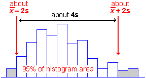
It is especially worth remembering that approximately 95% of values in a normal population are within 2 standard deviations of the distribution's mean. To be more precise, exactly 95% of values in a normal population are within 1.96 standard deviations of the mean.
Drag over the normal probability density to read off the probabilities of getting a values within 1, 2 and 3 standard deviations of the mean.
Use the popup menu to the right of the graph above, to check that the same results hold for other normal populations.
The 70-95-100 rule of thumb for data sets
The 70-95-100 rule was written for normal distributions. However it also holds approximately for many real data sets.
- Approximately 70% of the values are within 1 standard deviation of the mean.
- Approximately 95% of the values are within 2 standard deviations of the mean.
- Nearly all of the values are within 3 standard deviations of the mean.
The 70-95-100 rule holds approximately for most reasonably symmetric data sets. However for skew data, or data sets with long tails, outliers or clusters the rule is likely to be less accurate.
In the diagram below, the blue line is centred on the mean and its length is one standard deviation. In other words, the line is mean ± 0.5 standard deviations.
Click the button Sample a few times to generate some similar data sets.
Now use the lower pop-up menu to display the mean ± one standard deviation. Take a few more samples and observe that approximately 70% of the values are within these limits.
Repeat with displays of the mean ± two and three standard deviations, verifing that approximately 95% and 100% of data values are within the limits.
Use the pop-up menu on the right of the display to repeat the exercise with batches of skew data. Observe that the 70-95-100 rule is less accurate when the data do not have a reasonably symmetric distribution.
Guessing the standard deviation from a histogram
People usually find the standard deviation a difficult concept. Luckily, understanding its definition is much less important than knowing its properties and having a feel for what its numerical value means.
If you have understood the 70-95-100 rule, you should be able to make a fairly accurate guess at the standard deviation of a batch of values from a histogram or dot plot (without doing any calculations). About 95% of the values should be within 2 standard deviations of the mean, so after dropping the top 2.5% and bottom 2.5% of the crosses (or area of the histogram), the remainder should span approximately 4 standard deviations. So dividing this range by 4 should approximate the standard deviation.
Sketching a histogram from a mean and standard deviation
Similarly, given the mean and standard deviation for a data set, you should be able to draw a rough sketch of a symmetric histogram with that mean and standard deviation. (It would be centred on the mean and 95% of the area would be within 2 standard deviations of this.)
4.1.4 Standardising data
Translating data into z-scores
In the previous page, The 70-95-100 rule, you saw how any normal distribution can be standardised by subtracting the mean and dividing by the standard deviation. This standardised normal distribution is the same whatever the original normal distribution.
The same transformation is useful for data sets. The standardised values are called z-scores and are found with the formula:
![]()
For mark data, the z-scores explain how many standard deviations an individual mark is from the mean class mark.
The properties of z-scores are similar to those of a standard normal distribution.
- The z-scores have mean 0 and standard deviation 1.
- About 70% of the z-scores will be between -1 and +1.
- About 95% of the z-scores will be between -2 and +2.
- Almost all of the z-scores will be between -3 and +3.
The latter three properties are a rule-of-thumb that is often called the 70-95-100 rule.
The z-scores provide a good summary of how far above-average or below-average an individual value is. For example, a student whose mark corresponds to a z-score of 2.1 is well above-average -- from the 70-95-100 rule, only about 2.5% of students would be expected to be above 2 (and 2.5% below -2) so a z-score of 2.1 must be one of the highest marks in a class.
The diagram below shows the marks obtained by 20 students in a maths test.
Click on individual crosses to see how the mark relates to the z-score for that student.
Use the pop-up menu to see how the same students performed in a reading test. The mean mark for the reading test is lower, so the z-scores do not correspond to the same raw marks as for the maths test. A z-score of 0 always corresponds to the mean raw mark in the class, and the best students are still getting a z-score of about 2.
Observe that Simeon obtained the lowest mark in all tests. All three of his z-scores are therefore around -1.5. Similarly, Samantha got the highest mark in all tests so all of her z-scores are between +1.5 and +2.5.
The table below shows all z-scores together.
| Student | Maths | Reading | Spelling |
|---|---|---|---|
| Simeon Suzanne Carolyn Marie Melanie Lorna Leith Julian Daniel Andrew Craig Aaron Benjamin Gar Katie Gavin Kamini Tracy Scott Samantha |
-1.51 -1.44 -1.19 -0.86 -0.80 -0.60 -0.80 -0.73 -0.28 0.37 -0.09 -0.22 0.11 0.69 1.01 1.08 1.53 0.82 1.27 1.66 |
-1.45 -0.74 -1.23 -1.12 0.06 -0.91 -0.26 -0.69 0.33 -0.53 -0.42 -0.15 -0.37 0.93 0.23 0.50 1.52 1.20 0.60 2.49 |
-1.54 -1.37 -1.04 -0.87 0.06 -0.36 -0.70 0.49 -0.44 -1.12 -0.02 -0.36 0.66 0.74 0.82 -0.61 1.67 1.25 0.99 1.76 |
The z-scores allow us to compare student performance better than the raw marks since they have corrected for the different levels of difficulty of the three tests.
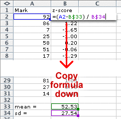
Standardising marks in Excel
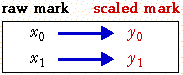
Marks can be easily standardised in Excel. The mean and standard deviation should be first evaluated in two cells of the worksheet. The top mark is evaluated with a formula that is then copied down the spreadsheet.
4.1.5 Stanines
Translating data into stanines
A z-score provides a good measure of a student's performance in relation to the mean performance of the class. However many people find a z-score difficult to interpret. Sometimes the concept of a z-score is therefore simplified by transforming it into an integer value between 1 and 9 -- a stanine.
The table below shows how z-scores are mapped into z-scores. The stanines 2 to 8 each correspond to a range of 0.5 z-scores.
| Z-score | Stanine | Percentage in normal population |
|---|---|---|
| Under -1.75 | 1 | 4 |
| -1.75 to -1.25 | 2 | 7 |
| -1.25 to -0.75 | 3 | 12 |
| -0.75 to -0.25 | 4 | 17 |
| -0.25 to 0.25 | 5 | 20 |
| 0.25 to 0.75 | 6 | 17 |
| 0.75 to 1.25 | 7 | 12 |
| 1.25 to 1.75 | 8 | 7 |
| Over 1.75 | 9 | 4 |
If stanines are obtained from a normal distribution of marks, we can evaluate the percentage of marks that will fall into each stanine. These percentages are shown in the third column of the table above. For smaller sets of marks, these proportions will be only approximate, but can be used as a guideline for interpreting the stanines.
Note that very few students will get a stanine of 1 or 9. You might expect approximately 4% of each -- say one in any class.
The jittered dot plot below shows the 20 maths test marks that were examined in the previous page.
The diagram has been shaded to illustrate how the z-scores correspond to stanines. Click on crosses to read off the z-scores and stanines for individual students.
Observe that most students have stanines between 2 and 8, the exception being Samantha who got a stanine of 9 for her reading and spelling tests.
Although stanines are in some ways simpler than z-scores, they have poorer 'resolution'.
For example, look at the spelling test above. Samantha and Kamini got marks that were only 1 different (70 and 69), but Samantha's z-score of 1.76 was translated to a stanine of 9 whereas Kamini's z-score of 1.67 was translated to a stanine of 8.
On the other hand, Katie and Tracy both got stanines of 7, but their raw marks were 5 different.
There are some benefits in using stanines for reporting marks to a layman, but it is usually better to use z-scores for your own analyses.
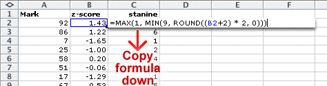
Stanines in Excel
Stanines can be obtained from the z-scores as follows.
4.2 Reference populations
- National distributions
- Percentiles from national distns
- Stanines from national distns
4.2.1 National distributions
Standard tests
In the previous section, Z-scores and stanines, we looked at a single set of class marks in isolation. In the current section, we ask how these marks compare to a larger population -- for example, the rest of the country.
In New Zealand, various standard tests have been written and are available for any school to use. These serve several purposes:
- They are well-written and effectively assess student ability.
- They allow student performance to be compared to a national distribution of marks. Guidelines for interpretation of marks are often provided.
- The results from these tests provide educational researchers with information about how student ability is changing from year to year.
We concentrate on the second of these points. The national distribution of marks for a standard test provides a guideline for interpreting an individual student or class.
School Entry Assessment
One standard assessment package is the School Entry Assessment kit which is used by many new entrant teachers in New Zealand. Student summary sheets are returned to the Ministry of Education and the diagram below shows the national distribution of marks for one part of the assessment ('Checkout') from about 30,000 students between 1997 and 2000.
The numbers of students getting each mark are shown on the axis on the left. The axis on the right shows the proportions and is of more interest. Drag over the bar chart to read off the proportion of students with marks less than any value -- the sum of the bar heights to the left of the value.
No need to smooth
For a small set of class marks, a normal distribution may be an adequate description of the distribution since there is not enough data to accurately assess the shape of the distribution.
However, when there are many thousands of marks, a simple distribution such as a normal distribution is unlikely to be adequate. Since a bar chart or histogram of the data should be reasonably smooth, there is usually no need for further smoothing.
Warning
The students whose marks are compiled to form a 'national distribution' may not form a typical cross-section of the country. If only high-decile schools conduct a particular test, the 'national distribution' of marks will be centred on a higher mark than would be typical from the country as a whole.
For example, many of the better students in New Zealand sit the exam for the Australian Mathematics Competition. Since this is a fairly selective group of students, an 'average mark' in this exam should not be taken as an indication that the student is only an 'average student'.
National distributions should therefore be interpreted with caution unless they represent a genuine cross-section of students.
4.2.2 Percentiles from national distns
Obtaining percentiles
If a national reference distribution is available for a particular assessment activity, how can it be used to help interpret the marks from individual students?
One way is to translate individual marks into percentiles from the reference distribution. The percentile for any student is the percentage of the reference distribution that received lower marks than this student. (To be more precise, we add the proportion getting lower marks to half the proportion getting the same mark as the student.)
School Entry Assessment
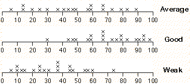
The jittered dot plot below shows the marks of 20 students who attempted the 'Checkout' task in the School Entry Assessment kit.
Click on any cross on the dot plot of the raw marks. The proportion of students in the reference population who got less than this -- the percentile -- is the sum of the highlighted bars on the bar chart above.
Note that the percentiles in a class will be evenly spread between 1 and 100 if the class is 'average', but will be bunched higher for a 'good' class and bunched lower for a 'weak' class.
4.2.3 Stanines from national distns
Obtaining stanines
In the previous section, we showed how z-scores and stanines were obtained by standardising individual marks with the equation:
![]()
In this equation, the mean ![]() and standard deviation s
used to scale the marks were the mean and standard deviation in the class.
When a national reference population is available, the mean and standard deviation
from this distribution can be used to obtain z-scores, and hence stanines.
and standard deviation s
used to scale the marks were the mean and standard deviation in the class.
When a national reference population is available, the mean and standard deviation
from this distribution can be used to obtain z-scores, and hence stanines.
The national distribution of marks in the 'Checkout' task in the School Entry Assessment kit was shown on the previous two pages. The mean of this distribution is 18.399 and the standard deviation is 7.136, so z-scores can be found with the equation
![]()
The diagram below illustrates how a class of marks can be transformed with this equation into z-scores.
Click on the crosses for individual students to read off the raw mark and z-score. The diagram also shows how stanines are obtained from these z-scores.
Use the pop-up menu to select Good class. Observe that the same equation is used to obtain z-scores for this class, so the z-scores of most students are positive. (If each class had been standardised with its own mean and standard deviation, about half of each class would have had positive z-scores.)
Using a reference population to obtain z-scores and stanines therefore makes it easier to compare classes or other groupings of students.
4.3 Scaling marks
- Linear scaling
- Piecewise linear scaling
- Doing it in Excel
4.3.1 Linear scaling
Aim of scaling
Sometimes it is felt that an exam or test is 'too easy' or 'too hard' and that the marks therefore do not give a fair indication of how the students have performed in relation to other classes or to a national expectation. For example, if the internal assessment component of marks for a Bursary subject are out of step with the marks achieved by the class in the external exam, they will be scaled up or down.
Linear transformations
The simplest type of scaling is called a linear scaling or a linear transformation of the marks. The simplest form of scaling multiplies each mark by a constant.
![]()
If the constant b is less than 1.0, the marks are reduced by the scaling whereas if b is greater than 1.0, the marks are increased.
A problem with this type of scaling is that its greatest effect is on the highest marks in the class and the lowest marks are affected least. A more flexible type of linear transformation is given by the equation
![]()
The effect of these types of transformation are most easily explained in an example.
The jittered dot plot at the bottom of the following diagram shows the raw marks of 20 students in a class. The line represents a linear scaling of these results.
Initially the constant a in the transformation is zero -- a mark of 0 stays 0 after the transformation. Drag the red arrow on the right to change the constant b -- the dot plot on the left of the diagram shows how the scaled marks are changed.
Click on individual crosses to see how their values are affected by the transformation.
Click on the checkbox Zero unchanged under the diagram to turn it off -- this allows you to change both parameters. Drag the two red arrows to adjust the scaling of the marks.
Centre and spread
The centre and spread of the scaled marks can be easily found from those of the original marks. After a transformation of the form:
![]()
the mean (and other measures of centre such as the median) are similarly related:
![]()
The standard deviation (and other measures of spread that are expressed in the same units as the raw data, such as the inter-quartile range) are related with the equation:
![]()
You will never want to use a negative scale factor, b, for scaling marks. However note that if the scale factor, b, is negative, we must change its sign since the standard deviation must be positive.
4.3.2 Piecewise linear scaling
Problems with linear scaling
Linear scaling has its greatest effect on the highest and lowest marks in a class. If you have one student whose mark is 0% and another whose mark is 100% and you want to keep these marks unchanged, then a simple linear scaling cannot be used to increase or decrease the mean mark in the class.
Piecewise linear scaling
An alternative scaling method is called piecewise linear scaling. It ensures that marks of 0% and 100% remain unaltered but scales up or down marks between. The transformation is defined by choosing some intermediate mark and specifying the mark to which it should be scaled. Marks below this mark are linearly scaled and marks above it are also linearly scaled but with different parameters.
For example, if we want a raw mark of 60 to be scaled up to 70, the diagram below shows the piecewise scaling that is implied.
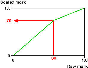
We will explain how to perform this type of scaling using Excel in the next page, but the diagram below helps to explain the effect of the transformation.
The horizontal jittered dot plot below the following diagram shows marks for a class of 23 students.
The test was difficult and the median mark in the class was only 43, so we might want to increase the median to 60. Select the cross for the student (Daniel) who had a raw mark of 43.
Drag the red arrow to a raw mark of 43 and scaled mark of 60. This piecewise transformation has little effect on the highest and lowest marks in the class, but increases the centre of the distribution of marks.
4.3.3 Doing it in Excel
Linear scaling in Excel
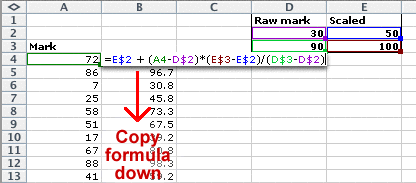
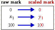
A linear scaling of marks is usually best specified by giving two raw marks and the scaled marks that we want to allocate to them.
A linear scaling then transforms any mark, x, into a scaled mark y with the equation:
![]()
This equation can be used as a formula in an Excel spreadsheet to scale a complete set of marks. For example, the spreadsheet below changes a raw mark of 30 to 50 and a raw mark of 90 to 100.
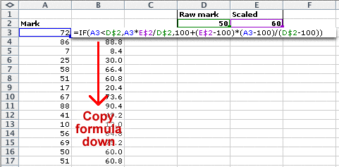
Piecewise linear scaling in Excel
Piecewise linear scaling is a little more complicated, but the formula is related to that above. For marks out of 100, we specify the required scaled mark for one raw mark. Since marks of 0 and 100 are unchanged, we have:
The first two rows specify the linear scaling for values, x, that are below x1 and the last two rows specify the linear scaling for values over x1. Simplifying the earlier equations, we therefore have the transformation...

In Excel, this can be implemented with a formula such as that below.