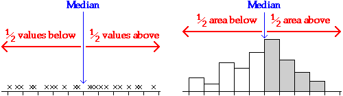
Median
The two most commonly used measures of centre in a data set are the median and mean.
The median is the middle value in a batch, so the same number of values is above and below it. (If the number of values is even, the median is defined to be half way between the two middle values.)
Mean
The mean of a data set is found by adding all the values, then dividing by the number of values, n.
![]()
The best way to understand how the mean behaves is to imagine each cross on an unjittered dot plot to be a solid object resting on a beam with negligible mass. The mean is the value at which the beam will balance.
Maths test marks
The diagram below shows the maths test mark data.
Drag the red arrow to change the value of k. When the beam is balanced, k is equal to the mean.
Mode
A third summary of centre that is occasionally encountered is the mode of the data. This is really only appropriate for discrete data and refers to the value with the highest frequency. For continuous data that are displayed in a histogram, the term modal class is sometimes used to refer to the class with highest frequency.
Median and mean in Excel
Excel has built-in functions to evaluate the median and mean of a column of marks. If the marks are contained in the cells A1 to A25 of a spreadsheet, the formula "=MEDIAN(A1:A25)" in another cell will calculate the median mark, and the formula "=AVERAGE(A1:A25)" will evaluate the mean mark.
3.1.3 Comparison of median and mean
Are the median and mean the same?
Although both describe aspects of the 'centre' of a distribution, they are not the same and can occasionally have very different values. This page describes some differences between the interpretation and properties of the median and mean.
Social versus economic indicator
For some data sets, the median can be considered to be a social indicator, whereas the mean can be interpreted as an economic indicator. For example, if a batch of values consists of the salaries of all teachers in a high school:
- the median salary indicates what the 'average teacher' earns (half of the teachers earn more and half earn less)
- the mean salary reflects the total amount paid as salaries to teachers in the school (since it is the total of the salaries, divided by the number of teachers).
Outliers
An outlier has little effect on the numerical value of the median, whereas an outlier affects the mean more strongly. The median is therefore called a more robust measure of centre than the mean.
The distribution of values in the data set below is fairly symmetric, so the mean and median are similar.
Drag the cross for one of the larger values with the mouse towards the right of the axis (approx 90) and observe the effect on the mean and median.
You should observe that the median remains unchanged at 24, but the mean increases considerably. If this change had been caused by incorrect recording of the value, the resulting outlier would therefore have badly effected the mean, but not the median.
Skew distributions
When the distribution of a batch of values is fairly symmetrical, the mean and median are similar. However if the distribution is skew, then the mean is usually further into the tail of the distribution than the median.
This can be readily understood in relation to the balance interpretation of the mean -- values far from the 'centre' have relatively high leverage, so the point of balance (the mean) is further into the tail of the distribution.
The diagram below shows the mean and median for a skew data set. Note that the mean is larger than the median (i.e. further into the tail).
You may drag crosses in the plot to investigate distributions for which the mean and median are most similar and dissimilar.
3.1.4 Mean of discrete data
Frequency table
All graphical displays of discrete data are based on the frequencies of the different values -- i.e. the number of times each value occurs in the data set.
In data sets with a small number of possible counts (say 20 or fewer), a frequency table is a useful summary in its own right. Unlike frequency tables for continuous data, no grouping is involved so no information is lost.
Calculating the mean from a frequency table
The mean of a discrete data set can be easily calculated from a frequency table.
The following frequency table describes the marks in a short test for 29 students.
| Mark |
Frequency |
||
|---|---|---|---|
|
|
||
| total | 29 |
The mean mark in the group of students is found by adding the marks from all 29 students then dividing by 29,
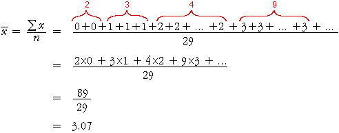
Note that the numerator, 89, is the total number of marks obtained by the
29 students, so the mean number of marks per student, ![]() ,
equals the total number of marks divided by the total number of students.
,
equals the total number of marks divided by the total number of students.
The second line in the calculation can be generalised to give the general formula
![]()
where the summation is over the distinct possible marks in the data set, rather than all students.
| Note that the mean number of marks per student is not a whole number. This is perfectly reasonable for the mean of a discrete variable. |
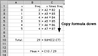
Using a spreadsheet
The above calculation can be easily performed on a spreadsheet. The diagram below indicates how this may be done using Excel.
3.1.5 Quartiles, deciles and percentiles
Describing other locations in a distribution
The mean and median both describe the 'centre' of a distribution. This is usually what you want to summarise about a set of marks, but occasionally a different part of the distribution is of more interest.
For example, you might want to describe a typical mark for a 'good' or 'weak' student.
Quartiles
The median of a distribution splits the data into two equally-sized groups. In the same way, the quartiles are the three values that split a data set into four equal parts. Note that the 'middle' quartile is the median.
The upper quartile describes a 'typical' mark for the top half of a class and the lower quartile is a 'typical' mark for the bottom half of the class.
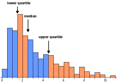
The quartiles are closely related to the histogram of a data set. Since area equals the proportion of values in a histogram, the quartiles split the histogram into four approximately equal areas.
(The relationship is only approximate if the quartiles do not coincide with histogram bin boundaries.)
Deciles
In a similar way, the deciles of a distribution are the nine values that split the data set into ten equal parts.
You should not try to calculate deciles from small data sets -- a single class of marks is too small to get useful values since the extreme deciles are very variable. However the deciles can be useful descriptions for larger data sets such as national distributions for marks from standard tests.
The diagram below shows a jittered dot plot of 60 marks from an exam.
Click on the areas between the quartiles and verify that the quartiles split the students into four groups of 15.
Use the pop-up menu to display deciles for the data, and verify that the 9 deciles split the students into 10 groups, each containing 6 students.
Deciles for the distribution and for individual students
The term 'decile' is used in two different contexts. It is confusing that the same word is used in both ways, so be careful!
When applied to a distribution (a large group of marks), there are nine deciles, each of which is a mark.
A student whose mark is below the first decile is said to be in decile 1. Similarly, a student whose marks is between the first and second deciles is in decile 2, ... and a student whose marks is above the ninth decile is in decile 10. When applied to individual students, the term 'decile' is therefore a number between 1 and 10.
For example, the histogram below shows the distribution of marks in a test (out of 60) that was attempted by 600 students. Each student's mark is represented by a square in the histogram.

The nine deciles split the students into 10 groups of 60.
The first decile is 17.5 so the weakest tenth of the students in the class had a mark below this. This decile therefore summarises the performance of the weakest students.
Students with marks below 17.5 are said to be in decile 1. Those with marks between 17.5 and 26.5 are in decile 2, and so on, up to students with marks higher than 54.5 who are in decile 10.
Details
Unfortunately there is no commonly accepted precise definition for the lower and upper quartiles -- different software (and indeed different statisticians!) use slightly different values. One simple definition is that the lower quartile is the median of the lower half of the data (excluding the middle value if there is an even number of values) with a similar definition for the upper quartile.
In practice, the precise definition is of little practical importance, especially for large data sets. The main thing to remember is to be consistent with your definition if you are comparing several data sets.
There are similar problems with precisely defining deciles but again the precise definition used should not affect your interpretation of the data.
In practice, you are advised to use the functions built into Excel to evaluate quartiles and deciles.
Percentiles
In a similar way, the percentiles of a distribution are the 99 values that split the data set into a hundred equal parts. These percentiles can be used to categorise the individuals into percentile 1, ..., percentile 100.
A very large data set is required before the extreme percentiles can be estimated with any accuracy. (The 'random' variability in marks is especially noticeable in the extremes of a data set.)
Quartiles, etc. in Excel
Excel has a built-in function to evaluate the quartiles of a column of marks. If the marks are contained in the cells A1 to A25 of a spreadsheet, the formula "=QUARTILE(A1:A25, 1)" will calculate the lower quartile of the distribution of marks. If the second parameter to the function is 2 or 3, the median or upper quartile will be shown.
In a similar way, the function "=PERCENTILE(A1:A25, 5)" will evaluate the 5th percentile of the distribution, etc.
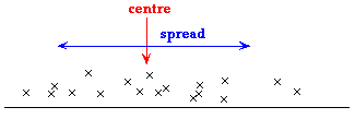
3.2 Describing spread
- Range and interquartile range
- Distance from k
- Measures of spread
3.2.1 Range and interquartile range
Simple summaries of spread
The simplest summary statistics that describe the variability in a data set are based on the quartiles and extremes of the distribution.
- Range
- The range is the difference between the maximum and minimum values. All the data are within an interval of this width.
- Interquartile range
- The interquartile range is the difference between the upper quartile and lower quartile. Half of the data lie between the two quartiles, so an interval of this width includes half the data.
The range of a data set only depends on the minimum and maximum values and is therefore a fairly poor summary of spread. In a large set of marks, it is not uncommon for one student to obtain full marks and another to get zero, so the range does not describe the spread in marks for more typical students.
The interquartile range is therefore a better summary of the spread of marks.
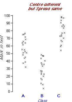
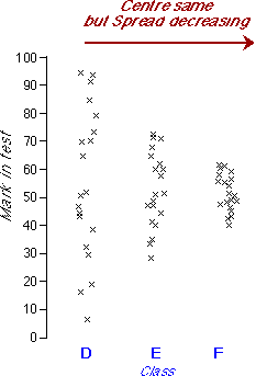
The diagram below shows marks in a test that was attempted by three classes
It is evident from the jittered dot plots that:
- Room 1 tends to have higher marks than rooms 2 or 3.
- Room 3 is more variable than the other two classes.
| The table of medians and ranges concisely summarises these differences between the classes. |
(The medians are also displayed as blue lines on the dot plots and the ranges are represented by the widths of the gray bands behind the dot plots.)
Click the button Sample a few times to give the three classes different tests. In most (but not all) of these different data sets, you will observe the same differences between the classes.
Interpreting the median and interquartile range
Although a single measure of centre and one of spread provide only limited information about the shape of a distribution of values, it is possible to sketch a bell-shaped histogram that matches the values. Such a 'guess' is often close to the actual distribution of values.
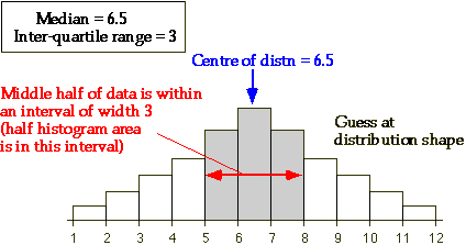
The two values do not provide any information about skewness of the distribution or other features of its shape, so such a 'guess' may not be accurate.
In Excel
There are no built-in functions to evaluate the range or interquartile range in Excel, but they can be easily found from the minimum, maximum and quartiles of the distribution. If the marks are contained in the cells A1 to A25 of a spreadsheet, the formula "=QUARTILE(A1:A25, 3)-QUARTILE(A1:A25, 1)" will calculate the interquartile range and "=MAX(A1:A25)-MIN(A1:A25)" will find the range.
3.2.2 Distance from k
A different approach
Although the interquartile range is a useful and easily interpreted summary of the spread of values in a data set, a different summary of spread called the standard deviation is more commonly used.
The standard deviation is harder to understand than the interquartile range, so we introduce it by first asking how far the data values are from some 'target'.
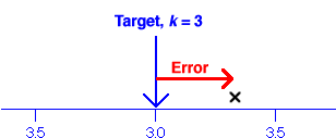
Distance from a target
As part of their lessons about weight, primary school students are taught to estimate the weight of various common items. How close are the students' guesses to the correct weight of a 3kg item?
- Single value
- The distance of a single student's guess, x, from the target, k, is called the error,
![]()
-
- Mean error (bias)
- The average of the individual errors can be shown to equal the difference between the sample mean and k,
![]()
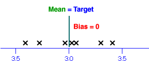
- This quantity is called the bias and clearly tells us something about whether the students tend to over-estimate or under-estimate the weights.
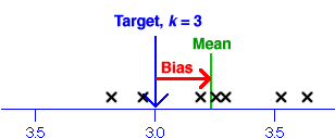 |
- However even if the bias is zero, individual students may have guesses that are very different from the target, k.
 |
- Mean squared error
- One solution to the problem of negative errors is to square them before averaging,
![]()
- Root mean squared error
- The main problem with the mean squared error is that its units are the square
of those of the raw data. For example, the guessed weights are kg, so the squared
errors are 'squared kg' and the mean squared error is also 'squared kg'. How do
you interpret a value with these units?
The solution is to take the square root to return the value to the original units.
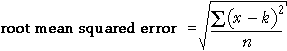
| The root mean squared error is a 'typical' error. |
Guessed weights
The diagram below shows the guessed weights of a 3kg object from seven students.
A square is drawn for each data value whose sides have length equal to the error for that student's guess.
| The area of each square is the squared error for the value. |
The root mean squared error is the side length of the square whose area is the average of the areas of the squares. It is shown in red on the diagram.
Drag the crosses to see how the values affect the root mean squared error.
You may notice that an outlier corresponds to a square with a very large area, so it has a disproportionate effect on the root mean squared error.
3.2.3 Measures of spread
Distances from the centre of the distribution
The root mean squared error summarises the distances of data values from a target constant, k.
The standard deviation is a similar summary statistic that summarises the distances of the values from the centre of their distribution.
![]()
| The standard deviation summarises the spread of the values. |
The standard deviation is the most commonly used measure of spread, even though its definition is less easily explained to a non-statistician than the interquartile range.
| The standard deviation is a 'typical' distance of values from the centre of the distribution. |
Illustration of standard deviation
The diagram below shows 7 values and represents their squared deviations (distances from the mean) by squares.
The red square has area equal to the average area of the blue squares.
| The standard deviation is the side length of this red square. |
Drag the crosses to see how the standard deviation relates to the data values. (Note that the mean also changes when a value is dragged.)
If you drag the lowest cross to turn it into an outlier, you may notice that it has a disproportionately large influence on the standard deviation.
| The standard deviation is strongly affected by outliers, so it is not a robust summary of spread. |
Variance
The square of the standard deviation is called the variance of the data.
![]()
As with the mean squared error, the units of the variance are the square of the units of the original values (e.g. square kg). Its use as a summary of spread is therefore discouraged.
Sample standard deviation
The above definitions of the standard deviation and variance are more correctly called the population standard deviation and variance.
Two alternative definitions called the sample standard deviation and variance are often encountered. Indeed, when you read of a standard deviation in a report, it is likely to be the sample standard deviation that is intended. The only difference is that the sum of the squared deviations is divided by (n - 1) rather than n.
 |
The sample standard deviation is denoted by the letter s and will be widely used in later chapters.
There is little practical difference between the two definitions provided the sample size is reasonably large. Even when the sample size is small, both definitions should lead you to the same conclusions about your data. (Otherwise, you are probably over-interpreting your data!)
In Excel
If the marks are contained in the cells A1 to A25 of a spreadsheet, the formula "=STDEVP(A1:A25)" will calculate the population standard deviation (with divisor n). The formula "=STDEV(A1:A25)" will calculate the sample standard deviation (with divisor n-1).