Histograms describe the density of values
Stem and leaf plots (and dot plots) separately identify each individual value in a data set with a symbol. In large data sets, it is unnecessary, and indeed distracting, to show this much detail.
With a good choice of the number of classes, the density of values is described by the 'canopy' shape made by the ends of the rows of leaves, as illustrated in the example on the right.
A histogram directly displays this canopy shape and therefore summarises how the density of values changes over the range of the data.
Since individual values are not shown, histograms are particularly useful displays for large data sets.
Histograms
Stacked dot plots and stem and leaf plots are closely related to histograms. Indeed, replacing each cross or leaf by a rectangle gives a histogram.
Example
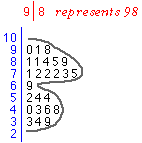
The stem and leaf plot below shows the ages of 36 primary school students when they first reached a reading age of 8.
Drag the slider to change the stem and leaf plot into a histogram.
Histograms are usually drawn above a horizontal axis (rather than against a vertical one). In the simplest type of histogram, the axis is split into classes of equal width. The height of the rectangle above any class equals the number of values that fall in the class. This is called the frequency of the class.
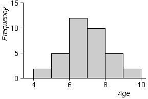
The diagram below is a more conventionally oriented histogram of the age data.
2.1.2 Choice of classes
Flexibility in bin widths and bin starting positions
There is much more freedom in the choice of histogram bins than in the corresponding bins for stem and leaf plots. Indeed, any values can be used for the bin boundaries in a histogram.
We initially restrict attention to histograms where all bins are of the same width, but even then:
- The bin width can be any value.
- The bins can start at any value, not just multiples of the bin width.
Bins should be chosen for smoothness
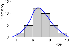
As in stem and leaf plots, we aim for smoothness in the outline of the histogram rectangles. The histogram below of the ages when students reached reading age 8 is reasonably smooth -- we informally interpret the histogram in the same way as the smooth blue curve that has been superimposed 'by eye' on it.
Histogram bins should therefore be chosen to make the outline of the histogram as smooth as possible. Adjusting bin width is most important in attaining this goal.
- When the bins are too narrow, the outline becomes jagged.
- When the bins are wide, the outline becomes blocky.
There is no substitution for trial-and-error in this process!
The histogram below shows the distribution of 200 values.
Use the buttons below the histogram to investigate the effect of narrowing and widening the histogram bins. Which histogram is smoothest (and therefore best)?
- When bin width is less than 4.0, the histogram starts to look jagged.
- When bin width is greater than 8.0, the histogram becomes blocky and shape information between 0 and 10 is lost by the grouping.
The general principle is to use the smallest bin width that is not jagged. This is a subjective judgment and any bin width between 4.0 and 8.0 would be acceptable, though a bin width at the lower end of this range is better.
Warning about histograms of small data sets
Adjusting the bin width and the starting position for the first bin can give a surprising amount of variability in histogram shape for small data sets. As a result, you must be wary of over-interpreting features such as clusters or skewness in such histograms.
Maths test mark data
The histogram below shows the 25 maths test marks that we examined earlier.
Use the buttons under the histogram to adjust the bin width and to shift the histogram bins to the left or right. Note that the appearance of splitting into clusters is only apparent in some of the histograms, but not in others.
Are the clusters real, or are they just an artifact of our choice of bins? Without further supporting evidence, the clusters are not pronounced enough for us to conclude that the students must form into two meaningful groups. However they do give an indication of clustering that a good 'data detective' would investigate further.
Dot plots should be used in preference to histograms for small data sets. They show the size of the data set more clearly and hence give some warning about the risk of over-interpretation.
Histograms of larger data sets are more representative
For large data sets, changes to the bins have less effect on the histogram shape -- we would sketch a similar smooth 'canopy' over most resulting histograms. Since they provide a much less cluttered display of the data than dot plots or stem and leaf plots, histograms are good summaries of the distribution of values in a large data set.
Finally, the shape of the histogram is less variable when different data sets are measured from the same underlying process.
The histogram below shows the distribution of 300 marks.
Click the button Sample under the histogram to observe the distribution of another 300 marks recorded from similar students. Repeat several times and observe that although details of the distribution's shape vary, the following features are visible in most sample histograms:
- The distribution is fairly smooth and unimodal (with a single peak).
- The distribution is centred round 40.
- There are occasional values almost as low as 0 and as high as 100.
- The distribution is skew with a longer 'tail' of higher values.
Use the buttons under the histogram to adjust the bin width and shift the bins left or right, and observe that the above features persist.
2.1.3 Relative frequency and area
Frequency and relative frequency
The number of values in any range is called the frequency of values in the range. In a similar way, the proportion of values is called the relative frequency.
The key to understanding histograms is the relationship between the area of the rectangles and the relative frequency of the corresponding bins.
Area equals relative frequency
A stem and leaf plot can be changed into a histogram by replacing each leaf digit by a rectangle of the same size. In a histogram, each value therefore corresponds to a rectangle of the same area.
As a consequence, the area of a histogram contributed by each value is the same
![]()
where n is the number of values in the data set. Therefore,
| The histogram area above any bins equals the proportion of values in these bins. |
In a high school, all 120 year 9 students take an English grammar test. The histogram below summarises the marks of the students (out of 50).
Each of the 120 values in the data set is represented by a rectangle.
Click on the histogram at the value 12 on the axis and drag to the right, highlighting marks from 10 to 19. Twelve students out of 120 got marks in this range, so a proportion 12/120 = 0.10 of the values are in these two histogram bins. This is also the proportion of the histogram area that is highlighted.
In the same way, drag over the histogram bins with marks from 25 to 34. Half of the students got marks in this range so this is half of the total histogram area.
Two aspects of the above histogram are worth stressing.
The histogram bins are offset by 0.5
Marks are usually whole numbers. If the histogram bins are 0 to 10, 10 to 20, etc, then there is ambiguity about whether a mark of 10 will belong to the first of second of these bins. (Even if you follow a strict rule when drawing the histogram, there will still be a visual uncertainty for the reader.)
It is best to offset the histogram bins by 0.5 to remove this ambiguity. In the above histogram, the bins are -0.5 to 4.5, 4.5 to 9.5, etc.
All bin widths are the same
All bins in the histogram are the same width, 5. If any students had a mark of 50, we would therefore have needed to add an extra bin 49.5 to 54.5 at the end of the histogram.
It is possible to draw histograms with unequal bin width, but the corresponding rectangle heights must no longer be the frequency of bins -- this is explained further in the next page. Note however that it would be incorrect to extend the final bin to 44.5 to 50.5 to include the mark 50 without the modification described in the next page, More about histogram bin width.
2.1.4 More about histogram bin width
Reason for considering histograms with mixed bin widths
When drawing histograms, you should usually define bins that all have the same width. However this is not essential. Histograms can be drawn with mixed bin widths -- indeed, a histogram can be drawn corresponding to any choice of bins.
Although the details will be of little practical importance to you when drawing histograms, the underlying principles will help you to interpret histograms and, in a later section, normal distribution curves.
Combining histogram bins
To retain the correct visual impression, in a histogram with bins of different widths the vertical axis must not be 'frequency'. Instead, the vertical axis must be labeled 'density'. (We will not give a precise definition here.) The guiding principle is...
| In a correctly drawn histogram, each value contributes the same area. |
The histogram below shows the 25 values in the maths test marks data.
Select Wider classes from the pop-up menu to combine the highlighted bins. Observe that each value is still represented by a rectangle with the same area, but of a different shape. The total highlighted area remains the same.
If the height had been 'frequency', the height of the combined bins would have been doubled, incorrectly distorting the visual impact of the bin. The correct height is the average height of the two bins that have been combined.
Select Narrower classes from the pop-up menu and observe that the areas contributed by each value again remain the same.
Why use mixed bin widths?
When all bin widths are the same, frequencies can be written on the vertical axis, simplifying interpretation. If possible, histograms should therefore be drawn with constant bin widths.
However the goal of smoothness can sometimes be attained better by using narrower bins in regions of high density.
The histogram below shows 100 marks (percentages) from a test where most students performed very well -- two thirds got marks of 80 or more.
Although the histogram is fairly smooth at the higher marks, it becomes more jagged at marks of 50 or less. However increasing all bin widths to smooth the lower marks leaves the histogram blocky on the right. (Select All classes wide from the pop-up menu.)
Select Mixed classes from the pop-up menu and observe that it gives a smoother picture of the distribution.
Interpreting histograms
The guiding principle for interpreting all histograms is that area equals relative frequency. For example, if half the area of a histogram is above a particular range of values then half of the data are in that range.
The histogram below shows the above skew distribution of 100 marks using bins of mixed widths.
Drag over the three bins that cover the marks between 0 and 69. The area is 17% of the total histogram, so 17% of the values are 69 or below.
2.1.5 Frequency polygolons
Other displays of density
A few other graphical displays are sometimes encountered that can look smoother than histograms. The simplest is a frequency polygon which simply joins the midpoints of all histogram bins.
In the diagram below, drag the slider to change the histogram into a frequency polygon.
The frequency polygon is a little smoother (less blocky) than the histogram.
Superimposed frequency polygons are easier to distinguish than histograms when two or more groups are to be compared. The rectangles for any bin in the different histograms will be identical when their bin frequencies are the same, but the counts in two adjacent bins must be the same for any frequency polygon lines to be identical.
The histograms below show the distributions of marks in two different classes. Again drag the slider to change the histograms into frequency polygons.
It is easier to see that the class represented in red has performed a bit better the class represented in blue when frequency polygons are used.
2.1.6 Drawing histograms
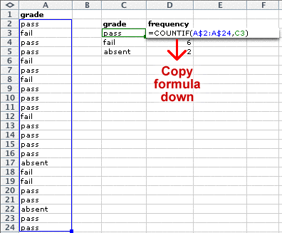
Frequency tables in Excel
The first step towards drawing a histogram is to create a frequency table for your marks.
In Excel, firstly enter your marks into one column then type details of the bins that you intend to use in a second column.
Next, type a formula to evaluate the number of values in the first bin, as shown below. (The formula counts the number of marks in the spreadsheet cells A2 to A31 that are less than or equal to 10.)
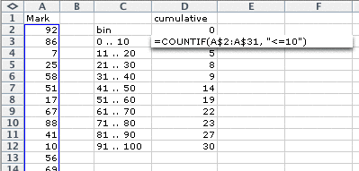
Copy this formula down in the spreadsheed (Edit > Fill down) then edit each formula to change the strings to "<=20", "<=30", etc.
The resulting values are the cumulative counts for the data -- each entry is the count for that bin plus the counts for lower bins. To obtain the counts in the individual bins:
- Type a zero in the cell above the top cumulative count.
- Type a formula in the next column for the first bin to evaluate the difference between it and the count above.
- Copy this formula down in the spreadsheet (Edit > Fill down).

This is a frequency table for your marks.
Drawing the histogram in Excel
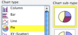
Excel does not have a specific chart type for histograms, but it is possible to draw one with a bit of effort. Firstly drag over your column of frequencies then use the command Insert > Chart... to select the following chart type.
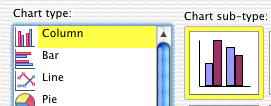
The next page of the Chart Wizard should show a draft (poorly drawn) histogram for your marks. Select the Series tab then specify the labels that should be used under your histogram bins.

On the next page, click on the Titles tab and type names for the two axes of your histogram (probably "Frequency" and "Mark"). You will probably also want to remove the Label. Now click Finish.
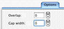
One final modification is required. The histogram rectangles must be widened to touch -- it is incorrect to display them as distinct bars. Double-click one of the histogram bars. In the resulting dialog box, click the Options tab then set the gap between the bars to zero.
The resulting histogram is not perfect. The horizontal axis is not well labeled -- it would be better if the axis was labeled as a conventional numerical axis, rather than having a label attached to each bin. However this is the best that Excel can do.
You may also have noticed that the first bin contains one more possible values than the other bins -- it can take 0, 1, ..., 10 which is eleven values. The only fix for this would be to create an extra bin for values -9, -8, ..., -1 and 0. However since Excel's 'histogram' is drawn with all rectangles the same width (irrespective of the range of values that may be included in it), this is less of a problem than if you drew the histogram by hand!
2.2 Normal distributions
- Smoothing a histogram
- Normal distributions
- Normal probabilities
2.2.1 Smoothing a histogram
Smooth curve to approximate a histogram
We have suggested that smoothness is a goal when drawing histograms, and especially those of large data sets. In this section, we explicitly try to obtain a smooth curve that approximates the shape of a histogram. Such a curve is called a probability density function.
Drawing a smooth curve by hand can be criticised for its lack of subjectivity -- two people might draw quite different curves. As a result, we prefer to use a more objective curve-fitting method based on a mathematical function. The challenge is to find a smooth curve that matches the data's histogram closely.
Why bother?
Sometimes we collect marks in order to gain a better understanding of that particular class of students. However we may also be interested in using the distribution of marks from one year in order to predict the likely marks from the same assessment activity for a different group of similar students -- for example, the following year's class.
For a small data set, such as a single class set of 30 or fewer marks, there is a considerable degree of 'randomness' in the data and therefore in the shape of the resulting histogram. As a result, direct use of one year's histogram to predict the distribution of marks in the following year may be poor -- the 'random' bumps in the shape are unlikely to be repeated in the same way.
A curve that smooths out irregularities in the histogram is likely to give a better guide to the expected distribution the next year.
The histogram below describes the distribution of marks in a test that is sat by a class of 30 students.
Click Sample a few times to see different histograms that might be observed from other classes of 30 similar students. In a data set of only 30 values, there is considerable 'randomness' in the shape of the histogram, so we really have very little idea of even whether to use a symmetric distribution to predict the following year's mark distribution based on a single sample.
As a result, a very simple smooth curve will give as good a prediction of the next year's distribution as other more complicated types of curve.
2.2.2 Normal distributions
Large and small data sets
If national data are available about the distribution of marks for some standard test -- a large data set -- then we will have fairly detailed information about the shape of the distribution and a simple curve may not match the data well enough.
However for small data sets, such as a single class set of fewer than 30 marks, a histogram cannot strongly suggest the detailed shape of an approximating curve. It is therefore usually acceptable to use a very simple generic curve.
In the rest of this section, we restrict attention to a 'family' of distributions (curves) with a limited range of shapes called normal distributions and pick one of these to approximate the histogram of a data set.
Shape of the normal distribution
Normal distributions are all symmetric 'bell-shaped' curves. There are two numerical parameters called µ and σ that can be adjusted to give a range of symmetric distributional shapes. (The two parameters are the distribution's mean and standard deviation -- see Chapter 3, Numerical Summaries.)
If we are looking for a curve that can be used as a model for a particular data set, we can therefore choose a normal distribution with parameters that provide a shape that matches a histogram of the data resonably closely.
The diagram below illustrates the range of distributions from the normal family.
Use the two sliders to adjust the normal parameters. Observe that the location and spread of the distribution are changed, but other aspects of its shape remain the same for all values of the parameters.
Note also that the total area under the probability density function remains the same (exactly 1.0) for all values of the parameters. This holds for all probability density functions.
The diagram below shows a histogram of marks (out of 60) for 60 year 7 students in a vocabulary test, with a superimposed normal probability density function.
Use the sliders to adjust the normal parameters to obtain as close as possible a match to the histogram. This normal distribution can be used as an approximate model for how the data might have arisen.
We have used a subjective procedure of matching the shapes of the histogram and probability density 'by eye'. A more objective way to 'estimate' the normal parameters will be presented in the next chapter. Click the button Best fit to apply this objective method.
2.2.3 Normal probabilities
Normal curves, histograms and underlying populations
A normal distribution curve is really a histogram -- it can be thought of as the histogram of an extremely large population of marks that underlies the available data.
For example, we might consider a single class to be a 'randomly selected' collection of students from a large 'population' of potential students from similar backgrounds who have been taught in the same way. The normal curve therefore approximates the histogram the distribution of marks from similar students who have been taught in this way in general.
Area = proportion of values
A normal distribution curve therefore has the same properties as a histogram. In particular, the area under the curve above a particular range of values on the axis is equal to the proportion of values in that range.
When a normal distribution is used to describe an 'underlying population', we call the proportion of values in any range the probability of getting a value in that range.
This relationship between area and probability (or proportion of values) is central to the understanding of normal curves
The diagram below shows the histogram of 30 marks.
In histograms, each value is represented by a rectangle of the same area. As a result, the proportion of values in any histogram bin is given by the area of the rectangle above that bin.
Drag with the mouse over some of the histogram bins to highlight them. The area above these bins is equal to the proportion of students with marks in the selected range.
The same holds for a normal curve. The normal distribution below approximates the distribution of the 30 marks in the previous histogram.
Again drag with the mouse over the diagram to highlight an interval of values. The probability of getting a value from the interval is equal to the area above that interval.
2.3 Discrete and categorical data
- Discrete and continuous data
- Bar charts
- Categorical data
- Stacked bar charts and pie charts
- Drawing bar and pie charts
2.3.1 Discrete and continuous data
Discrete and continuous data
In this section, we distinguish between two types of numerical data.
- Discrete data
- When the values in the batch are whole numbers (counts), the data set is called discrete. Examples of discrete measurements are:
- the number of absences in a class each day,
- the sizes of new entrants classes in a region on 30 January,
- the number of correct answers in a test.
- Continuous data
- When the data are not constrained to be whole numbers, the data set is called continuous. Examples are:
- the ages of students in class on 1 July,
- the heights of the students in a class.
Note that ages are commonly reported as whole numbers, but age is a continuous quantity that could be recorded to arbitrary accuracy.
Most mark data record the number of correct answers and are discrete
Displaying large counts
Some discrete data sets contain large values. Attendance records at professional football matches provide an example -- in this type of discrete data set, all counts would be greater than 1,000. When the counts are large, the distribution of values can be summarised with the same methods as continuous data -- dot plots, stem and leaf plots, and histograms.
Displaying moderate counts
For discrete data sets where the range of values is smaller, some or all of the values are likely to be repeated several times in the data set. For such data sets, most of the earier displays can still be used, but:
- Basic dot plots are misleading since repeat values are drawn as a single cross.
- Stacked dot plots are better than jittered dot plots. No information is lost by stacking since there can be a column of crosses for each distinct value.
- Histogram class boundaries should end in '.5' to ensure that data values do not occur on the boundary of two classes.
The following table gives the marks in a maths test for 106 year 7 boys in an intermediate school. The test was marked out of 40.
| 13 17 13 8 7 10 10 21 18 17 |
19 15 15 23 12 12 15 27 19 23 |
6 2 9 11 5 18 20 24 15 14 |
11 2 4 4 13 10 13 19 25 14 |
11 4 14 12 23 19 17 16 17 13 |
7 9 12 11 30 19 4 11 18 18 |
24 15 13 12 6 17 27 3 10 7 |
1 14 22 16 10 2 7 9 5 21 |
18 17 18 12 15 13 13 15 6 25 |
13 15 5 28 20 19 14 11 14 4 |
8 10 7 23 18 24 |
The diagram below shows an unjittered dot plot of the data.
Observe that the basic dot plot gives no indication of the distribution of choices -- there is a cross for most possible counts, even though some of these crosses represent several volunteers.
Use the pop-up menu under the diagram to display jittered and stacked dot plots of the data. The stacked dot plot is the best display of these data.
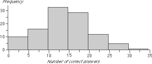
The histogram below is also appropriate for these data. Note however that the bins are defined as '-0.5 to 4.5', '4.5 to 9.5', ... to ensure that the data values do not occur on boundaries.
2.3.2 Bar charts
Displaying small counts
When using a histogram to display the distribution of marks that are recorded out of 100 (or any other large total), the histogram bins will usually be 5 or more marks wide.
However if the total mark for the test is small -- say 10 or 12 -- then we would usually draw a histogram in which each bin contains only a single possible value, (0.5 to 1.5), (1.5 to 2.5), (2.5 to 3.5), etc. These bins should be centred on the possible values in the data set (i.e. 1, 2, 3, etc).
Such a histogram can be improved by narrowing the rectangles so that they do not touch, since this emphasises the discrete nature of the data. The resulting display is called a bar chart of the data.
For discrete data, bar charts are preferable to histograms, provided this does not result in too many classes.
Marks out of 12
The table below shows the marks (out of 12) for 100 students in a test.
| 3 3 4 2 4 11 4 5 9 8 |
3 3 4 2 4 8 8 6 7 4 |
3 4 2 6 4 6 3 3 2 4 |
8 3 3 9 5 6 7 4 3 4 |
2 0 5 6 7 6 6 4 5 3 |
1 4 1 5 5 9 4 6 7 11 |
6 11 8 7 3 4 7 6 4 9 |
0 2 4 3 5 3 6 5 3 3 |
5 3 4 3 6 7 5 5 5 10 |
4 1 3 3 7 7 12 5 7 8 |
The diagram below shows a histogram of the marks.
Click the button Animate Grouping to change the display into a bar chart -- the best display of the data.
2.3.3 Categorical data
Numerical and categorical data
Most, but not all, assessment-related data are numerical. A numerical variable contains a number from each individual. A categorical variable classifies each individual into one of several groups. For example, 25 year 4 students in a class are asked to give an ending to a story whose beginning is read to them. Each student is assessed for the originality of their ending, with the following results
moderate, little-or-no, moderate, very, ...
Batches of categorical data like this can be summarised with a frequency table which displays the number of times that each distinct category apprears in the data set (the category's frequency). Frequency tables are often augmented with a column of proportions or percentages since they are easier to interpret than the raw frequencies.
Story completion
The frequency table below is based on a table published by the New Zealand National Education Monitoring Unit describing the originality of a story-completion exercise by 1440 year 4 students in 2000.
Choose the option Freq and proportion under the frequency table to see the proportion of the students of each type.
Finally, choose the option Freq and percentage to express the proportions as percentages. Although the percentages are simply 100 times the corresponding proportions, the leading zeros are suppressed so the information in the data stands out better.
Bar charts for categorical data
Although frequency tables provide easily digestible summaries of most batches of categorical data, the same information can also be displayed graphically. The simplest graphical display of categorical data is a bar chart. This is similar to a bar chart for discrete data, but the horizontal axis is a list of the possible categories rather than a numerical axis. The heights of the bars are still the frequencies or proportions for the different values.
The bar chart below again shows the originality ratings for the 1440 year 10 students in a 2000 story-completion exercise.
Clicking on any bar highlights it and the corresponding values on the frequency table.
Note that the bar chart is shown with both a frequency axis (on the left) and a proportion axis (on the right). It has the same shape whichever is used.
In the remainder of this section, we will not distinguish between discrete data where the possible values are small and categorical data -- the same graphical displays can be used for both.
2.3.4 Stacked bar charts and pie charts
Other displays of discrete and categorical data
Two variations of the standard bar chart of discrete and categorical data are often encountered. A stacked bar chart is simply a bar chart in which the bars are stacked on top of each other. It is particularly useful when comparing several distributions since the stacked bar charts can be drawn side by side.
In a pie chart, a circle is split into segments according to the proportion of data values in each category. The angle for each category is given by the proportion.

Although pie charts seem visually different from the two types of bar chart, they are closely related.
In bar charts, stacked bar charts and pie charts, the area for any category equals the proportion of values in that category
The bar chart below again shows the assessed 'originality' of a story-completion task by 1400 year 10 students.
Drag the slider to the right to stack the bars of the bar chart.
In the diagram below, drag the slider to change the stacked bar chart into a pie chart.
Beware 'chartjunk'
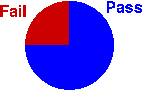
Bar charts and pie charts are usually graphical displays of a very small amount of information. A small frequency table often contains the same information. The pie chart below only shows that 75% of this class passed the exam -- information that can be expressed in a single value!
There is therefore a temptation to embellish bar charts and pie charts by adding a third dimension or using pictures instead of simple rectangles in a bar chart. This is often called chartjunk. (Software such as Excel makes it easy to do this.) Try to resist the temptation since some of these embellishments can be misleading.
It is best to draw a pie chart simple and small.
Bar charts and pie charts highlight different aspects of the data
Although a bar chart and a pie chart are visual representations of the same values (the proportions in the categories), they highlight different features of these proportions. Bar charts provide better comparisons of the individual proportions, whereas pie charts allow us to assess better the proportions in two or more adjacent categories.
The diagrams below describe the reading age of 120 students in the junior classes of a primary school. Each student was classified as reading at their chronological age, up to 6 months above or below, up to 12 months above or below, or over 1 year above or below.
The bar chart shows that the proportion with reading age 1-6 months below their chronological age is slightly greater than the proportion 7-12 months below. This is less obvious from the pie chart. Click on the categories to read off the exact proportions.
On the other hand, the pie chart shows that more than a quarter of the students have reading age more than 6 months below their chronological age. This information is not immediately apparent in the bar chart. Drag over adjacent categories to read off the proportion of the population in these groups.
2.3.5 Drawing bar and pie charts
Frequency table in Excel
All graphical displays of discrete and categorical data are based on a frequency table. The diagram below shows an example of how a frequency table can be produced in Excel.
Drawing a bar chart in Excel
This is based on a frequency table. Drag over the frequency table (values and frequencies) then choose the command Insert > Chart.... In the resulting dialog box, select the following chart type.
Then click Finish and the bar chart should be added to your spreadsheet. The following chart sub-type draws a 3-dimensional version of the bar chart.

Drawing a pie chart in Excel
A pie chart is drawn in a similar way to a bar chart. Firstly the frequency table is selected with the mouse, then the command Insert > Chart... is chosen.
Clicking Finish will display the pie chart. There is also a chart sub-type to draw a 3-dimensional version of this pie chart.